T.S. Eliot Collected Poems 1909-1935

t.s eliot collected

My copy T.S. Eliot Collected Poems 1909-1935 was reprinted by Harcourt, Brace and Company, Inc. in  New York, 1936. The original publication was by Faber in London of the same year. In this copy the title page has a stamp from Milton Academy library in blue ink. After some research, I found that Milton is a k-12 private school in Massachusetts that’s been around for over a hundred years. The book must have belonged to that library before it was either donated, or bought by the used bookstore I purchased it from. This collection contains all of Eliot’s work between the years 1909-1935. It is an old hard cover, but I’m unsure of its exact age. The pages are yellowed, the binding is worn, and unlike newer editions of Eliot’s collected poems, it lacks footnotes. However, someone has gone through and lightly marked up with pencil the more studied works, like The Waste Land, “The Hollowmen”, and “The Love song of J. Alfred Prufrock”. The annotations are in meticulously small and written a quite beautiful and delicate handwriting that leads me to believe that whoever wrote in this book was once a female student or professor at Milton Academy.

the hollow menMy first encounter with Eliot was through The Waste Land. I had the Norton critical edition, which provides all of Eliot’s original footnotes and then some. I can only imagine the time and effort that this person went through to understand all the obscure references and to translate passages that were in a different language. Her notes are extensive, but there are a lot of stanzas that are made clearer by the Norton edition.

Although I write in almost every book I own – underlining, circling words I don’t understand, and making comments – I would never dream of touching my pen to these pages. I have come to the minor epiphany that I don’t write in any books that I purchase used; there is something sacred about these annotations, and any marks made by me would be disfiguring the true heritage of the book. The most annotated poem in this collection “The Hollow Men” suggesting to me that whoever the book belonged to at Milton might have had to write a paper on it. I wonder how it made its way to my favorite book store?

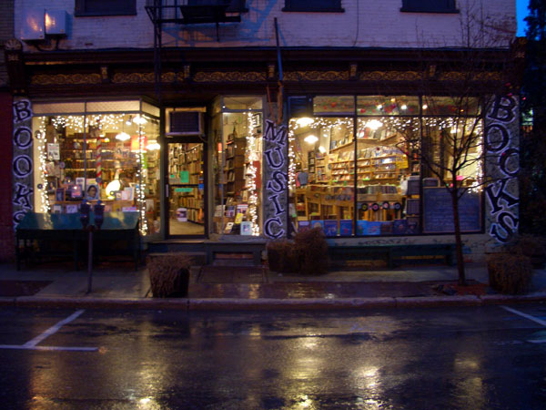
I picked if off the shelf on a rainy cold day sometime in mid-November of last year in the Bruised Apple book store in Bruised-AppleInside10Peekskill. The clerk who is usually there is an older gentleman with a kind smile and a receding hairline reminiscent of Prufrock. I once heard him read poetry at an open mic several years back. He had brought in his poem to the open mic reading in a paper bag and while he read dramatically dropped the pages to the ground as he flew through his verses. He started off saying, “No one wants to be a poet – it’s like being an aristocrat during the revolution.” I still don’t know if I agree with him, but I’ll never forget the surprise I felt in finding that the little old man behind the counter of my favorite bookstore had so much to say. It was a lot like finding this book. Forgive the cliché, but I had discovered something much more in its pages than the cover could ever reveal

.Bruised-AppleOutside13

Just Another Used Book

Instead of returning to the four Shakespearean plays for this week’s blog, I am going to focus on another used book, also found in the “Used” section of the Barnes and Noble in Paramus. I originally purchased this book, The Portrait of the Artist as a Young Man by James Joyce during this past winter break, purely for the reason that it was included on my book list. Once I got home, I set in the box with the rest of my booklist and didn’t return to it until about two weeks ago when we began reading it for class.

It appeared to be the Penguin edition, just as my professor suggested, and the page numbers correspond to the correct edition. It wasn’t until a bookmark fell out that I noticed I had not bought the same edition. The bookmark is a boarding pass, assigned to one Morris Lang, flying from Dublin to Shannon, Ireland. So I looked at the cover of the book again, noticing a sticker on the back cover that had the bookseller’s name on it: Hughes & Hughes Booksellers, and a price: ϵ 8.25. There was also another sequence of numbers: 27 05 02 but I was originally struck by the Euro symbol. Euro – not dollars. I had purchased a book from a country I’ve never visited. So I emailed the company after finding them on Facebook, and am awaiting a response.

Setting aside my interest in the person who purchased the book and why (perhaps he needed a good read for his flight), the origins of the book are quite international, too. The booksellers are Irish – there are six locations, one which happens to be in Stephen’s Square, Dublin (I presume that this is the location from which the book was published, although I am not sure). The copyright page of the book gives the name of the printer and a blurb describing the copyright rules, which interestingly enough don’t apply to the U.S. The printers, Clays Ltd., are actually English – and are a part of St. Ives plc which is the canopy for a dozen or so marketing and publishing companies for books. Clays and St. Ives are both located in London.

Below the printers, the book notes that it was printed with monophoto photosetting which is the second generation of the mechanical photosetting machine. The first generation had an output of about 8000 characters an hour.  The book was printed in Sabon typeface – which was created in the 1960s. This particular font became very popular because it was designed for monotype and linotype printing, specifically for the purpose of making the italic and bold variations of the font the same size as the roman form. This font is also a bit narrower, saving space and money for the printer. Thus, it became an economical option which fits considering my copy of the book is a mass-produced Penguin edition.

Physically, the book is about eight by five inches, the average size, and just under an inch thick. The cover is worn, with what looks like some water damage to make the last couple of pages wavy. It was either a well loved book, or since it’s travelled through three different countries (that I know of), a well abused book. The mediocrity of the physical appearance turns out to be a good inference as to the mediocrity of the edition itself. Despite the European origin, it contains the same exact text, notes, introduction, etc as the American version.

The editor of this edition works for Penguin, and was born and educated in Ireland. Again, another fitting element since Joyce is an Irish writer (I would hope the person is well versed in the culture in which the book was written – and he seems to be).  He is also the General Editor of all of Joyce’s works for Penguin. The book was obviously based on Joyce’s original work, but this edition has notes for each chapter, explaining terms and often times referring to things by their locations in Ireland. This doesn’t help me much because I don’t know Ireland’s geography, nor am I familiar with the characteristics of a city that is mentioned as a qualifier for one of the events. But with the availability of Google Maps, this shouldn’t stand as a problem.

The edition I have is based on the original publication of Portrait in 1914-1915 in The Egoist, but since has been edited by Chester G. Anderson (New York: Viking and London: Cape) in the 1960s, which became the edition that was revised with notes and an introduction by the General Editor in 1992. It was then republished in 2000 by Penguin Classics. The three publication variations (or reprints) that are noted in the book lead me to believe that the original text was used as a basis in 1992, by the General Editor.

Nonetheless, it turns out through a comparison to the American version of the same Penguin Classics’ Portrait that the ONLY difference was where the book was printed. The American version was printed in America (appropriately so although it does not say by which company) and even uses the same phototype and font. Whatever the similarities, I still think it’s cool that an Irish book has made it into my hands.

Good Ol’ Frankenstein

For this assignment, I was a bit sad to find that I didn’t actually bring the one book I really wanted to talk about, which was a little known novel titled We by Russian writer Yevegeny Zamyatin. Somehow, in my cloudy, collegiate brain I didn’t think to bring this one little book, a book that I fell in love with and read nearly from cover to cover despite my particularly bad habit of so rarely reading, just because I had filed it away under, “finished” and therefore unimportant. So for this particular assignment, I took a look at my sadly underpopulated bookcase and scanned for another book I could claim that I read in its entirety and lo and behold after some deliberation, I found it; my copy of the Oxford World’s Classics edition of the 1818 original text version of Mary Shelley’s Frankenstein or the Modern Prometheus.

Now, from what I know, the book is roughly eight inches in height, about an inch in thickness, and about five inches in width. Like all Oxford World’s Classics books, this particular version of Frankenstein sports a smooth, almost stone-like cover that seemingly has a layer of “new” dust to it, the kind of dust that comes with completely new books like a preservative to keep the pages semi-white. Along the front cover, the book sports the OWC’s usual conventions for their brand of books; a picture designed the represent the core theme of the novel along with a white strip near the bottom of the cover that sits against the picture that contains the title, author, edition and finally the OWC’s brand name. The picture on the front cover is an oddly grotesque painting of the Creature from the novel and what’s so immediately striking about it is the somehow cartoonishly large eyes that the Creature sports which give him a somewhat sassy look to him.

Like most books in my possession, I tend to try and keep all the pages straight and unblemished, the cover and corners unbent, and the spine straight. For this particular copy I own, all of those requirements have been met despite the fact that I brought this book to two separate classes nearly four days a week. I bought this book new and for the most part, it still looks new, which I take an odd amount of pride and satisfaction in.

The actual blood and bones of the book are fairly simple; OWC’s usually scoops up the rights to a pretty wide swath of novels ranging from antiquity to the early twentieth century and they typically include an index of important references, footnotes and other bibliographical information as well as a history section documenting a particular book’s publication process and relevant history about the author’s life and colleagues. In any case, this version of Frankenstein is, like I mentioned previously, the 1818 unrevised text version of the novel. Mary Shelley, who authored two versions of the novel, the initial and widely regarded to be “superior” version of the text and a later revised version published in 1831 at the behest of her publishers Richard Bentley and Henry Colburn to be a tad more conservative and truncated. While I have but little knowledge of the 1831 version of the novel, as I’ve only read and owned the 1818 version, I can understand why the novel was toned down. When Mary Shelley was in the process of writing the story on her famed vacation at the Villa Diodati with her husband Percy, step-sister Claire, their friend Lord Byron, and his physician John Polidori, the impetus for which was both a terribly cold climate affecting much of the populated world, (known as the “Year Without a Summer”) as well as a challenge by Byron to write a “ghost” story, Mary fashioned what was ostensibly conceived to be a horror story from the very beginning and as a result, the book contained themes of sublime isolation, terrible, murderous weather and of course, a monster so closely resembling man that much of the novel is spent uncovering what it is to be human. Though it’s a bit difficult to understand why a book like this would be scary, the subject matter of the book is somewhat grotesque and unsettling and therefore it’s easy to understand why someone would want the content to be toned down.

In any case, I just have a weird connection this book. I read it in highschool and liked it but didn’t “get” it, and I knew that I’d have to read it some time in college, which luckily I did. And you know what? I actually took the time to sit and read its relatively brief 191 pages and came to find that I really enjoyed it.