Silver Earrings: Reassessed

I think it is important to point out the origins of the Mexican town in which I purchased these earrings in order to fully comprehend the importance of silver and by proxy the existence of these earrings in the first place.

Taxco is located in the state of Guerrero, Mexico. It’s about an hour and a half away from where my grandparents live in Cuernavaca, Morelos. Hernan Cortes’ palace in located in Cuernavaca, and he had a strong hand in founding the existing town of Taxco as it is recognized today. So colonialism is an ugly but integral part of the existence of these earrings.

Taxco was not always a silver mining town. In fact, the name Taxco comes from the indigenous language of Nahuatl meaning “place of the ballgame”. Indigenous sport was infinitely more important to the culture than was the abundance of silver located in the land, which the indigenous population saw no real use for. It was Cortes who came in and demanded that the indigenous population begin to mine the silver and ready it for export back to Spain.

Silver mining and exporting became much less integral to the town of Taxco during the Mexican Revolution in 1910, during which the town was actually sparsely populated. It was an American by the name of William Spratling who brought the history of silver mining in Taxco back to life in the 1920s. He opened up many silver design workshops and exported much of the silver jewelry that came out of it back to the U.S. Since then, Taxco has had a boom in population and most of the commerce within the town in due to tourism.

I was one of these tourists when I bought the earrings. I was excited, never having ventured to Guerrero before, eager to get out of the small bubble in Cuernavaca that my family encouraged me to stay in while visiting them. But this leads me to believe that since these earrings were brand new, made by the man I bought them from in a small but deliberately charming hole-in-the-wall shop in el centro (downtown) of Taxco, that the purpose of them was not to convey some cultural significance or align myself with my Mexican heritage. The town was originally populated by indigenous people who were either worked to death or contracted diseased by European conquistadors. My Mexican family does not see themselves as having indigenous roots at all (although they are probably undeniably there if one goes back far enough in our family tree). Therefore I conclude that the main purpose of these earrings is to make money for the existing tourism sect in Taxco, as well as to put food on the table for the man who made the earrings and sold them to me for 80 pesos. Their secondary purpose seems to be adorning my body, for that seems so much less important in the long run. The act of me buying the object is much more consequential than their presence in my life after that transaction.

Not a Fantastic Object: Final Fantasy XV

Final Fantasy XV was my “happy” object from the beginning of the semester. I decided to take a closer look at how it functions as an object.

Game cases have two main functions: to attract potential players, and to protect the delicate contents inside. Square Enix, the publisher of the game, is pretty good at the former: the art on the color is lovely and holographic, and there’s a sleeker, sophisticated inner black cover. It’s worth nothing that the North American version of the cover is much less sentimental than the Japanese version of the cover, which has the four friends featured in a much warmer, more brotherly pose.

As much as I tried looking through the little pamphlets and fine print on the case and disc, I was unable to find any information on the manufacturing of the physical disc and case itself. Presumably, it was made in a factory somewhere, stamped in a mold in translucent blue plastic. The disc was made in a factory too, and branded and coded. Everything about this item was made to be mass-marketed; the quality of the case, the contents inside, even the game code itself. It’s not meant to be unique, or anything other than a container for the story coded onto the disc. From the factory, it was then shipped by plane or boat or car to the store where it was purchased. From there, it was then taken to my house. I did not lay hands on the object from the moment of its creation until it was given to me as a gift.

This adheres to the Marxist idea that workers and purchasers are alienated from the items that they buy. Something like this was most likely made by a person in a foreign country for starvation wages; its design, while artful, is meant to be uniform to all the other copies of the game. I find this ironic, because one of the main aspects of the game is connecting with your friends on an adventure.

With the advent of digital technology, a gamer doesn’t even need to buy the physical copy of the game in order to experience it. There is no disc to protect; the code is transmitted right to their system. Soon, the physical disc will cease to exist, and these will most likely become strange curious, or occasionally, the odd drink coaster.

In a strange way this leads to the alienation of art from people, too. If a piece of art is not necessarily physical, does it affect us the same way? Of course, one could argue that, by looking at a TV or holding a controller, there’s still a tactility to it. I do find it unsettling that, despite the thousands of hours poured into creating this game, the most covert artists of it are hidden from existence.

The Oxford: A Functional History

For this week’s blog post, I decided to continue my analysis of my object that I discussed last week; my oxford shirt. To get a better sense of the history and function of my shirt in a broader sense, I did a bit of research regarding the origins of the Oxford. With this information, I hoped to be able to better understand why the Oxford style has been so enduring, and what it means to me now in my own personal life.

According to TM Lewin, a British Dress company based in London, the Oxford was originally just a specific type of textile design, and not necessarily a style of shirt. Ironically, the Oxford shirt isn’t actually from Oxford at all, but rather originally from Scotland. Apparently during the 19th Century, Scotland had a big boom in textile manufacturing, and each different company in the region sought out to have their own signature fabric. With that came much experimenting with different blends and techniques, and consequently the Oxford style was born. The Oxford was recognizable by its unique weave, which is a combination of two different yarns in a basket-woven pattern. The Oxford was actually part of a series of new textiles, each named after four different prestigious universities; Harvard, Yale, Cambridge, and Oxford. Since then, the other three in the series have gone out of production, with the Oxford style being the only textile to persevere.

Back when it was first being produced, the Oxford was seen as a luxury because of its expensive price. Because of this, manufacturers of the shirts tried to make them as functional as possible, with their cuffs and collars detachable. To make the shirts last as long as possible, one could simply replace the collar and cuffs with cheaper fabric, and subsequently get as many years out of the body of the shirt as they could. This functional property has become obsolete due to cheaper pricing, but helps us understand the shirt’s original purpose.

Today, the Oxford shirt comes in two different styles, the Button Down Collar (for casual dress), and the Pointed Collar (for a more formal look). This difference also delineates an interesting difference in functional quality. The shirt was groundbreaking because of its versatility in an era when objects and money were scarce for many, allowing men to dress-up and dress-down with the same shirt. Men could wear it with a suit, or untucked with more casual pants.

After learning about this history and the legacy my Oxford shirt carries with it, I understood the more functional and purposeful use of a style I have come to love so much. It was interesting for me to see how the style has come such a long way, and has endured mostly because of its versatility; something I too enjoy from it even today. Getting to know the personal story of my shirt better, I understand the life inside of it, and the impact it has had for generations. Now, every time I put my shirt on, I also put on a history of functionality, innovation, and style.


http://tmlewin-blog.com/2015/01/history-oxford-shirt/


My shoes!

img_4015

My Clark’s desert (also known by the name “chukka”) boots are the “object” I have chosen to describe in detail here. They are my first non-sneakers I ever purchased on my own, and I got them on Black Friday, three years ago. They are size 9 and about 10 inches long from heel to tip, measure between 4 and 5 inches at their widest part, and are about 3 inches high at the heel. Their suede has gone from a light brown to taupe (now close to matching the color of the cord laces) and has lost some of its softness. From the side, the shoes’ profile is essentially triangular—very clean and simple. As for the toe boxes (the part of the shoe that rests on top of the foot), they have begun to crease, resulting in lines that resemble crow’s feet. The leather near the toe has become scuffed and has acquired a light, white cast due to the snow and salt of winter.

I wear these shoes quite often. Because of this, along the length of the edge of their soles—from heel to toe—they darken from lightly browned to charcoal black. The undersides of the soles are mostly blackish-grey as well; however, the sole rubber is lighter colored where heel and sole meet to form a sort of “corner” (these corners have been spared the discoloration of the rest of the rubber, and are still, for the most part, their original tan hue). In terms of texture, the soles lack ridges or grooves of any kind, and even if they had had them once upon a time, they would have been worn away by now. The rubber below the arches of my feet has thinned, and the once squared-off heels are now worn down to a curve that I can rock slightly backward on.

Regarding the insoles, there is brown leather padding to support my heels and arches, which has been burnished to an impressively high shine by my socks. The insoles beneath my toes are made of some kind of mystery fabric, now worn (noticing a pattern?), but somehow not threadbare. Opposite the insoles are the shoes’ tongues, the undersides of which are each stamped with the words:

MADE IN VIETNAM

LEATHER UPPER

NATURAL CREPE SOLE

in black ink. Amazingly, these letters are still all very legible, despite the condition of the rest of the shoes.

The overall look of these shoes, however beat up they might be, is clean but casual. They do not hurt my feet when I wear them, even for an extended amount of time (though sometimes a little bit afterward). Though I have described them in a way that makes them sound like they are past their prime, the change in color seems to still suit them; in a sense, they have aged gracefully, as I have broken them in. Since they are not stained and do not look dirty, in my opinion, the newly acquired color gives them “character,” and I think they look like they have walked many paths with me, which is true!

Little Black Alarm Clock

I am writing about an alarm clock my father gave to me in the 8th grade when I just moved to the U.S. The clock is small, black and very portable. The length is about 3 inches and the width 2. The clock has a small black cover that takes up about half of the front of the clock. The small black cover when opened forward reveal two small black buttons and two small indicators. The two small buttons have “hour” written on one and “minute” on the other, whereas the two small indicators have “TIME SET/ NORM/ ALARM SET” on one and “ALARM ON /ALARM OFF” written on them. Above the two indicators, and outside the realm of the small black cover is a long dark blue button measuring about an inch. On one end of the blue button is the word “LIGHT” and the other “SNOOZE.” Above the long blue button is a screen of some sort that digitally displays the time. The back of the alarm clock holds two battery slots and has a curved bump to it.

Out of all the other alarm clocks in my home and even others I have come across, this one my father gifted me is fairly simple and ugly. From the look of the clock, it is as if the alarm clock was made with just the purpose of it functioning to wake its owner up. The alarm clock is not aesthetically pleasing and neither does it carry out any other function than to wake me up. The style of the clock reveals two things, one about my father and the other about me. The first thing it reveals is that my father is a fairly simple and practical person. He does not see the function of having overtly multifunctional and ultra-stylish products. My father is a person that believes that for something to serve a function it does not have to do anything but that function. The other thing it reveals about me is that I am the same as he is. Why would I need a stylish alarm clock if the only time I will have contact with it is when I am going to sleep and waking up? The practical mentality of me and my father can be deduced just from a small alarm clock as the one I have.

I write about the practicality of my father and I, and how that is reflected in alarm clock he gave me, but what this object fails to do is show how close I am with my father. While my father gave me this clock with the explicit intention of using it as an alarm clock, how I have come to keep it after six years does not in any way have to do with the clocks function. The last time I used this clock was my freshman in college, but I have made sure that anywhere I moved this clock comes along. It does not have a practical function for me anymore but this clock has come to represent and almost embody the relationship I have with my father and how much I cherish it. I feel like whenever I take this clock with me to a new dorm building I’m living in I am taking my father with me. I am taking the memories we have had; the late night talks and the hours we spent watching documentaries.

Silver Earrings

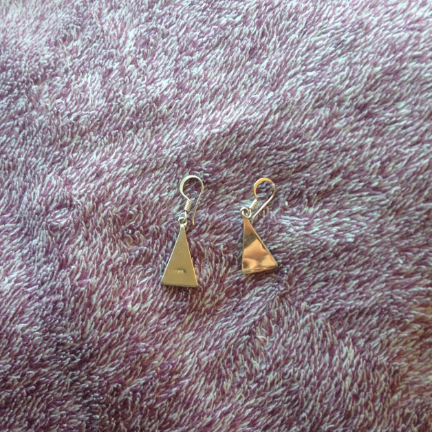
My item is a pair of silver earrings that I bought in Taxco, Mexico. This is a significant detail because the town itself is widely regarded for its silver jewelry production. I can also confirm that they are made out of real silver because I have very sensitive skin, so jewelry made out of cheap materials usually make me itch.

file_000-2

The items themselves are small, measuring at about 1.8″. They are constructed of an ethereally light triangle of silver that is attached through a small circle to a long, thin, semi-circular sliver of silver that is placed through a pierced ear. There is a small spring at the juncture of the circle connection the two pieces of silver together. Because of this juncture, the two pieces of metal are connected but not welded to each other, making it so that the triangle pendant portion of the earring is free to swing back and forth, usually due to the turning of one’s head or the speed and forcefulness of one’s gait.

The design on the triangle is quite abstract, but at the same time not at all. It  is a navy blue background painted over a thin layer of quartz. You can tell that the quartz is natural because the material on each earring is distinct, with varying ripples of color running through each. The design contained within the navy blue paint is a crescent moon with three circles, two on the bottom left and right corners and one above and center of the crescent moon. On one earring the crescent moon is facing right, and on the other it is facing left–I don’t think it matters which way the earring in worn, but personally I like so wear them so that the moons are facing each other. The design of the moon itself looks to be made out of moonstone, and is probably constituted of a thin sheet of moonstone and placed within the triangle pendant of the earring much like the sheet of quarts was embedded at the bottom of the earring. The three silver dots on each earring appear to be the same silver that the base of the earring is made of.

File_001 (1).jpeg

The back of the earring is plain compared to the front of it, but it’s lovely all the same. It is only the reflective surface of the silver, with one discrepancy–the earring on the left has a string of numbers etched/pressed into it, numbers that I can’t quite make out. But I do know that these numbers are meant to signify that the silver is indeed authentic. The slightest area around this numerical sequence is ever so slightly concave, only really noticeable when one plays with the earring in the right light.


Sticky Fingers

I was inspired to choose this vinyl for my object because of previous discussions in class. This is The Rolling Stones 1971 album Sticky Fingers.

Screen Shot 2017-02-17 at 1.53.43 PM.pngScreen Shot 2017-02-17 at 1.53.25 PM.png

Screen Shot 2017-02-17 at 1.54.07 PM.pngScreen Shot 2017-02-17 at 1.54.23 PM.png

This object is square in shape with the image of a man’s pants on the front. Attached is a zipper that is functional, but shows signs of rusting. The front and back contain cup-like rings, yellowing and tears. The top is ripped, allowing the record to fall out. Inside the vinyl sits in a paper slip with one side displaying a picture of The Rolling Stones and the back, the logo and song list. Because of the rip on top, you can see the Andy Warhol signature, who Is famous of designing the artwork for the album.

image2.jpeg

This album resides in a card box box of albums in my suite. It was bought in the 70’s by my father, whose favorite band is The Rolling Stones. I’m not sure what he did with it or how often he used it, but it must have always been out on the coffee table because of the numerous stains and ring marks on the cover. I’m not surprised by the damage because my father has a tendency to not take care of his things. It could also be because records at the time didn’t have the same value as they do now since they were so common. I found this album along with hundreds of other records of my fathers in his basement. He was going to throw them out cause he has a distaste for vinyl records and I started screaming inside my head. There was no way he was going to throw out years of collecting records, so I gladly took them off his hands. I searched through the large box and took out all the ones that I’d listen to, which including 10 different Stones albums and other great classics such as The Clash, The Talking Heads, Frank Zappa, The Doors; I was in heaven.

Since this is an original record, it was made in 1971 and according the back produced in the USA. I wish I could find more information on it and found out where my dad bought it, but he probably doesn’t remember. I’m assuming somewhere in the town I live on Long Island since my dad grew up there too and didn’t leave until much later in his life.

There’s an obvious function of this record- to play music, but I think theres so much more to it. Music in general is an escape; it helps people relax or express themselves in ways they feel they can’t otherwise. This album in specific is important to me because it was my dads favorite. He would play these songs over and over again on long car rides and it sparked my love for classic rock. When I got older and was able to drive, I would also blast this album; it just creates the perfect background music for drives with your friends to the beach or to wake me up on the drive to school. This was all through digital versions of this record though, which don’t match up to the sound of vinyl. It’s pretentious, I know, but there’s something about the sound of original records that can never be replicated through digital sound. Its that crackle and popping; the sounds of imperfections-that small scratch, the slight warping of the vinyl. Because of these sounds it creates a whole new, unique and personal sound. Even if I went out and bought this same record on vinyl, it would not be the same. Although this record meant nothing to my father, it means everything to me.


Turtle Love


This is a necklace that I have been wearing nearly every day as of the last six months or so. It’s pendant is relatively light–perhaps the weight of a quarter– and it is of a turtle. The body of the turtle is formed from a sturdy, but to my guess, relatively available metal. It is rose-gold in color, and based on my limited knowledge of manufactured jewelry, I would assume that it has been coated in this color to make the pendant appear more attractive and expensive. “Gold” jewelry often gives off this effect.

The head of the turtle is small. It is about the shape and size of a singular “Nerds” candy pebble. On each side of the head there is a small circular indent, like someone had pushed the tip of a pen into soft metal. These are the eyes of the turtle. A loop of metal connects to the head. This is the loop through which the chain goes through. This loop is not meant to be noticed, which is why it was attached to the backside of the pendant. It is not a part of the turtle’s structure, but it is necessary to secure the pendant to the chain. I’ve actually never paid attention to this element of the pendant before, and the loop looks a bit like a nose for the turtle–turning it into quite a different creature from that angle.

The appendages of the turtle stick out from its shell. The arms are curved downward and fin-like. Fine lines are engraved into the arms to give the turtle a little bit of texture. The bottom legs are slightly smaller, straighter, and without deliberate lines. A very small tale sticks out from the bottom of the shell. These bottom parts of the turtle have a couple of lined creases in the metal. It is hard to tell whether they are intentional, but they do give the pendant a more “crafted” feel to it. The arms and legs are exactly symmetrical or the same shape. This adds personality to the piece. I can imagine a jeweler sitting at his or her work-place making this necklace, as opposed to some sort of manufactured process. I am not actually sure how this necklace was made, however.

The shell of the turtle is adorned with six evenly spaced out pink, iridescent semi-circles, and a complete circle in the middle of the shell. It seems like this material was placed on top of the rose-gold shell. The decoration on the shell is what helps establish the pendant as a turtle, and it is what, I believe, gives the necklace it’s appeal. The baby pink material and its light-reflective greenish tint complements the rose-gold base very well. When flipped over, the backside of the turtle shell has small little dots indented in it, and some sort of jewelry notation.

The chain of the necklace is thin and of a gold color. I do not think it is real gold either. It is made of up really small linked boxes. Next to the latch of the necklace are two small knots in the chain, because I had gotten the chain knotted up and not put in the energy to take the knots out. It doesn’t affect the appearance of the necklace because they can’t be seen behind my neck.

For the longest time, this has just been a pretty necklace for me. I happen to like turtles, but they are in know way my favorite animal. Lately this necklace has meant a lot to me because I got it when I was with my mother. We were are a department store such as TJ Max or Macy’s,  and I picked it out of the glass case. It probably fell between a twenty and thirty dollar price range, and it meant the world to me that my mom bought it for me. Now I associate the necklace with her, and I wear it as a means of keeping her with me, for she had passed away a couple of years ago. Although this complicates my relationship to the necklace, it is also a “joy” object for me as well, because it reminds me of a good memory with my mom, and because I like the color pink and I think the turtle is rather cute.

Oxidized Opener.

This particular object is 6-1/4″ long, and 1-1/4″ at its widest point. It can be characterized as a rusting piece of shaped metal with protrusions, encased in a molded plastic handle and capped with red clear plastic, which resembles a mid century tail lamp. The stem of the metal piece can be seen through the red end.

It reads, “PRESTON LODGE; Hotel – Bar – Restaurant; Tel. RE 3-9050; Bloomingburg, N.Y.” and has stylish red arrows and diamonds at each end that wrap around the cylindrical portion of it.
The Backside reads “PAT. PEND.,” expressing that this is a proprietary design, not yet approved as an innovative contraption, but in the process. There is no indication of who may have applied for such patent or who the manufacturer might have been, or where it originated.

The telephone number included dates this item to be from or beyond 1955, as the telephone exchange created that year would have similar combinations of letters and numbers, indicating, the regional exchange, switchboard, and finally, the line. This object might be something of an advertising material, in the same way we have pens, key chains, and small functional trinkets now, or it may be something the bar ordered in order to keep numerous on hand from a promotional company. I have determined the handle material to be Bakelite by the weighted balance of the item, and the promotional nature of the item. Bakelite is one of the first synthetic plastics (heated phenol and formaldehyde) made that could be molded, manufactured cheaply, and was often used for pool ball sets, as well as telephones due to its durability and weight. I imagine due to age that this material was molded around the metal as it does not spin, move, or otherwise seem loosened by wear. I believe it to have been manufactured somewhere between 1955 and 1965, determined by said materials, longevity of print (solvent based), and anecdotal stories about the place in the printing. The rust on the useful metal end suggests it has been used for many years, exposed to liquids, or prolonged humidity. The red plastic is an end to simply cap it off, as you can see the bare metal of the stem, which would otherwise make it obnoxious or painful to maneuver the tool.

This would principally be used by a bar owner, bar tender (or some thieving patron who’d taken it home), to open bottles, cans, or to pry things apart. The protrusions on both sides are indices that it could be used a number of ways. The topside, used with the writing facing inward toward the body, would be used to latch onto the rim of a can to puncture a top with the pointed tip. The backside would be used for, and have for more leverage for a bottle with a cap, and would be used print facing out, so as not to puncture the cap. It is in good enough shape to still use it as a tool, or opener, but would most likely contaminate anything coming in contact with the piercing tip (front side) with the byproducts of the oxidation of metal.

This is the last known object related to the Preston Lodge (in time and physical being) and is a precious object that still serves its function, often. I cannot find any information online indicating that it ever existed, so I will fill in some unconfirmed knowledge that I understand as truth. This particular bar (and inn) closed about 1965, as the owner was known to be far too generous to her patrons and was quite honestly, going broke. This information is a tale that has circulated in my family for three generations, for which there is no known account of outside of those who had patronized the establishment, worked there, owned it, or grown up on the premises. The item now resides in my home, nestled in a stretched coca-cola bottle, for ease of use. It is also friendly reminder of my great grandmother, who not only owned a bar called “Preston Lodge” into the mid-1960’s, but a woman who had started a bar and restaurant in St. Petersburg, Florida during prohibition. In 1952, she returned to New York after the death of her husband, to continue her love and  skills as a proprietor of such an establishment. It is where my grandmother grew up, it is where my (19 year old) great uncle’s collation was held after his funeral, it is where my grandmother met my grandfather, and the first place my mother had visited after she had been born.

I chose this particular item, perhaps in line with the many, many things I have to represent my great grandmother, as a driven, yet practical person. I don’t necessarily identify many retro/heirloom bar items I’ve received over the years as special, as I use hand-blown green glass swizzle sticks for coffee, and continuously break them. This one is not only a useful tool, but a useful reminder that it is always possible to start over and continue your passions, regardless of roadblocks and gender. I think her and I align in that way, and that makes it so valuable. I have other, less rusty bottle openers, but this is the one that I find myself using continually, regardless of its handicaps.


A Hapless Gator

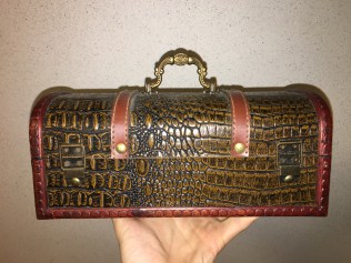
For this blog post I will discuss and describe an antique box that I own. Let me preface this by saying that this box, despite my having owned it for several years, is still quite an enigma: I know little more about it now than I did when I procured it. Speaking of which—I did not obtain this box by any conventional means: it had been abandoned by its previous owner and, for some unknown reason, was neglected by many different and unconnected people who had the opportunity to take possession of it. Nevertheless, I seized the opportunity when it arose, and here we are. Anyway, all I know about the box is that it sports an alligator skin exterior and is wooden—and seemingly old. Not exactly a gold mine of information. There is nothing – no company or personal name – inscribed or printed anywhere on the box. As a result of this lack of search criteria, the best I was able to do was to find some obscure online Chinese antique seller who had boxes that were similar to mine; so, I suppose mine may be of Chinese style or origin, but who knows. As for its value, again, I do not know. I once took it to a pawn broker along with some other objects, and, upon seeing that I was probably ignorant of its value, he quickly offered me twenty dollars for the box, ignoring everything else I had with me—so I figure that it’s worth maybe fifty to eighty bucks, depending on how bad the pawn guy was trying to screw me. Regardless, I declined his offer and have no plans to sell it.

img_4312img_4313img_4314img_4317

Over the years – in addition to its unwavering role as a decorative conversation piece – the box has served a couple purposes: first it held cables for various devices, now it sits on my desk and holds miscellaneous objects; I should probably think of a better use. Anyway, on to its description. Firstly – from a frontal perspective – the measurements of the box are 12” wide, 7” front to back, and about 6” tall, excluding consideration of the handle. As mentioned previously, the box is wooden – cedar, perhaps? – and is outfitted with alligator skin. Additionally, it is fitted with straps made of leather, which, I presume, lend support to the structure and prevent the skin of the murdered alligator from lifting off of the wood. The straps are riveted to the box quite effectively; it is evident that the box was made by hand—and rather expertly, at that. The trimmings seem to be wood, and are affixed to the box with very small nails. At the front of the box is a screw mounted latch with a swivel mechanism that I am very much a fan of: it allows for swift unlocking, but, when locked, keeps the box firmly closed. On the reverse of the box are two metal hinges, each fixed in place with four Philips head screws and a single rivet.

The top of the box is fitted with a metal handle, the bases of which are attached to the box with a total of four Philips head screws. I do not know which type of metal the handle is made of, but my guess would be brass. The style of the handle is rather ornate, and at its focal point is what appears to be – at first glance – a star with eight points; however, if you’ll allow me a moment of wild speculation, I think that this “star” is no star at all. Now, we’ve already established the somewhat remote possibility that the box – at least as far as its style goes – is of Eastern, particularly Chinese origin; and, upon closer inspection, it appears to me that the “star” looks more like a flower. In the Buddhist religion (as well as in other Eastern religions), the Padma (lotus flower) is a very important symbol. The lotus is an aquatic flower which often grows in swampy, muddy waters; however, the flower itself is divinely beautiful, and the vulgar murk and mud of its birth never adheres to its petals, and this effects a striking and symbolic contrast between the gorgeous brilliance of the flower and the aesthetic dearth which surrounds it. As a result of this peculiar nature, the Padma has come to represent purity of being and freedom from attachment to the world, and the unfolding of its petals symbolizes the expansion of the soul toward enlightenment. In Buddhism, the lotus is often depicted with eight petals, each corresponding to a step in the eight-fold path to enlightenment. It is my conviction – despite how incorrect it very well may be – that the “star” symbol present on the handle of my box is, indeed, a Buddhist lotus flower. Compare below: