Kim Blum, Waterbottle Description

I have chosen to technically describe my waterbottle. This is an object I’ve brought with me everywhere for the past 4 years. Despite the lack of any historical significance, this bottle has witnessed both large and small intimate parts of my personal life. 

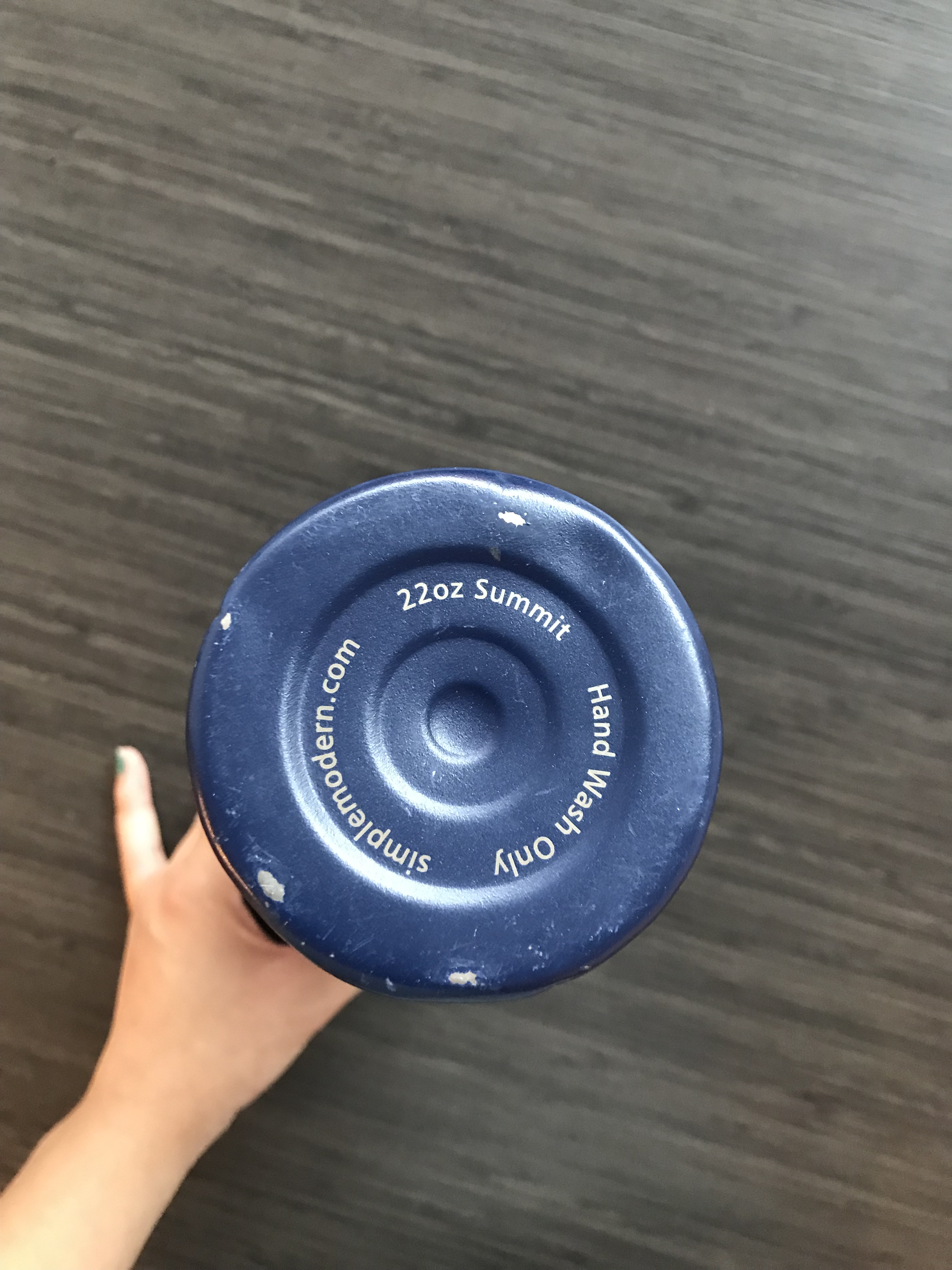
The bottle measures at 10 ¾ inches in height, with a 1 ⅝ inch radius. The body of the waterbottle is a stainless steel metal, a silver color. The outside metal body is thinly covered by a navy blue paint. On the body, there is a silver geometric line design. The geometric design is the result of the navy paint color being removed, to reveal the contrasting silver steel color of the bottle underneath. This is possibly the result of a laser removal process. At the bottom of the bottle, the silver letters S and M (the bottle company’s logo) are revealed in the same manner, sizing at about the size of a thumb print. When running your fingertips along the side of the bottle, you can feel the fine ridges where the paint layer has been removed for the design. The bottle has a few notches, scratches, and dents, mostly at the bottom of the bottle where the edge of the bottom and side surfaces meet. At the bottom end of the bottle, there are three circle ridges centered inside one another. The text, “Hand Wash Only, simplemodern.com, 22oz Summit” follows the circular circumference shape of the bottle bottom. The body of the waterbottle itself has no curves. It is a long cylinder shape, sized to fit inside the palm of a hand perfectly. There is one ridge at the top of the metal bottle, created for the edge of the body to meet the screw-on plastic cap. 

The cap of the waterbottle is thick black plastic. The cap has a cylinder base, with a handle extending outwards at a 90 degree angle. The handle does not move or rotate in any capacity. Rather, it is a full extension of the main cap base without any seams. The cap can be unscrewed to access the bottle, for filling and emptying. To drink, the cap has a small spout at the top, where the user can unscrew a small ridged cap to access. The spout can be measured to the size similar of a quarter. The cap has scratches and dents everywhere, hinting towards it’s age and use. 

There is one singular sticker on the waterbottle, placed at the top half of the bottle. The sticker is rectangle shaped, with curved corners. Centered on the sticker, a brown and white dog smiles. The dog is framed by a thin purple circle outline. The background behind the dog’s circle frame is a red and white diagonal striped pattern. The sticker clearly has wear, inferring the sticker has existed on the water bottle for quite some time. The top right corner of the sticker is completely worn off. The colors of the sticker are faded, possibly from water damage or sun damage. To the touch, the sticker has lost any glossiness it might have had, and has worn down to a paper texture.

The bottle is empty, resulting in a deep hollow echo as it knocks against anything. However, these hollow sounds are temporary- lasting until I thirst again.

More Than a Fancy Piece of Wood

View of the bar from the front
View of the bar with its middle and right compartments open, showing the storage space and shelves
Angled view of the side/front of the bar, where one of the legs can be seen

The object I decided to discuss is a bar that was handed down to me from my parents. Literally, it’s a sort of wooden cabinet, but it had been marketed as a bar (a place to store liquor), and had only ever been used as such. My parents bought it when I was about 2 or 3 years old from a furniture store that is no longer in business. They acquired it as one of their first of many beloved pieces of furniture when they bought their first home.

The bar stands at about 32 inches high, and a few millimeters shy of 40 inches wide. It stands on four short legs, each about 4 inches tall and resembling a gourd. The bar consists of 3 storage spaces. The center one is the largest and the two on either side are smaller and identical in size.

The two side storage spaces are semi-cylindrical cabinets that open with metal knobs that have an almost trapezoidal shape. These cabinets each have two shelves. Each shelf has a metal gate about 3 inches high on the outer perimeter for keeping the contents secured inside. The side cabinets each have what appear to be a hand-painted design. The design consists of two geometric images. The outermost is a thin golden rectangular line with small golden details in the corners, which consist of delicate tendril-like curls in either direction. The innermost image, about an inch or so from the other, is a 1-inch-thick black rectangular border with a golden three-pronged flower pattern within. The black border is rimmed on the inside and outside with a gentle line of gold.

The cabinet in the center has the same interior layout as the two smaller ones but on a much larger scale and is a full cylindrical shape. It too consists of two shelves each enclosed by 3-inch-high metal gates. It opens and closes like a Lazy Susan; you push the door and it swivels around 360 degrees to reveal the interior. The hand-painted design on the center has the same two geometric images as on the smaller cabinets but on a larger scale. They are both in the shape of a square rather than a rectangle. Inside the innermost square, there is a beautiful design featuring a vase of flowers, circled with a round border of thick tendril-like curls. These curls are like the ones in the corners but thicker and more pronounced. The colors of this image consist of light browns and muted greens, blues, and reds, which all fit in with the rustic, antique style of the piece.

On the center compartment there is attached a latch. My father installed it when I was in high school and prone to mischief so he could put a lock on it. The latch still remains although the lock no longer does. There are chips on the top of the wood in the form of perfect circles, likely where my brothers and I would place our drinks without coasters, despite my parents attempts to prevent that. There are other various scuffs and marks from all sorts of childhood hijinks.

After almost two decades, my parents decided it was time to part with one of their first pieces of furniture, a wooden structure that represented a milestone in their lives and which had witnessed their family grow. It retains the character to prove it. Now it sits in the living room of my first college home, which I share with three friends. It still serves as a bar, and also as our TV stand which was only supposed to be temporary. But once we got used to looking at it every day, it didn’t seem right to make anything else the centerpiece of our living room.

And it retained even more character in its new home. There is a red paint drip mark at the bottom of it from one of the many crafts my housemates and I have gotten into. I think specifically it was from the bloody hand print tapestry we made one Halloween.

This piece of furniture, while visually and physically unique, holds stories that can be realized through its physical characteristics. I plan to hold onto this piece of furniture that has watched me grow up, for a very long time. I hope for it to develop more character over the years and expand its little collection of tales.

My grandmother’s Visa

The object that I chose was my grandmother and great grandmother’s immigration visa. This object has a personal connection to my family, but also a connection to The Hare With Amber Eyes, as this takes place in parallel to the events discussed in parts one and two of the book. I have the digital scan of the visa, but since it is so old I try to avoid touching it. Knowing my mother, she probably has it tucked away somewhere in one of our many filing cabinets.  

The visa is a hundred years old now. It is stamped with the date 13 Jan. 1921. The pages are old tan paper that look like they have been stained with tea, and they curl and crumple at their edges. The booklet is bound together by two very old and rusty staples. There are so many layers of paper, writing and ink that it is hard to make out any of what has been written on it. It is written in a jumble of French, Romanian, and English. One of the clearest stamps on page eleven in the right side of the booklet reads “American Consulate Bucharest, Rouman” before cutting off. There is also a fee stamp, like one used for postage, also from the United States consulate that has “$2” written in bold font. That is worth about thirty dollars in today’s money. The visa lists them as coming from Bucarest, Rumania by way of France, and the fine print underneath warns that the documents will expire in two months, but it is covered in stamps. Behind all of this text is a faded red pattern that is smudged with the green stamp ink. The French and Romanian text above indicate that “This page is reserved for visas”. On the left page the same red pattern and visa reservation are there. There are three stamps on this page, two of them green and one a transparent white. They are almost completely illegible, but you can catch a few Romanian words here and there. There are also several things scribbled in cursive handwriting, but between the language barriers, age, and layers of ink, it is very difficult to read. The last thing on this page is the most interesting, it is a photograph of my grandmother Chaika, soon to be Clara, and my great grandmother Chana, who will become Anne. The photo is on its own separate piece of paper that has been pasted in. It has its own yellowed and crumpled edges, and features a sepia portrait of my two relatives. My great grandmother is wearing earrings, I will have to look for them next time I am home. My grandmother looks glassy-eyed and has a shiny bow in her hair. She is seven years old at this point. 

My great grandmother, Annie Meyerson and her daughter, Clara, immigrated to Boston from Bucharest, Romania (although it is listed as Bucarest, Rumania on the visa). She had lived in Romania for about three years while trying to secure passage to America. Prior to that she lived in Kodima with Clara, my grandmother, and her husband Isidore, my great grandfather. Kodima is a town in Russia (present day Ukraine) in the Galicia region outside of Odessa. At the time about half of its population was jewish, my relatives included. Antisemitism was on the rise at this point and there were pogroms in and around Odessa. These pogroms forced my family to flee, and they eventually ended up in Brooklyn.

My Aunt’s Black Stratocaster

When I was six years old, I gave up the guitar. Figured it wasn’t for me. I had played it for only a little over a year, most of which had been full of steady enjoyable progress and musical bliss. But, in the way of a mind working with a barely developed prefrontal cortex, one bad experience was enough to knock me off the proverbial horse. I won’t go into the details. Suffice it to say, I couldn’t handle the paternal pressure. Besides, i’ve never been good at sticking to one thing for an extended period of time and when I decide I’m done with something that decision is more or less set in stone. Or more accurately, deep within my synapses. 

So imagine my surprised when an black and white Stratocaster was forced into my hands by my Aunt Sarah and, at its touch, ten years of neurological connections were fried in an instant. She had had it since she was my age, sixteen, but somehow the guitar was pristine. Well not quite pristine, but at that point I wouldn’t have noticed the slight divots pressed into each nickel-silver fret. I plugged into one of the unused amps that were scattered around the house, took at least a minute to get my hands in the right position after a decade of inactivity, and strummed a single G chord. The sound tore through the hallways, reverberating of the walls and killing any remaining doubt about this sleek, six-stringed instrument.

I can’t say I’ve managed to keep the guitar in the same condition as my Aunt. The black laquer of its body is covered in fingerprints. The hand sized space between the bridge and the fretboard has an almost worrying accrual of dandriff. The plastic covering now grips the mother of pearl pickguard façade less like an infatuated lover and more like a mother trying to keep ahold of a wayward child. The strings, although I feel as if I changed them just yesterday are already staring to tense and fray. And most subtlety, but perhaps most demonstrative of my indulgent affection, is that those six divots in each fret on its long rosewood neck have deepened. 

You likely wouldn’t guess that the instrument is made almost entirely from wood, because the sheen of the black finish gives the material of the body the look and feel of some high quality poly-fiber plastic. Somehow its frame still maintains a certain softness to it that allows it to sit in my lap and be cradled by my hands for hours. Eventually, the guitar almost feels like a musical limb of my body as it fades into my hunched form. The neck is hard but smoothed and sanded so thoroughly that it also doesn’t feel much like wood.  

At the lower end of the fretboard, hiding under the strings are four rows of small metal nubs peaking out from the white pickguard form the guitars pickups. Some of those nubs are touched with dusty red rust. Further down the board we come to a bridge crowded with the saddles responsible for holding the strings at the correct high above the fretboard. They always look a bit desperate to me, shivering each time I strike a chord, as if they’ve taken on a job they can’t quite handle, but insist on preforming anyway.  

Moving up the board we can see that the strings eventually end. Tied up and threaded through the holes of little metal towers. The towers are arrayed in a diagonal line with the tower farthest from the guitar’s center holding the thinnest cord and the closest tower holding the thickest. A curious but necessary arrangement. Compared to the saddles opposite from them, the towers appear strong and stately. Calm and confident in their duties. 

Perhaps most important of all is the sound of the thing. When played by itself, the guitar seems meek, unsure. Good for playing sweet, though slightly flat, dewy morning tunes. But as soon as the amp cord slides into the output jack, the instrument gains the power to start a riot. Even with the settings at low on both guitar and amp the sound is more than enough to fill a room. And as the melodies rip through the air and flow from its body into mine, I can tell it’s chomping at the bit to fill something bigger, a building or even a stadium. A journey I fear I’m incapable of taking it on.  

A Token of Good Luck

Pendant shown from the front with a penny for scale reference.
Pendant shown from the back showing the apparent wear and tear it has undergone.
Pendant shown from the side, showing the beveled edge and detailed inlay.

The object I have chosen to describe is my mother’s yin and yang pendant. This pendant was gifted to me when I was just thirteen and I have kept it safe and close all these years.

From an outside perspective, this pendant is no more than meets the eye. Having a circumference of just a little over 3.5 cm, it has a very large presence and makes a statement when worn. A petite neck like mine is not suited for such a large piece adorning my chest. My Mother, on the other hand, can adorn this necklace as if it was made for her, and maybe that is one of the reasons I adore it so much. The pendant has a beveled outer circle inlaid with an abstract pattern consisting of dots and lines. This texture can be felt with your fingertips if grazed slightly over feeling the ridges and dips of the metal. This base structure that the yin yang is placed on is a type of copper or nickel that at one point and time was silver plated. As the years have passed by, so has the once shiny and finished appearance of the pendant leaving it now with a worn and heavily loved appearance.

The yin and yang symbol itself sits a mere .75 cm from the base giving it the appearance of coming out of or towards the intended wearer. The symbol itself is made from Bakelite, a type of synthetic resin that was first used in the 1900s. Despite Bakelite’s advantages of being more durable than other synthetic plastics, the pendant has a chip or two showing great wear and tear on the upper left section of the black teardrop shape. This symbol is from Japanese culture and is an ancient symbol of harmony and balance in the natural world. This idea of balance and the natural ebb and flow in life is an idea that my mother whole heartily believes in and has passed those beliefs down to me.

The origins of this object are pretty much unknown to my mother for she acquired it at a flea market when she was just a teen. The quality of this object and the materials reflect the cheap and often stereotypical flea market qualities we all know, maybe some a little too well. However, this object despite its little to no material value has been with my mom through the fires and back, quite literally. My mother in her early twenty’s, a volunteer firefighter at the time, was battling one relentless and unforgiving fire. Amid everything the dainty delicate chain that once belonged to this pendant, broke in two, releasing the pendant from around her neck. When the flames were snuffed, my mother noticed quickly that her beloved pendant was gone. Later that day when she was taking off her steel-toed boots, on the bottom of her shoe, or the soul of her shoe rather, lied the pendant. The pendant survived the raging fires and as she tells it, helped keep her safe in one of the worst fires she had ever encountered.

With that being said this pendant has come to be a great token of good luck for both my mother and I.

Maple Spoon

As a young teen, I attended a wilderness camp where I found a passion for carving spoons out of wood. Over the years, I have fine-tuned my skills as a woodworker, especially in the wooden spoon arena. I have become skilled with the many tools used in the process to make a spoon and have developed much knowledge of wood in general. Most of my spoons are given as gifts to loved ones, who use them regularly. Their regular use changes the spoon in terms of its color and feel throughout its life. Wooden spoons are more than a simple eating utensil, they conjure stories and emotions when looked at and held by their users.

One object particularly close to my heart is a sugar maple eating spoon I made a few years ago. The eight-inch- spoon is ideal for eating cereal, whether it is hot oatmeal on a camping trip or cold Cheerios in my dorm room. Weighing just a little more than a feather, it may seem fragile, but time has proven its durability. This spoon is different from any other spoon I have made in that it is the first one I made that I use consistently.

When looking at the spoon from a bird’s eye view, there is a dividing line that runs vertically along the left side of the spoon that is slightly off-center. The line splits the appearance of the wood into a right and left side. The darker side (on the right) comes from the center of the original log and the smaller, lighter side is from the outer edge of the wood. Sunlight, weather, and age cause the wood to have a lighter tone. The contrast of the colors makes the spoon appear to have two separate sides. The lighter side is a light brown with a slight golden hue. The hue comes from the linseed oil used to put a protective coating on the wood. Over time the color of the spoon becomes richer with use. This is apparent when comparing the current color to photographs taken when the spoon was first made.

The tooled finish gives it a unique smoothness that stays consistent throughout its life. The back of the bowl reveals small knife marks that are smooth themselves but have some roughness when looking at them together. The curvature of the back of the bowl is fairly round which makes it difficult to have long cuts. When making the finishing cuts, the longer a cut is, the smoother the wood feels while short cuts leave a slightly less smooth feel. The curvature of the bowl is exacerbated by the crank of the spoon. The term crank is often used in the spoon carving community to describe the slight upward bend of the bowl. This allows the spoon to hold more food without being too deep. The crank of this particular spoon can be seen by the handle holding a constant plane until a quarter of the way into the bowl where it curves up about an inch. The profile of the spoon is defined by the crank. Looking at a regular metal spoon can illustrate the necessity for this feature. The bowl of the spoon could be described as a soft trapezoid. The end of the bowl is smaller while the part closer to the handle is larger. The edges are rounded as most spoons are for the comfortable feel in the mouth.

The back and front of the bowl are the only parts of the spoon that show tool marks other than the small ball on the top of the handle. The ball (purely for aesthetic) is the size of a small pea that sits on the top middle part of the handle. A decorative ball on the handle of a spoon is a common addition to improve aesthetic. The handle is tapered meaning near the bowl, it is narrower than at the top. This gives the spoon a comfortable feel in the hand. The widest part of the handle is close to an inch and a half. The widest part of the handle is about an inch from the top. It tapers around half an inch in at the top which leaves a half-inch surface for the ball to sit on. The back of the handle has a slight triangular ridge running vertically along the spoon. The area near the end is close to flat but as the handle connects to the bowl it becomes more pronounced and sharper. The ridge contributes to the comfortable feeling when holding the spoon.

This spoon holds a special place in my heart; wherever I am in life, the spoon is with me. Each time I use the ergonomic and solid spoon, it grows; the story develops, the character of the spoon evolves, and the overall look of the spoon changes. Whether the pigment becomes more enhanced from coffee grounds or a small ding on the handle appears after a camping trip, the spoon tells an evolving story and mirrors my busy life.

A Woven Leather Bracelet

I have decided to use a simple woven bracelet for this post. While the object doesn’t hold much historical value, neither from my family nor in history in general, it holds a lot of sentimental value to me personally. It was the first gift my girlfriend gave to me, and the first gift I received here in New Paltz.  

Bracelet and Paperclip for scale

The bracelet is three and a half inches across and is made from black leather and beads. The leather is carefully woven in what appears to be a double-braid, constantly alternating which pair of leather strips flow through the center channel. At equally spaced intervals on the bracelet, small white and amber beads are woven into an intricate pattern. The pattern once translated to “I love You” in morse code but the constant wearing of the bracelet caused the beads to shift and rearrange, leaving the original statement as nothing but a cheerful memory. The two ends of the bracelet are knotted off and tied together with a slip knot, allowing the bracelet to be tightened around the wrist, and two larger white beads are tied at the ends of the knot. 

When I first received the bracelet, it was almost shiny with the glint of new materials. However, after much wear and tear, the bracelet has lost much of its pristine glamore it once held. The slip knot is loosening, and the leather strands it runs over are showing cracking from the constant friction. The pattern of beads has become sloppy, much less uniform and more of a random assortment from rolling along the wrist. Still, despite the cracks and deformations, the bracelet holds much sentimental value to me. It was a gift from my girlfriend, whom I met on this very campus, and just the emotional value of the gesture outways the gift itself. The use of new materials, bought from a local crafts shop on main street we’ve walked through many times, shows how much she values me. The careful, hand-worked pattern shows the effort she has put into the gift. The fact that she gave me a gift at all is symbolic in a way, showing how much she enjoyed my company and our time together. 

When I first received the bracelet, I wore it every day. I don’t wear jewelry, but the sentimental value of the object along with it’s simple and minimalistic design are appealing to me. As of the time of writing this post, I do not wear the bracelet as I am afraid that doing so will lead to the knots untying and the pattern of beads being lost. But by this point the bracelet has subsided from being a decoration and has become a much more important symbol: that of our bond. I love the woman who gave me this bracelet, not because of the gifts she’s given me but because I enjoy her company and love spending time with her. I do not need a bracelet, nor any other physical object or quantifiable measurement, to prove this fact. We care for each other, we enjoy each other, and we love each other. Besides, if we ever want to make another bracelet we know where to go to make another.