Tilson’s Timepiece.

Narrative

Tillson_Residence_Highland_NY

“Lake Ledge,” the family home of the Tilson’s, Highland, New York.

1853 map

Oliver Tilson’s Ulster County, 1853. {HRVH}

August 7th, 1863 Harry C. Tilson was born to Mary and Oliver J. Tilson, of New Paltz Landing (now known as Highland), NY. His father Oliver was a fruit farmer, Rosendale town supervisor, and established cartographer for the county of Ulster (1853 map is stored with the Huguenot Historical Society’s Map Collection). On October 13th, 1886, Harry married Mathilda “May” Allen, daughter of a methodist reverend. Their marriage was cut short by the sudden illness and subsequent passing of May. They had three children the youngest being 5 years of age. Harry Tilson met his end 53 years later, after suffering a heart attack, post surgery, where he had relocated in the years following May’s death, in Deland Florida. The Kingston Daily Freeman reported that he was active in the Presbyterian church and the ancient order of Good Fellows (a now defunct masonic group).


Physical Description

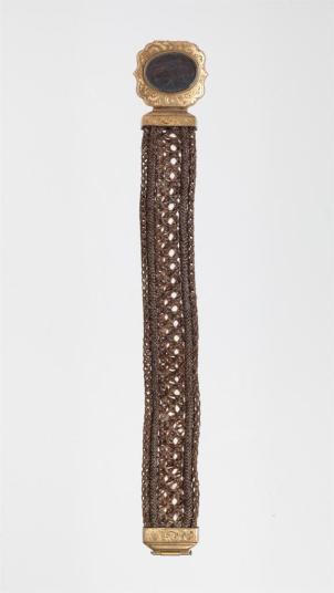
This item, once belonging to Harry C. Tillson, is a gold pocket watch, donated by the Tilson estate (Oliver Tilson II, Grandson to Harry) to the Historic Huguenot Street collection. The watch is that of a full hunter-cased style, a case which can be opened with one hand, and is roughly two inches in diameter. This design has a latching front and back, which closes to protect the crystal, hands, and dial (face) from dust and scratches. The mechanism on top is a push button type crown which opens the outer casing and winds the watch. The front outside is elaborately engraved with finial design of  the initials HTC. In the watch cover, there is also simple scripted engraving that reads “California 1875.” Both front and back closures are hinged at the bottom, which aligns with 9 on the dial. The outside, or rim of the timepiece itself is grooved, which is most likely for secured holding or pure decorative accent, as like the rest of the outer portion, it is gold. Immediately linked to the hoop surrounding the crown is a standard clasp, is a tightly woven chain of human hair, accented with gold, measuring approximately 7-½ inches. Connected on the opposite end, a latch to keep the watch worn, to a something such as a button hole, a belt loop, pocket, so as not to lose the watch, or as adornment. In the center of the chain there is an additional accent, which may act as an additional support, attached is two small charms or fobs, which have a design that has patinaed and worn away, and is now indistinguishable, but are likely to have matched the ends, or signified something of the bearer.

hair 2

Full Hunter Case Pocket watch with watch chain, made of human hair.                                      [Photo provided by Ashley Trainor, collections manager, Historical Huguenot Street]

Provenance

The watch is thought to be made in California 1875, rather than Harry purchasing it in that time, as he would have been twelve. In scaling the Tilson genealogy, it was determined to be Harry’s monogram, not only because the grantor is the paternal grandson, but because, any other Tilson carrying the HTC initials were born well after the inscription. Although I was unable to see the engraving itself in picture or person (collection unavailable), I am pressed to believe it is in/or the backside of the hunter-casing, as a maker or jeweler’s marked inscription or inception. Curiously, it is a practice for the maker to include his Name or Mark above the made date, as trademarking at this time, on casing is a sign of value or worth. Perhaps this has been worn away. Harry, himself, can be traced to California via his coal business of which he had built, along with the house next to the family home “Lake Ledge,” in the former New Paltz Landing, on Vineyard avenue. In the 1908 listing of copper mines, it is established that Mr. Tilson was in the business of mining copper in New Mexico, placing him much closer to California. This is a seminal reason as to why May Tilson’s death had been reported in a Los Angeles newspaper May 4th, 1900. The tight braid connecting this watch to Harry himself may have been made to commemorate his wife’s death in 1900, and is very likely to be made of her hair, a token of his love for her. Although this is speculative, it is common practice during this time and being so far from home, it may have been his only resolve at the time. It is unknown at this time as to where Mrs. Tilson is at rest, further burying the mystery of the hair attached to the watch.

Historical Hair Ornamentation

The use of human hair as adornment and memory begins in France and England in the 1700’s, something which Queen Victoria herself popularized. This trend became an evolving craft of wig makers, inevitably reaching to becoming another parlor craft of home makers and funerary momentos throughout Europe and the United states in the following century. This home craft extending beyond mourning, to include ornamental hair samples of lineage from children of the women weaving, keeping a very personal family album, an estrangement from bible cover lineage. In the United States this practice may have been adopted not only in craftwork, but to make special, as the sentimentality of the losses of the very recent Civil War and the onset of the manufacturing boom of the Industrial Revolution.

AWSS35953_35953_32666739 (1)

Women’s bracelet made of intricate hair work, American, 1850-1899 (Artstor

The hair mourning jewelry typically worn by women can range from elaborately woven laces to simple lockets containing a small snippet of hair. Being so popular towards the end of the 19th century, it was common for many jewelers to have in-house hair weavers, custom fitting precious metal (predominantly silver and gold) to chains and in this case, a watch chain. This particular chain and many like it often had charms accenting the rest of the metal work and clasps. These accents were particular to the owner of the watch of of the taste, and often a piece of jewelry belonging to the deceased.

Men’s accessories were not as elaborate of their counterpart’s however, the sentimentality remains, as an embodiment of the hair-owner’s soul, forever in  functional capacity with the bearer. In the cases of long braids, such as this example, it would be necessary for the hair to be long, and tightly woven so as to minimize fraying. The hair is often taken from the body before burial and for such a memento, it is likely to be conditioned to minimize its deterioration, as it is likely to be touched and used more than that of a women’s piece of jewelry, such as a brooch, pendant, or bracelet. It would be sensical then, for Harry to display his mourning practice and love for his deceased in this manner. As a business man, it would be important for Harry to keep time, and secondly, to have adequate remembrance of his wife. New Paltz’s rich history includes many items of hair-craft. It would befit the cultural practices at the time and his hometown if he were to display such a mourning practice.


American. Bracelet. 1850-1899, Woven hair, ARTstor. Web, 18 April 2017.

Holm, Christiane. “Sentimental Cuts: Eighteenth-Century Mourning Jewelry with Hair.” Eighteenth-Century Studies, vol. 38, no. 1, 2004, pp. 139–143.

“Los Angeles– Mrs. Harry C. Tilson”. May 4 1900. XIV, Page 226. Local Obituaries, Elting Memorial Library, New Paltz. 11 April 2017.

Lutz, Deborah. “The Dead Still Among Us: Victorian Secular Relics, Hair Jewelry, And Death Culture.” Victorian Literature and Culture, vol. 39, no. 1, 2011, pp. 127–142.

“Obituaries.” Kingston Daily Freeman 1 May 1953, Notices sec.: n. pag. Print. “Harry C. Tilson”

“Oliver J. Tillson Family Papers (1787-1899).” Historic Huguenot Street. Huguenot Historical Society, 17 May 2004. Web. 8 Apr. 2017.

Stevens, Horace J. The Copper handbook: a manual of the copper industry of the world. Vol. VIII. Houghton (Mich.): H.J. Stevens, 1909. Print. p. 1431

“Tilson: Mathilda”. October 13 1886. VII, Page 125. Local Marriages, Elting Memorial Library, New Paltz. 11 April 2017.

Tilson, Mercer V. The Tilson Genealogy. Vol. 1638-1911. Baltimore: Gateway Press, Inc., 1982. Print.

Tilson, Oliver J. “Map of Ulster County, New York.” The Library of Congress. N.p., n.d. Web. 12 Apr. 2017.


Special Delivery

In response to Revenge of the Analog, I decided I would rely on the postal service to deliver my text message responses. I live in an antiquated world of my own creation, as my play and free time is large spent with analogous experience. I admittedly own the tapes, regularly listen to vinyl, and own a surmountable stockpile of 80’s-90’s Nintendo artifacts, which I play to unwind, weekly. Although the ancient game systems would have been the easiest means to transport everyone with without a time machine, I opted for letter writing. Although I have tried in the past (I am a terrible correspondent during any given semester), I thought I would approach it differently this time.

So often, we check our text messages as a means of quick or passive response. The way in which I personally approach texting is unquestionably passive, sometimes leaving the phone in other rooms, coming to find emergencies on the screen of my phone, rather than actual phone calls, usually to something I don’t ultimately find pressing. I, for many years was plagued by the overriding panic of waiting for a message, but I have worked myself into a “mindful” place, living in the moment, with reservations about immediate communication needs. Coming out of class on Tuesday at 4:45 pm, I found 11 texts from 5 people, and decided I would address them once I had arrived at my next destination. An illuminating thought, what if I responded to them through letter writing? A century ago, this type of communication would have arrived by pony express (or train) and pressing conversation would have been wired or spoken in person. Conceptually, I would need to respond to the pressing matters first, such as my mother’s, “What day is your flight? I’m putting in for my vacation Friday,” clearly needed a response in that moment. I decided to write her the boring, “I registered for A, B, C, D, E for Fall…” along with one of my class papers, which I usually send by email. This particular piece of mail felt boring, but I was trying to stick to my plan of writing to all five of my text messages senders.

In deciding which texts to respond to, it was simple, as conversation always dulls resulting in “what did you do today,” and “how’s everything?” I decided in three instances overall there were deeper questions to answer through letter writing. I just needed to keep my recipients at bay, proclaiming how busy I was, and in one case completely avoiding the conversations by asking the sender self-indulgent questions about themselves to the point of distraction.

Mail!

No one can resist the charm of personalized, handwritten mail!

Having the tools needed to complete this task helped tremendously. I get stamps regularly for my grandfather and I, so I know that is no chore, and a little over $10 for an entire book. However, unexpectedly, I found the writing itself to be a more elaborate process. Taking into consideration the length of my intended message I found some of the smallest and least tacky of my paper/stationary collection, and a postcard someone once gave me, I’m going to send it back to them. I then sat down to write. What style of penmanship is appropriate to write? Is my doctor-like script too hard to interpret? Why does my hand hurt so much? Perhaps the paper was too big, maybe I didn’t have enough to say, or maybe drawing seemed easier when I ran out of things to comment on. Some of the letters included doodles that I tried to make relevant, including pictures of themselves sending me texts. In another case, I drew the actual text bubbles to introduce what I was referring to, since the letter seems so out of place and out of context to begin with. In writing itself, I found myself using more flowery and eloquent language than I would normally send in a 7 word reply. I fought my urge to draw emoji, something I didn’t realize I was using to imply connotation. I felt the need to also include important information such as where I was writing from, what date and time, as well as to mention how strange and interesting this exercise was. I suppose the date was for pertinence and my uncertainty about how long it would take to be delivered. I also wrote one each day, trying to spend at least 15 minutes writing each letter.

In the end of each letter, I included a short request that they write back, because I do love any and all constructs of exchange. Additionally, I would love for someone to experience the same intimacy with the transaction and process. It was fun to come up with doodles and interesting things to talk about, or include a poem that was uplifting only to default to some quirky, ever so existential, Bukowski. Overall, the experience of writing feels more like a craft, leaving room for creativity and a need to take time to plan it all out.

My reaction and excitement about getting surprise real mail is only comparable to a small child getting exactly what they want for their birthday. My unending fascination with paper, notebooks and postcards supports that this is a long-time-coming (cue Sam Cook) project, that I intend to continue.

I think I’ll be standing next to the mailbox in anticipation… until I get something other than bills.

Atrocious Album of Antiquity.

As a closing from Part III of The Hare with the Amber Eyes I would like to introduce another book I own. Its importance lies in the controversy of its existence, as well as my ownership of it. I do not cherish such an item, but I allow it to have a place in the world, as reminder of how mere words, and well-advertised ideation can influence an entire planet. I myself am conflicted with it, which is the very reason this uncomplicated chain of ownership exists. It is very arduous to view it objectively.

img_7638

As one might set eyes on this object, it is clearly a book. It measures 10-3/8” by 12-3/8”. The cover is a red leather-like material, punched into the material is a swastika surrounded by large leaves and acorns (which is barely visible to the naked eye and very difficult to photograph), a profile of a soldier’s bust embossed with a gold leaf, and lettering in a darker red, which reads, “Deütschland erwacht,” including two stalks of grain. This translates to “Germany Awakened,” the contents are the rise and accomplishments of the NSDAP party, from beginning to the year of publication, which conveys that they are Awake at this time. The binding is a woven beige cloth material showcasing the title in the same dark red lettering as the front cover along with the number eight, or an infinity symbol in a circle of red. There is no indication of the meaning of the “8”. The binding is falling apart, the glue is losing its hold on the pages. There has been no care in preserving this particular book. I have looked through it few times, and it loses a section from the glue on each occasion. The binding has broken in several places and comes apart easily. Despite its regal outer cover, it has fallen apart in several semantic ways. The pages have yellowed and there are quite a few pages in which it looks like there are cigarette burns.

I have looked it up online to find that a well-maintained copy shockingly sells for $174.99, used, on Amazon, as well as collector’s aging websites. Through my research, this piece of putrid propaganda was published in 1933, and this unscrupulous copy is a first edition. The only first edition I do not proudly display, rather, it stays in a musty plastic bag of unknown origin, in a container full of family documents and death certificates, under several other containers, in the back of a walk-in closet. I prefer it to live there, as I do not have a deeper hiding place. It was published by Cigaretten Bilderdienst Altona Bahrenfeld, Berlin. This book is a cooperative distribution by the Altona Cigarette Company and Hitler’s private photographer, Heinrich Hoffmann. The book originally came with just text, completely and elegantly printed in the German language using the font Deutsche Schrift, a favorite of the NSDAP. Initially it had placeholders for the owner to insert photos. As an exchange, one would cut out the proof of purchase from the Altona cigarette packages or cartons and mail them, the photos would have been delivered from the cigarette company by mail, on what I recognize as cheap, thin, easily torn glossy card-stock paper (printed at a high quality, but not actual photos). This allows the owner to create his own personal coffee table book, inserting memories (photos) of the “Werden, Kampf und Sieg der NSDAP,” as the interior subtitling states: The Struggle and Victory of the Nazi party. There were roughly two million printed in the entire run.

In 1958, a young infantryman who specialized in mechanics visited Germany during his tour of duty. This man’s name is Donald, and as the story was told to me, he stole this book from a home, presumably of someone in support (past/present) of the Nazi regime, considering this copy is complete with all photos collected and intact. He smuggled it into his rucksack, and on November 8th, 1958, he mailed it to my great grandmother from Luxemburg. On August 21st, 1959, he died in a motorcycle crash while home on leave, and Eleanor became the owner of a book that would not see the light of day again until her death on August 1st, 1995. It is at that point my grandmother, Cheryl, took possession of all of her mother’s belongings, as well as the lingering effects of her brother Donald. It is at this time, she combs through the book her brother was scolded for mailing when she was a girl of 15. It was viewed in her recollection, twice in its existence (other than to move and place items on top of it). In coming to terms with her fate, she instructed me to consider it her only real possession of her brother’s that had any connection to his year in Germany, and that is why we own it, and to that right, why I will now own it. She understands my mother’s aversion to collecting dusty items she has no connection with and entrusts me with this horrifying printing stating that I am, “never to show or allow anyone to see it.”

img_7639

Top: Sympathetic Hitler stands concerned at the bedside of a man in a hospital; and bottom: to thank a wounded German veteran for his services. The portrayal of his hard leadership, and soft candor is the story all of the pictures tell, as if to say, “He is just a man.”

I am breaking this oath to provide a grim picture of how our things and the display of them define us. Although it paints a picture of an advantageous young man (my great uncle) with a possible inheritance of kleptomaniacal tendencies, it also speaks to who I am as an owner. My last name is unquestionably German, and with little research I have come to find that my family has been brewing beer in the same building in Bavaria since 1679. I am ashamed in certain ways about this, although one has absolutely nothing to do with the other. I resemble the Gypsy Polacks (who surprisingly found a home in America in the year of this book’s publication), and Presidential Irish of my mother’s heritage (née Filmore), the branch of my family that gave this book a home in New York. If I displayed this in my home like I do my other first editions, one may think differently of me. My former Jamaican spouse would have been in the same conflicting relationship with me, as I am in with this book. Although it reserves my views as a stark contrast, it preserves the power of influence, and what generations of my family have hidden. That we are human, and this fallacious material is a necessity to culture, as it is a history most people would like to avoid repeating.

img_7653

I chose to include this picture, because of Miller’s homes, and because the creator of this book felt it necessary the average man have a private view of Hitler’s home, allowing the reader to equate his humble daily life to theirs.

Expounded Edition

img_7566

This particular object is 8-5/8 inches by 5-5/8 inches.

It seems obvious to state it is a book, but without foreknowledge, it is a black and red rectangular artifact containing what seems like 120 pieces of paper, but is 60 pages, halved, sewn, and glued to make a binding to hold them together.

The item itself declares it has been printed and published in 1929, a first edition, by W.W. Norton and Company in New York. It presumably had a dust jacket but otherwise, is encased in a dyed, black, woven cloth which has been heavily worn by what we can assume to be hands, other books, or the missing dust jacket itself. The edges are rounded and the dye of the fabric of every corner and curved surface has been worn away. The title on both the cover and binding is a glued-fast card stock which states eloquently “MYSTICISM AND LOGIC by Bertrand Russel,” in Minister Black, a typeface which I have found was created in the same year by a man named Carl Albert Fahrenwaldt1. Accompanying the binding’s statement is the logo and name “NORTON.” The paper contained within has a deckled edge, which points directly to the age of the item, and the grandiosity (or lack thereof) of the book. Publisher’s now choose this as a design feature, but at one point was a flaw in the printmaking process, a consequence of a water and frame method of sizing paper. In order to make books more affordable, or ready for sale quickly, the printmaker would forego trimming the edges of the paper stock of a book. W.W. Norton was a company of a mere six years at the time of publishing, so I would imagine that this is a fairly flashy printing2. The company had started out as man and wife transcribing lectures and making pamphlets of classes for Cooper Union, in their living room. Although since deceased, these two have certainly succeeded as Norton is a primary source of my monetary loss.

What I found to be most interesting about this book, beyond how it was made and whom contributed outside of the author in the printing process is the luxurious sets of annotations. There are four distinct sets of handwriting, sometimes arguing over the meaning and connotation of what Russell had published. A mysterious fifth insisted upon putting red checks near paragraphs, I can only speculate, he/she approved of. Some is in pencil, mostly black pen, and noticeably, the person who only uses capitalized block writing, is using this method as a form of highlighting, as we would today. All serial 232 pages, with some form of annotation, none of which I can lay claim to.

I came to own this book as it was given to me as a gift. I have owned two copies, one of which I willfully cast out last month during the beginning of the semester, during the practice of the Kondo Method, in what I refer to as the beginning of the Great Purge. In contacting the gift-giver, my best friend of seventeen years, and fellow book collector, she claims to have bought it at a yard sale for a mere five dollars, in a location she doesn’t recall, and has no connection or relevant information as to whom had owned or written on all of the pages. I came to love this book more than any other, because not only is it a first edition, but it can be encountered as what I thought of as an “Expanded Edition.” The previous owners’ notes are so remarkable in number but in speculation of Russell’s ideas, it is a truly unique object, even on the scale it was  produced. The initial function in its former life and its beginnings in 1929, was that of a philosophical value, like the contents. The reader was likely of higher education or curiosity. I myself would deem it a tough read if you have no interest in either. Although it has stayed in its original manufacturing state for nearly 90 years, it is worth noting that the purpose has not changed, other than how it is handled. I’ve read it four, encroaching on five times, and couldn’t tell you what half of it says. I handle it much gentler than the previous owners and find myself in a salon style debate with the penciled margins every time I open it to read it (which is probably in the hundreds by now).

img_7572

Notice T.S. as the only declarative contributor and the myriad of writing adding to the print.

In knowing nothing of the owners, I find solace in the particularities and histories of the publishers, designers, the author, and the work itself. I wish I knew more about the persons who left their commentary and legacy of philosophy in the margins than I do the author or the piece. I think it speaks to not only their willingness to deface the publication, but their divine opinions, of who they were or could have been. I imagine four people having introspective conversation or intellectual argumentation of Bertrand Russell, his relationship with science and thought, and the passion that went into the comment on page VI of the preface,

“T.S. * Russell REALLY says, then, that each thing is itself…”

The script is so small and barely legible so I can assume T.S. is a doctor, as this soliloquy is about 30 words long and I can only make out the first nine and the punctuation, underlines and so forth. It seems the very owner before me couldn’t quite grasp why this is important, so as I jokingly refer to myself as the book conservator, the keeper of ramblings of those since passed, they are safely refuged here, with me, indefinitely. Every so often, admittedly, I take it out to appreciate what’s hand written more than the printed words.


1 I mention this because I find this name interesting. It can be translated to “to go to the forest,” which is where you might find the paper that may be useful in printing your type creations.

2 This title, along with Freud’s works, as they were his ONLY American Publisher at the time, had launched Norton into popularity.


Oxidized Opener.

This particular object is 6-1/4″ long, and 1-1/4″ at its widest point. It can be characterized as a rusting piece of shaped metal with protrusions, encased in a molded plastic handle and capped with red clear plastic, which resembles a mid century tail lamp. The stem of the metal piece can be seen through the red end.

It reads, “PRESTON LODGE; Hotel – Bar – Restaurant; Tel. RE 3-9050; Bloomingburg, N.Y.” and has stylish red arrows and diamonds at each end that wrap around the cylindrical portion of it.
The Backside reads “PAT. PEND.,” expressing that this is a proprietary design, not yet approved as an innovative contraption, but in the process. There is no indication of who may have applied for such patent or who the manufacturer might have been, or where it originated.

The telephone number included dates this item to be from or beyond 1955, as the telephone exchange created that year would have similar combinations of letters and numbers, indicating, the regional exchange, switchboard, and finally, the line. This object might be something of an advertising material, in the same way we have pens, key chains, and small functional trinkets now, or it may be something the bar ordered in order to keep numerous on hand from a promotional company. I have determined the handle material to be Bakelite by the weighted balance of the item, and the promotional nature of the item. Bakelite is one of the first synthetic plastics (heated phenol and formaldehyde) made that could be molded, manufactured cheaply, and was often used for pool ball sets, as well as telephones due to its durability and weight. I imagine due to age that this material was molded around the metal as it does not spin, move, or otherwise seem loosened by wear. I believe it to have been manufactured somewhere between 1955 and 1965, determined by said materials, longevity of print (solvent based), and anecdotal stories about the place in the printing. The rust on the useful metal end suggests it has been used for many years, exposed to liquids, or prolonged humidity. The red plastic is an end to simply cap it off, as you can see the bare metal of the stem, which would otherwise make it obnoxious or painful to maneuver the tool.

This would principally be used by a bar owner, bar tender (or some thieving patron who’d taken it home), to open bottles, cans, or to pry things apart. The protrusions on both sides are indices that it could be used a number of ways. The topside, used with the writing facing inward toward the body, would be used to latch onto the rim of a can to puncture a top with the pointed tip. The backside would be used for, and have for more leverage for a bottle with a cap, and would be used print facing out, so as not to puncture the cap. It is in good enough shape to still use it as a tool, or opener, but would most likely contaminate anything coming in contact with the piercing tip (front side) with the byproducts of the oxidation of metal.

This is the last known object related to the Preston Lodge (in time and physical being) and is a precious object that still serves its function, often. I cannot find any information online indicating that it ever existed, so I will fill in some unconfirmed knowledge that I understand as truth. This particular bar (and inn) closed about 1965, as the owner was known to be far too generous to her patrons and was quite honestly, going broke. This information is a tale that has circulated in my family for three generations, for which there is no known account of outside of those who had patronized the establishment, worked there, owned it, or grown up on the premises. The item now resides in my home, nestled in a stretched coca-cola bottle, for ease of use. It is also friendly reminder of my great grandmother, who not only owned a bar called “Preston Lodge” into the mid-1960’s, but a woman who had started a bar and restaurant in St. Petersburg, Florida during prohibition. In 1952, she returned to New York after the death of her husband, to continue her love and  skills as a proprietor of such an establishment. It is where my grandmother grew up, it is where my (19 year old) great uncle’s collation was held after his funeral, it is where my grandmother met my grandfather, and the first place my mother had visited after she had been born.

I chose this particular item, perhaps in line with the many, many things I have to represent my great grandmother, as a driven, yet practical person. I don’t necessarily identify many retro/heirloom bar items I’ve received over the years as special, as I use hand-blown green glass swizzle sticks for coffee, and continuously break them. This one is not only a useful tool, but a useful reminder that it is always possible to start over and continue your passions, regardless of roadblocks and gender. I think her and I align in that way, and that makes it so valuable. I have other, less rusty bottle openers, but this is the one that I find myself using continually, regardless of its handicaps.


Residence & Resident.


The concept of “Habitus” within the scope of sociology had previously eluded me as an ambiguous sidebar, but Daniel Miller offers distinct insight on a psychological level and as societal mechanism worth mentioning. Small or large, homes can offer us great or little detail about the person and their background, but with a different scope, how they adapt and manipulate the environment, or conversely, how the environment changes them physically and emotionally.

As a child, I most admired my great grandmother. She lived in a tiny one bedroom apartment and was the only person I knew who kept art on her walls. Admittedly it was dated 40’s-70’s deco art (I mean this in the most affectionate sense possible), some curtains that undoubtedly matched her shirts, indicating she’d made them herself, and some hand drawn portraits of Jesus, John F. Kennedy, and Millard Fillmore. I understood the Fillmore, as he is a not so distant relative, and later the JFK (a Catholic staple in any Irish home) but the rest seemed puzzling, but enjoyable. I was determined to have her hang my precious works of art, which of course she did. Daniel Miller recognizes the differences in homes and the value of personalization, much like I had as a child. My stepmother’s ability to hang the most delicate porcelain masks, my mother’s metal butterflies and wooden spoons, and my grandmother’s bric a brac seemed so impersonal compared to my matriarch, Eleanor.
I am an art pusher, mainly because I can, let us call it a humanitarian effort. The idea of a bare wall translates to me as a vacant person, I’m rescuing visitors, if not the people themselves from boredom. My grandmother, Cheryl bought a painting from an unnamed angsty twelve year old and hung it at the top of her stairs for ten years. Just long enough for my embarrassment to become sentimental and spark some larger ambitions. She and I created together and found we had quite a bit in common. It changed the nature of our relationship. My mother, claiming her tiny brick wall would be sufficient decoration recently, received a 3′ x 4′ painting for her home warming from an anonymous source in the mail. Again, how could one throw away these precious gifts? Since, she’s invested in some “modern art” she found at a garage sale for her front room. This is not because I’m an artist and she feels that there’s a segway in the former hotel-esque art, or because either of us have great taste. “The room felt so cold and impersonal, and it matches the stucco outside, for flow…” says the former brick enthusiast. It gives the occasional visitor something to look at, another story to tell, a judgement to make about pleasures and interests, or as a color transition. As a story, perhaps about the person who inhabits a home, or a narrative of the home itself.
My walls will tell you loads of stories about how tasteless art can be, but it also reveals how daily habits and interests are integral for my well-being, and even remind me to be more conventional.
As an example, here’s a tiny (5″ square) shameless story from my bathroom about how I came to meet my current dentist and found I needed 1, 2, 3, wisdom teeth removed, which might as well serve someone else as a reminder to brush their teeth, or not use their mouths to open sealed pistachios:
fullsizerender
Through this journey, I’ve mostly bound myself to learning the fine art of repainting and mastering the skill of spackling, with promises and deliveries for landlords so as to not lose my deposits (i.e. ask me about NY State rental laws). Fortunately, I’ve never lost a deposit or had a landlord who fixed anything him/herself. In homes without anything on the walls, I find myself disturbed, without distraction, and a detraction from my initial “belonging,” or welcome within the space. I have since forced several minimalists in my life to accept art as gifts from their favorite artist(s), knowing they would feel obligated to display it. Having been given a speculative gift in the arts, I have maintained this empowered tradition of hanging things on the wall. From Sid Vicious posters to show flyers, friend’s drawings, gifts of paintings, to what I now believe is my own private gallery of mostly my own unsold works, some paintings from very talented people that I’ve bought over the years, and Dalí reproductions. The nooks and spaces within my apartment of so constrained in comparison to other places I’ve lived that I find myself painting smaller pieces, more to the needs of certain spaces in case a commission falls through, or I find something small and affordable to put into a particular space. In this way I accommodate the peculiarity of the walls built around posts and the lack of forethought of the builder. Much like the space drives me to endeavors and work smaller than I used to, I enjoy the tasks as a challenge.

As Miller dances around the definitions of accommodations, I would agree that it is a compromise between resident and residence, that we place our Stuff. I would like to add another definition by Merriam-Webster (a much less wordy definition than my perception textbook), ” the automatic adjustment of the eye for seeing at different distances effected chiefly by changes in the convexity of the crystalline lens,” which I think frames any encounter with art quite nicely. To see the whole of a painting is to see the entire home, but if you stand close enough you can see the complexity of the color, stroke, and ultimately the artist, much like an object tells about an inhabitant.


Curating and curtailing.

I like to consider my living space interesting (and adaptable). It has been referred to as “lived in,” “interesting,” and “museum-like.” In other words FULL. The book the life-changing magic of tidying up and KonMari method has sparked a change in me and the way I regard my “stuff” and collections.
BOOKS: I am very protective and miserly about my books. I have dreams of my future where I peddle a ladder like a skateboard across a room to find a dusty book for reference and wield it like a sword of knowledge, knowing it’s exact location. Due to lack of funds and disgraceful housekeeping, I have resigned to Marie Kondo’s visualizing and decided I want to live in a world where I only keep the books that “spark joy,” or hold some possessive power over me and my need to preserve the historical value of good book binding. This visualization lead me to my collection becoming a “Curation” rather than a book rescue home.

I started with an estimated 350-400 books. I lost count and forgot around the 200 mark.
This was probably the first sign I’d have too many to justify keeping them all. img_7299
Admittedly, some of the things here aren’t even books. They’re things that ended up with books because there was a space, or a nook, or I was using it as a reminder of a book, or even an implement to inspire me to write. I left what I had on the now emptied shelf to make sure I was keeping them for a distinct purpose. Textbooks for this class, art I’ve JUST made (it’s a coffin, with a flamingo on it), an empty bottle of holy water (doesn’t matter why- trash), some Lady of Guadalupe devotional items (a growing collection), and a digital recording pen (voice and ink) that I use with a person for collaborative writing, currently.

This is my empty shelf and this is my PILE. I thought to pile because the task seemed less daunting and for motivational purposes, less than 350-400 squats. Standing over it and picking them back up to replace them was eased by categorical organization once I’d sorted them. I had two discard piles initially and decided to make a separate mountain to create the same effect of horrifying accumulation.

img_7346
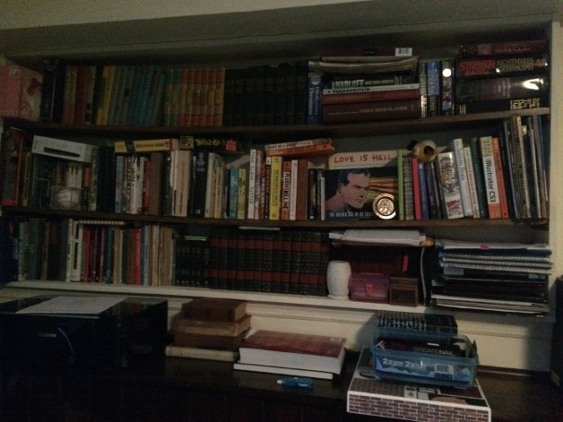
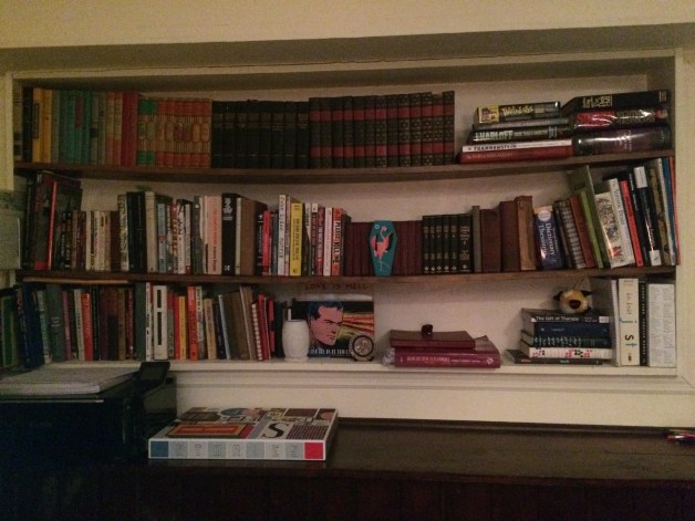
In this pile I will identify some things that are definitely worth throwing away, selling/donating (which I will revisit in a minute), and (re)gifting. I’m not entirely sold on throwing things out. I love having extra cash, maybe even to buy some new books, but I plan on parting some to my niece, who is in the process of learning to read. I have also discovered a useful app called “Decluttr” which takes your unloved medias (including books!), pays you (without a shipping charge!), and they are never to be seen or heard again.
•The Atlas: it is a Nascar atlas, which I choose to hide in the photo. My mother gave it to me in 2002 when I had embarked on a 23 hour road-trip after graduating high school. I kept it. it’s falling apart and has post-its of things she thought would be good ideas. I haven’t used an atlas since. I appreciate but almost never use maps now. The memory is so ingrained that I will never need to use it to remember.
•A tiny pink case containing an incomplete set of Garbage Pail Kids collector cards. Why? They’re funny. Why did I keep them? No idea! It’s got the location of where they’ll be going right in the name.
•Stephen King and Tim Dorsey paperbacks. I’ve read them about 20 times each if I had to low-ball. I still love them, I kept the signed hardcovers for apocolyptic trade value. Maybe I can wear the covers out on those next to show how much I truly love them.

This was probably the most emotionally strenuous tasks I have ever shared with books without actually reading them. I had held so much value in books that changed my life that I could quote verbatim. I kept books mostly for reference in things I am currently interested in. Heirlooms for future purge. I put them in a prominent place I cannot reach, but always have to look at so I can constantly ask myself if they are of value. I got rid of the rescued tale of two cities that had been attacked by rot and bookworms. I gave up the 5″ thick home medical reference that I have NEVER USED, accompanied by a funny little gift book about hypochondria.

img_7347

Rather than having books shoved on top of books competing for space, I have a half of a shelf to spare. What I had initially thought would be the tossing of 10-20 books, I counted a full 70 books I will parting with this round. In this process, I remembered that a part of my makeshift art studio is a hidden 50+ reference books. I am hoping this weekend to tackle that secret trove and aim for this empty space to be full, and my supply cabinet to become more functional. This to me is in fact, joy.  It only took a few hours to do. I got a decent workout by trying to lift each category in one stack. I can see the titles. I know where things are. I know that owning them contributes to my life.

I realize my foolish emotional attachment to books I had only read once, perhaps for a class, because they were a gift, because so and so gave it to me, etc.. I found that it’s the paper, the cover, the image of who I imagine myself to be. The books are proof of the journey that has landed me in the present. It’s the preservation that life I’ve lived that I’m really curating in the form of books. Books I’d never read were wasting space, much like the tasteless people who’d given them to me. I should instead be presenting and representing a better, more positive aspect of myself, and be an advocate for the things that do remain in my life because they make me happy, rather than justifying it as “experience” or an excuse to one day own a rolling ladder. I’ll probably buy that anyway.