Breaking Traditions to Preserve an Heirloom: The Napkin Ring

This 19th century napkin ring depicts an intricate engraving of cupid riding on a dragonfly.

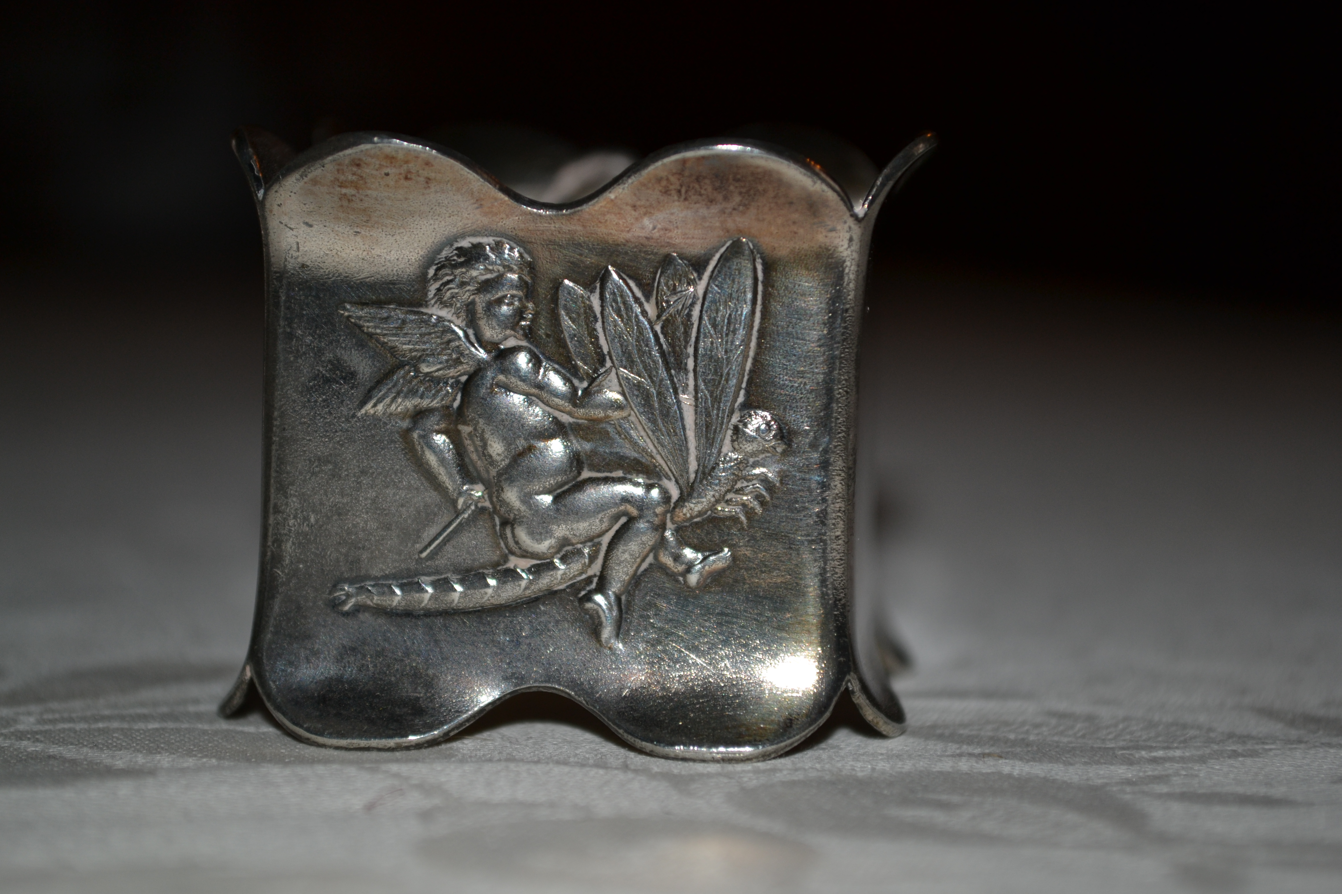
This 19th century napkin ring depicts an intricate engraving of cupid riding on a dragonfly. Photo Credit: Historic Huguenot Street

Caption:

A dining accessory that also functioned as a place card, this 19th century napkin ring belonged to the family of Gertrude M Deyo. This uniquely square napkin ring embellished with the owner’s initials marks cornerstones of a woman’s life, from childhood to marriage, and serves as a reminder of the traditional passing of possession of family objects, as well as the need to break tradition to preserve its heritage (Historic Huguenot Street).

Description:

Despite the name, napkin “ring,” this item is one and a quarter inch square napkin holder made of silver (Historic Huguenot Street). It has scalloped edges, two curves to a side, along both the top and the bottom edges. Given the approximate date of creation for the item in the late-19th century, it has suffered minimal damage, leaving the only traces of wear and tear small areas of old sticky tape (Historic Huguenot Street).  The main aesthetic feature of the napkin ring is the unique pairing of Cupid and a dragonfly. Cupid is riding atop the intricately engraved wings of the dragonfly (Historic Huguenot Street). However, the cursive engraving of “GMD” is the eye to the history of tradition and financial status in New Paltz.

“GMD” stands for Gertrude M Deyo, who would later marry Abraham D Brodhead. Photo Credits: Historic Huguenot Street

Provenance:

The initials engraved on the item distinguish it has property of Gertrude M Deyo, born 1868, and this particular pure silver napkin ring was donated with three other napkin rings, one belonging to each of her parents, and one belonging to Gertrude’s younger sister (Historic Huguenot Street, The Deyo Family). Gertrude’s napkin ring most likely stayed with her for a large part of her life, entering into her role as a wife to Abraham D Brodhead, and finally rested in the hands of Gertrude’s niece, Mrs. Henry E Downer (Historic Huguenot Street). The exact date of transfer out of Gertrude’s possession is unknown, and depending on the date, the ring could have passed first into the hands of her sister, Elvira, and then to Gertrude’s niece.

Narrative:

The path of possession of this simplistic dining accessory is remarkably influenced by the culture of the era in which it was created, as well as by the elasticity of the society in which it served its primary function. The ring’s engraving of Gertrude’s initials prior to her marriage designate the ring as a part of childhood. At the time of Gertrude’s marriage in 1890, the dining accessory that she had carried on with her into her marry life, most likely as a part of her dowry to her husband, Abraham Deyo Brodhead (The Deyo Family). Although by this point in time the traditional use of the dowry was being phased out of European culture, it was still a part of American culture. The dowry’s function as a way to initiate the furnishings of the newly wedded couple’s home engaged the passing on of household furnishings, and it is in this way that the napkin ring, possibly along with the napkin rings of its set, most likely came to rest at the Abraham D Brodhead estate (“Dowry”).

The New Paltz Independence reported in July of 1894 that the Brodhead estate would be renovated, expanding the house and implementing the most up to date amenities. The renovations would preserve the character of the existing home in remembrance of the family’s sole ownership of the property (New Paltz Independence). Over the next few years, the estate was under renovations, but by March of 1895, the Brodheads were hosting parties and gatherings in their completed home, which was furnished in the most elegant of fashions (Waite). By the turn of the century, the home exuberated the wealth and status that Abraham tried to keep as his persona.

The dining room was the showcase of the family heirlooms, and undoubtedly where the napkin rings would have resided. As recorded by the Deyo House Furnishing Plan, the dining room was encapsulated in mahogany Empire side boards, with a mahogany drop leaf table in the center, both of which dated to the 19th century. The side boards and dining table shaped the style of furnishings in the Brodhead house, as did the late-19th century dining set (Haley). The napkin rings would complete the ode to the family heirlooms of the Deyo-Brodheads and would serve as an elegant match to the style of the dining room furnishings.

Just a few years after the home was completed, the illustrious 19th century dining set would soon be out of fashion, and a proper 20th century style called for the elegance of simplicity (Haley). The walls would be left plain, and any silver or glass objects would be used minimally and in rotation (Haley). The tiny napkin rings would, at best, be displayed occasionally as the Brodheads kept with the trends of the time and continued to improve their home.

The home, however, was sold at auction in 1915 due to the alleged bankruptcy of Abraham D Brodhead (New Paltz Independence). For the first time since the home was built, it passed out of the hands of the family that built it and the Brodheads lost their family home. In 1926, Abraham passed away; at that time, an inventory for sales was completed of the dining room’s furnishings (Haley). The napkin rings, absent, must have already passed from Gertrude to either her sister or the last known owner of the rings, Gertrude’s niece. The napkin rings could have passed back into the hands of Gertrude’s family at the time of bankruptcy, preserving the family ownership of the napkin rings and avoid being sold to an outside citizen as was the case of her husband’s family home. The idea of preserving the family’s possessions is keen, even a tiny dining accessory could be the tie between family members and remain as one of the persevering items of the family lineage.

References:

The Deyo (Deyoe) Family. Ed. Carol Van Wagner et al. New Paltz: Deyo Family Association & Huguenot Historical Society. 2003. Print.

“Dowry.” Encyclopaedia Britannica. Encyclopaedia Britannica Online Academic Edition. Encyclopædia Britannica Inc., 2015. Web. 24 April 2015.

Haley Jacquetta. “Furnishing Plan – Deyo House.” New Paltz: Huguenot Historical Society. 2001. Print.

Historic Huguenot Street. “Ring, Napkin.” New Paltz: Historic Huguenot Street, 2015. Information Pamphlet.

New Paltz Independence. 13 July 1894 New Paltz : Print.

New Paltz Independence. 6 August 1915 New Paltz : Print.

Waite, John C Associates. “Deyo House Historic Structure Report.” New York: Historical Collection Elting Library. Print.

The Napkin Ring: A Remembrance of Massacre

napkin ring

A dining accessory that functioned as a place card, this napkin ring belonged to Gertrude M. Deyo as a child. At just over an inch in all dimensions, this square napkin ring embellished with Cupid riding a dragonfly sat atop a finely set dining table awaiting guests. Outside wall of the very same dining room, resided the skeletal remains of colonial conquest and slaughtering.

Despite the name, napkin “ring,” this item is one and a quarter inch square napkin holder made of silver. It has scalloped edges, two curves to a side, along both the top and the bottom edges. Given the approximate date of creation for the item in the mid 19th century, it has suffered minimal damage, leaving the only trace of wear and tear small areas of old sticky tape.  The main aesthetic feature of the napkin ring is the image of Cupid riding a dragonfly due to the intricate details on the wings of Cupid and the unique pairing of beings. However, the other engraving on it bears the historical significance of the object. This other engraving holds the personal history that’s embedded in the communal past of New Paltz, through three simple letters: “GMD” for Gertrude M Deyo.

Gertrude was born in New Paltz to Matthew Deyo and Julia Etta Deyo, in 1868 as the eighth generation of Deyo’s born in the United States (Van Wagner 184). She was given this prior to her marriage based on the use of her maiden name, and probably at a younger age since it is dated closer to the mid 19th century and Gertrude was born in 1868. It accompanied her most likely into her married years, and then was passed along to either to her sister, or directly to her niece, Mrs. Henry E Downer, the last owner of the ring (Van Wagner 255).

During the years of Gertrude’s marriage, she most likely kept her designated napkin ring with her, bringing her family’s silver dining accessories into her next life as a married woman. It would sit with the other dining furnishings, holding Gertrude’s name and place at the table with it. All would remain the same until  1894 when Gertrude’s husband, Abraham D Brodhead, decided to renovate the home in which they were living on Huguenot Street (NPT 1894). The home was to become “scarcely recognizable” and it was believed by members of the community that at least one of the other old stone houses should be “strictly guarded” to prevent a similar process of renovations from occurring (NPT 1894). The community feared that future generations would forget the lifestyle of their ancestors, that the culture of the time would be lost (NPT 1894). During this time, the couple moved all of their furnishings and themselves to the Tamney House for the duration of the renovation (NPT 1894). While excavating near the back of the home, a skeleton was discovered, along with parts of a shear and axe (NPT 1894). The New Paltz Times reported that very same month that the bones were of a Native American.

This, however, was not the first appearance of Native American corpses on the couple’s homestead, although it is reminiscent of a time of turmoil and conflict between the Huguenots and the native tribes of the area. Travel back in time another thirty years and Henry Johnson, much like Abraham Brodhead, while digging in his yard, revealed the human skeleton of a “red man” in the perfect state of preservation (NPT 1862). This body was seated upright, in the proper burial position of the Native American culture, and was determine to be at least two hundred years old, dating the skeleton back to the mid 17th Century (NPT 1862).

Flash back to the time in which the first Native American who was discovered lived, and the time in which Huguenots were only beginning to settle in present day Ulster County region.  The Natives still lived in peace, practicing their culture freely, without the interference or destruction of the settlers. The Huguenots, signing a contract with the native tribes in 1660, began to increase their population in nearby Esopus with rapid numbers (Sylvester 3). With more Huguenots, there became a need for more space, and less concern for the people that were sacrificing their lands for the Huguenots. In 1663, the Second Esopus War took place, resulting in the plundering of the Huguenots’ village (4). The Natives captured men, women, and children, and the Huguenots in return held a Native of respectable status hostage (4). With the help of the Native they held hostage, the Huguenots traversed the county to retrieve their wives, discovering the bountiful lands of New Paltz, the believed promised land of the Huguenots (5). It is along this area, on the east side of the Wallkill, that a single Native was killed along the journey, a person who attacked the caravan of men single-handedly and fell victim to the leader of the troop (5). Interestingly enough, the Natives of this time fought primarily with tomahawks and battle axes, being their most efficient weapons (4). The Huguenots returned to the fruitful land upon rescuing the women, thus settling in present day New Paltz.

Could this tale of the single Native American slaughtered during the first appearance of the Huguenots in New Paltz be the same Native found during the renovations of the Deyo House under Abraham Brodhead? Or could the body belong to another Native, evidence of another incident of colonial conquest and Western privilege? The Huguenots’ settlement in New Paltz was not one of harmony and community with the Natives of the region. It held bloodshed, captivities, pillaging, and destruction. The Huguenots built the life they felt they deserved, one of grand houses and silver, personalized dining accessories on top of the rotting and forgotten culture of the people whose land they invaded.  In the midst of a community shocked at Brodhead’s ability to alter a part of their past culture, they discovered the culture that they had impeded on and demolished for their own wanting, another community trampled in the name of modernity and self-fulfillment.

Works Cited

Van Wagner, Carol et al. The Deyo (Deyoe) Family. New Paltz: Huguenot Historical Society 2003. Print.

“New Paltz Times.” New Paltz Buildings. 1862. Print.

“New Paltz Times.” New Paltz Buildings. 1894. Print.

Sylvester, Nathaniel Bartlett. “New Paltz.” History of Ulster County, New York. Philadelphia: Everts &      Peck 1880. Print.

Just Another Used Book

Instead of returning to the four Shakespearean plays for this week’s blog, I am going to focus on another used book, also found in the “Used” section of the Barnes and Noble in Paramus. I originally purchased this book, The Portrait of the Artist as a Young Man by James Joyce during this past winter break, purely for the reason that it was included on my book list. Once I got home, I set in the box with the rest of my booklist and didn’t return to it until about two weeks ago when we began reading it for class.

It appeared to be the Penguin edition, just as my professor suggested, and the page numbers correspond to the correct edition. It wasn’t until a bookmark fell out that I noticed I had not bought the same edition. The bookmark is a boarding pass, assigned to one Morris Lang, flying from Dublin to Shannon, Ireland. So I looked at the cover of the book again, noticing a sticker on the back cover that had the bookseller’s name on it: Hughes & Hughes Booksellers, and a price: ϵ 8.25. There was also another sequence of numbers: 27 05 02 but I was originally struck by the Euro symbol. Euro – not dollars. I had purchased a book from a country I’ve never visited. So I emailed the company after finding them on Facebook, and am awaiting a response.

Setting aside my interest in the person who purchased the book and why (perhaps he needed a good read for his flight), the origins of the book are quite international, too. The booksellers are Irish – there are six locations, one which happens to be in Stephen’s Square, Dublin (I presume that this is the location from which the book was published, although I am not sure). The copyright page of the book gives the name of the printer and a blurb describing the copyright rules, which interestingly enough don’t apply to the U.S. The printers, Clays Ltd., are actually English – and are a part of St. Ives plc which is the canopy for a dozen or so marketing and publishing companies for books. Clays and St. Ives are both located in London.

Below the printers, the book notes that it was printed with monophoto photosetting which is the second generation of the mechanical photosetting machine. The first generation had an output of about 8000 characters an hour.  The book was printed in Sabon typeface – which was created in the 1960s. This particular font became very popular because it was designed for monotype and linotype printing, specifically for the purpose of making the italic and bold variations of the font the same size as the roman form. This font is also a bit narrower, saving space and money for the printer. Thus, it became an economical option which fits considering my copy of the book is a mass-produced Penguin edition.

Physically, the book is about eight by five inches, the average size, and just under an inch thick. The cover is worn, with what looks like some water damage to make the last couple of pages wavy. It was either a well loved book, or since it’s travelled through three different countries (that I know of), a well abused book. The mediocrity of the physical appearance turns out to be a good inference as to the mediocrity of the edition itself. Despite the European origin, it contains the same exact text, notes, introduction, etc as the American version.

The editor of this edition works for Penguin, and was born and educated in Ireland. Again, another fitting element since Joyce is an Irish writer (I would hope the person is well versed in the culture in which the book was written – and he seems to be).  He is also the General Editor of all of Joyce’s works for Penguin. The book was obviously based on Joyce’s original work, but this edition has notes for each chapter, explaining terms and often times referring to things by their locations in Ireland. This doesn’t help me much because I don’t know Ireland’s geography, nor am I familiar with the characteristics of a city that is mentioned as a qualifier for one of the events. But with the availability of Google Maps, this shouldn’t stand as a problem.

The edition I have is based on the original publication of Portrait in 1914-1915 in The Egoist, but since has been edited by Chester G. Anderson (New York: Viking and London: Cape) in the 1960s, which became the edition that was revised with notes and an introduction by the General Editor in 1992. It was then republished in 2000 by Penguin Classics. The three publication variations (or reprints) that are noted in the book lead me to believe that the original text was used as a basis in 1992, by the General Editor.

Nonetheless, it turns out through a comparison to the American version of the same Penguin Classics’ Portrait that the ONLY difference was where the book was printed. The American version was printed in America (appropriately so although it does not say by which company) and even uses the same phototype and font. Whatever the similarities, I still think it’s cool that an Irish book has made it into my hands.

The Books’ Niche on the Shelf

I am continuing to investigate the four little Shakespeare plays I have for this post. They currently rest on the second shelf of my bookcase (the middle shelf) in the front. I specify “in the front” because I have acquired too many books for the sanity of my tiny yard-long, foot deep, and yard-high bookcase. I have begun “second” rows in front of the first rows on both the bottom and middle shelves. It is on this middle shelf, in the front, towards the right hand side of the shelf that my plays rest.

Their placement is quite important. They are nestled in among the rest of my Shakespeare plays, and my small collection of “the classics.” Namely, between T.S. Eliot’s The Wasteland and The Tempest (a Norton edition). Ironically, I did not place this eloquent collection with my complete collection of Shakespeare’s plays – the Norton Shakespeare – which is similarly bound in red cloth and also has the thinnest paper imaginable. Instead, it is placed with the other individual editions of plays, most of which are used Signet editions – how fitting considering I originally purchased the collection in a used section of a bookstore as well. The other end of my Shakespeare collection is marked by a playbill of Othello – the play I saw on opening night of The Hudson Valley Shakespeare Festival this past summer (it was June 28, a Saturday night). That is the only other *important* piece of writing on that shelf.

This spot on the bookcase does hold some value, however. The books that I place in my created front row are ones that I am either currently working on, or I wish to see as a reminder to read them. For instance, Daniel Deronda and The Grimm Fairytales are a few books down on the same shelf, also in the front row. I haven’t reached past page 24 of the first, and have only glanced at stories of the latter. Quite honestly, I am not all that intrigued by Daniel Deronda, but I would like to return to it someday, and so, I must remind myself that I have it.

The top shelf of my bookcase only has one row of books, mostly hardcovers, and all ranking top on my list of novels. The entire Harry Potter series takes up about half of the shelf. I chose this because the weight of the hardcovers is heavy enough to steady the overused lower shelves without causing the shelves to become top heavy and tip forward. You see, I am cautious about this for fear of my books becoming damaged in the case that they should topple forwards.

I believe that the placement of the books reveals a bit of my personality, but mainly my reading interests – I like the classics and I like used books. It makes the classics seem a little bit more realistic in my mind as the older editions help to bridge the gap between the time the books were written and the year in which I am reading them. It almost tells me that the books have lived.

Another aspect of where the books rest has to do with where the bookcase is. It sits in the corner of my bedroom, between the two outer walls, is at the foot of my bed, and is nestled between two windows. I call this my reading corner because the natural light is always best here. The windows face south and east, so morning light is ideal. And I actually considered this when rearranging my furniture a few months back. My bookcase used to sit next to the door of my bedroom, which wasn’t very inviting.

I am partial to morning light – sunrises are beautiful, and the light is much stronger than afternoon rays to me. Allowing the sun to shed light on my books keeps me looking at them, my eyes follow the sun’s rays.

I also chose this corner of my room because of the height of the bookcase. As a mentioned, the bookcase is about three feet high. I have painted my walls, and the wall that sits behind the bookcase is painted sky blue with brown tree branches that only have a few leaves on them. Also on the branches are funky owls that I hand-painted in a modernist interpretation of Athena’s symbol (the owl). The lowest branch is three feet high, and I didn’t want to block the branch from my view, so I placed the bookcase in front which sits perfectly below the branch. It has become a bit of an ode to her, being that she was the goddess of wisdom, it’s fitting that books should rest below her.

The entire corner that houses the Shakespearean play collection is evidence of my interest in literature, especially the classics. From my ode to Greek gods (I have another tribute to Neptune on another one of m walls) to my unread copies of classic works that are begging for my return, I have undoubtedly created a challenge for myself – to expand my knowledge. This is quite telling as I love challenging myself with books I hope to eventually read, or with learning new painting techniques and interpretative skills, or simply with engineering my arrangement of books to obey the laws of physics.

I think that most of all, this corner reveals that I like to give things a purpose – my walls are for self-expression, for remembrance; my books are for enjoyment, yes but also to repurpose (since a great deal of them are used), by bookcase is being pushed to its limits rather than me just throwing it out for a larger one or adding one to my room. Perhaps it’s evidence of my ability to adapt – making the bookcase work for me, or adopting someone else’s books into my own hands and having them adapt to a new life, or making my walls personal and making the room m own (my brother and I switched bedrooms a few years back). The placement of the Shakespearean plays is one of my own – they aren’t given special privileges over the other books – they are still housed on the same bookcase, with the other editions of used Shakespeare plays. They are being used as partly as a book should be, but partly as this particular edition was intended – for collection. I recognize their nature as gifty, but have made them part of my own collection.

Transcending 100 Years and Two Unconnected Families

Just about two years ago I visited a Barnes and Noble in Paramus, NJ and stumbled over a used book section. So I took a look around and found the Drama section, then the Shakespeare section, and then these beauties:02420150209_125447

They are four copies of Shakespeare’s plays (Macbeth, Othello, Hamlet, and Measure for Measure), bound in red cloth with gold embossing. The cover merely has an image of a vulture/eagle standing atop a gilt and holding a pole (I think). The titles are engraved on the spine of the books, all in gold, except for Macbeth. I am guessing that this is due to wear and tear. The edges of the pages are gold, and the inside cover is eloquently printed with floral images, vines, and two reproductions of the same gilt image that was on the front cover.

20150209_12550620150209_125411

I scanned a couple of pages, noticing the single colored title page, and three of the four books had writing on them: two were addressed to a Pearl K. Merritt and one addressed to Ella A. Merritt. Ella’s was signed from Papa, Christmas 1902, and one of Pearl’s was also signed Xmas 1902. The second book of Pearl’s was signed by a Miss M.E. Bohrer.

028

The book missing a name to whom it belongs was also missing the blank page before the title page – I am thinking that the page of ownership shall I say, was cleanly removed, although at this point, I cannot begin to fathom why.

I couldn’t pass them up, especially when the set of four cost less than $10 – it was the perfect combination of Shakespearean literature and an authentic that I find lacking in the Norton edition and even in the single-play editions of Shakespeare that we are limited to today.

Now determined to find out something about the books, I went to Google, my side kick of confused times, and started with the actual book. When was it published? The books don’t have a copyright page, but the introduction was signed in three of the books by an H.M. and in the fourth as Henry Morley. My online search concluded that he was a prominent editor of English Classics in his day (1820s-1890s).

Additionally, the title page listed “Philadelphia, Henry Altemus” which was a publishing company from the mid 1800s to the 1930s or so. The company published mainly sets of books, with dust covers and boxes as cases. The company only published Shakespeare’s plays from 1899 until 1933, in multiple formats. Since my copies were dated, and are bound in burgundy cloth, with the title page starting with the title instead of “Henry Altemus,” I have Format 3, produced from 1900 until 1902.

20150209_125344

The books were obviously gifted to at least two people, but separately, not as the traditional box set as they were meant. And judging by the nature of the publishing company, the presentation/binding of the book, and the gifting, the books were probably of some value to the original owners.  They weren’t everyday copies to throw around at your leisure, but something a little closer to their hearts.

But why did they receive the books as Christmas gifts? Did they study Shakespeare? Was it merely a pastime? Who were they? They had the same last name, so I searched their names together, revealing that the girls were sisters. This was recorded in a journal called The StepLadder – a national periodical of the Order of the Bookfellows. This particular volume was published in 1919.  Not knowing what this was, I continued to look for more clues or explanations. The Bookfellows consisted of a group of writers, readers, and publishers, which was started by George Steele Seymour and his wife Flora of Chicago. So the girls were literature fanatics! So much so that Ella (member 49 of the Order) recruited her sister Pearl as the 100th member in 1919, and later a third sister, Iva, became member 299. I am curious if this third sister was the original owner of the book (Macbeth) which is without a name inside.

I still did not know where the girls were from, and since the Bookfellows were nationwide, it wasn’t likely that they were from Chicago. However, Ella joined the Bookfellows early on, being member 49, and Flora Seymour (one of the founders) spent her childhood years in Washington D.C. Not only that, but a Mary Eliza Bohrer was a resident of Washington D.C. during that time. I think that the girls might’ve resided there, and so looked into that angle. A Pearl K Merritt was born in D.C. in 1889 and later published an article in the Washington Journal in 1915, which she was the editor of in 1908. One of her poems was published in H.P. Lovecraft’s United Amateur in 1919. Interestingly enough, one of Lovecraft’s good friends was James Ferdinand Morton who married a Pearl K. Merritt in 1934 when he was working at a museum in Paterson, NJ. They did not have any children, but both took interest in labor reforms and equality for women. Assuming that this is the same Pearl K. Merritt, it would explain somewhat vaguely that her book travelled with her from D.C. to her husband in NJ, and quite possibly how I found the book in a NJ bookstore. Might be a bit of a stretch, but a think the dots can be connected.

Ella, however, was a known author of essays and books pertaining to child labor laws, which is quite similar to the interests of her sister and brother-in-law. Another source listed an Ella Merritt as a member of the American Economic Association in Washington D.C. Despite the fact that I have never known any of the Merritts, I am quite fascinated by the string of information connecting the girls with literature, writing, and different places across the country.

In summary, because my research has taken me in many directions that weren’t anticipated, I believe the girls were given the books as a collection between the two or maybe three of them when they were young, and have carried them with them. The girls were obviously part of a social reform through their writing, which would make sense that they were well educated and had the interest in classic literature. Perhaps their attachment to the books is what kept them all linked together for so many years, as three of them were members of the same Order of Bookfellows. The original purpose of the book – as a collection is gone today, it was gone when they were gifted to separate people from separate people. Maybe I will be able to find a descendent of one of the girls and return the books to their owners and the rest of their collection, seeing as the publisher published them as a set of 39 books (every play and one collection of sonnets).

I still cannot find a link between Miss M.E. Bohrer and Pearl, except that they both lived in Washington D.C. It’s also odd that she signed “Miss” in 1902 when she had been married since the 1880s. Maybe I have incorrectly drawn a connection where one doesn’t exist.

Through this research, I’ve come closer to the books that I once thought were cool because they were old. Their family is still preserved in the books and I am starting to cherish them as if they were my own family heirlooms – of course, I would love to return them to the Merritts. Perhaps their original function, as a collector’s item has returned, but for now, this collector is missing 35 books of the set, not to mention the dust covers and the box cover. Given my love of Shakespeare, the books are still a prized possession as they were over 100 years ago. Coincidently, my favorite Shakespeare play is Hamlet, the one book that doesn’t have a name written in it. Maybe it was meant for me?

Italian Cross

While gathering items for the first day of class, I searched my keepsake box to see which items I had set aside some years ago for safekeeping, and I came across this metal cross. It wasn’t kept in a jewelry box, or a plastic bag, but was just laying there beside a small rosary case. In more recent years, as I’ve gotten older, I’ve taken more care in storing valuables, especially jewelry, so I’m almost certain that I placed this cross in my keepsake box some years ago when I was in elementary school. Given that it was next to a set of rosaries given to me by my grandfather and most of the other items in the box were mementos of him, I figured this was probably from him, too.

Oddly enough, I know origin of the rosaries that were next to the cross – they were a gift from my grandfather when he returned from Italy (specifically the Vatican) when I was about four. The cross, however, was more of a mystery. There is tiny print on both sides of the cross, but it is quite minuscule. So I broke out my magnifying glass and in a tiny corner of the cross, on the side with the “M” for Mary, the word “ITALY” was inscribed. The other writing (on what I perceive as the front of the cross since it has an image of Mary on it) pertained to Mary and her immaculate conception – no further information on the origin of the cross.

cross 1cross 2

With the information inscribed on it, the cross was probably made in Italy, and I thought it was probably purchased there too, considering I stored it with other items from Italy. I asked my mother if she remembered any more of the history of the cross, and she confirmed my suspicions of my grandfather bringing it back for me from his trip to Italy, which we devised took place after we moved out of his house in 1998 and before his death in 2000.

I returned to the rosaries for some more clues, noticing that the rosary case had an image of a pope on it. With Google confirmation, it was an image of Pope John Paul II who was pope from 1978 until 2005. Those dates were not helpful, but another image I found online, quite similar to the one on the rosaries, was taken before 1998, so it that was a dead end, too. In conclusion, the cross was purchased in the Vatican between 1998 and 2000, by my grandfather. The rest is still a mystery.

Ball Mason Jar

Although Ball Mason jars seem relatively plain, this one packs a lot of personal meaning through its purpose. It is, however, used universally for canning and preserving, and Ball jars have been around since 1884. Soon after, they became a household item. Although all Ball canning jars are glass, they come in many sizes and styles, some have jellied finishes, some the “plain” design, size ranges from 4 ounces to 64 ounces, mouths can be wide or regular, lids metal or plastic. The Ball canning process has diversified itself.

My jar exudes simplicity – it is the standard quart size, regular mouth, metal canning lid, with a plain finish. Plain, in this case, means that the glass was made with an easy measuring system in both metric and standard. For the standard measurements, every four ounces are denoted by a horizontal line which is one inch long and every eight ounces is denoted by its numeric value in addition to the line.20150126_094725The ounces are displayed on the right, and the left displays the number of cups. Thus, I find this jar to be ideal for any person who spends a lot of time in the kitchen, saving someone time in the cleaning of measuring cups.

The jar stands seven inches tall and three and a half inches wide. The mouth of the jar is two and three quarter inches. The lid is made of two pieces. The sealing component is metal and sits on top of the mouth of the jar. The band twists over the seal and acts to securely close the jar. Both of the lid components are dependent on the other to properly seal the jar so that the contents stay fresh.

20150126_09464920150126_094643

The band of the lid has ridges along the top portion which are visible on the inside and outside of the band. On the inside, it acts to properly seal. On the outside, it adds a bit of character to the lid and also serves as an ideal place for particles to reside, making the cleaning process less than pleasurable.

The “plain” finish has an elaborate design of a variety of fruit (pear, apple, cherries, and plum – which is disproportionately larger than the other pieces of fruit) enclosed in an oval which has an olive branch border. 20150126_090541The design on this portion of the jar is evokes a taste of Tuscan living, and a culture in which food and making your own food is both common and a treasured way of life. The design alludes to the main purpose of the jar: practicality in the kitchen.

Despite the (what I find) appealing appearance of the design of the fruits, the jar holds a practical purpose – namely, keeping food fresh. My family has traditionally used this style of jar for making cracked Sicilian olives, and it is containing an nominal amount of said olives that the jar entered my home. In addition to the nostalgic feeling it evokes of my family canning activities, it is also an icon of my present activities. Over the past year or so, the jar returned from retirement and has traversed many miles since its first arrival to my home some five to ten years ago. Almost weekly, the jar accompanies me to work (a goat dairy) where it is then filled with fresh milk. The Ball Mason jar is iconic at the farm, although quart sized aren’t as popular as the half gallon in more recent months. Since the milk is raw, a canning jar is quite ideal for retaining freshness, especially when using the metal lids and bands instead of plastic lids. Additionally, the material of both the jar and the lid (glass and metal, respectively), appeal to people concerned with their carbon footprint and amount of waste they dispose of. Being able to reuse the jar, even from one purpose to another, like canning to storing, saves both money and resources. I believe this attribute appeals to people who are more prone to like simple and back-to-basic items. Therefore, the design, or one could possibly argue the lack thereof, also serves as a marketing tool to people of a certain mindset. 20150126_085634