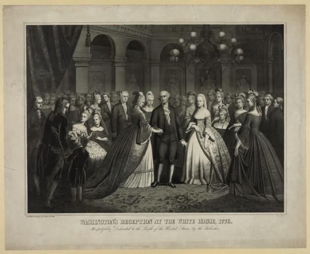
Chaos + Clutter + Change = Beauty: A Study of the Artist’s Creative Space


An artist’s creative space informs their process greatly. (Here, “artist” refers to anyone who works in visual, literary, culinary, or performing arts, or any similar expressive craft.) Michel de Montaigne, the highly influential French essayist, provided an example of this in action. Montaigne had quotes from classical writers and philosophers, as well as from the Bible, painted onto wooden beams in his library’s ceiling, so that when he needed inspiration, all he had to do was observe the room around him (see A. A. Balkema’s Les Inscriptions dans la bibliothèque de Montaigne).

This final project for The Materials of History, Thought, and Art presents a collection of the creative spaces of students and one professor at SUNY New Paltz. They were asked to describe and reflect on their spaces and their creative processes within their spaces. In each artist’s section of this project, their space is represented in two ways: as a collage and through a collection of photographs. The collages, made up of keywords from the artists’ interviews, convey how they perceive and experience working in their own spaces. The photographs of their spaces are unedited and unpolished, the intention being to reflect how creativity is rarely neat and clean, as well as to emphasize that disorder (present in some form in the majority of these spaces) is valuable. In this same vein, Balkema describes Montaigne’s space as ever-changing: from time to time Montaigne had quotes switched out for others—all part of the constant but messy evolution of the artist’s space that, in the end, benefits their creative process (Balkema 8).


William Rodriguez
Sculptorwill-wordart.jpg

Will’s studio space in the Fine Arts Building


Leighann Martone
Jeweler/PainterLeighann

Leighann’s workspace in her house


Nancy Saklad
Actor/ProfessorNancyIMG_4136IMG_4137
IMG_4138

Professor Saklad’s preferred studio in Parker Theatre, Parker 103


Rachel Rienecker
Costume DesignerRachelIMG_4139IMG_4140IMG_4141

The costume shop in Parker Theatre serves as Rachel’s creative space


Jessica Schrüfer
PainterJessica.jpg

The half of Jessica’s living room dedicated to art


Yoshi Abe
Theater DesignerYoshiIMG_4143.JPGIMG_4144

Together, the paint and scene shops in College Theatre make up Yoshi’s creative space


Jennilee Vasquez
Graphic ArtistJennileeIMG_4147

Jennilee’s dorm room


Bea Vera
Painter
Bea

IMG_4151IMG_4152IMG_4153

Bea’s painting studio in the Smiley Art Building

Inventing History: “Washington’s Reception” Lithograph

Caption
At first sight, Washington’s Reception looks like just one of countless prints depicting a founding father. However, US history tells us that much of what is going on here is actually completely wrong! To understand why someone would produce such a falsified account of history, we have to examine the role of art in households of a family like the Brodheads.

Washington's Reception, Deyo House

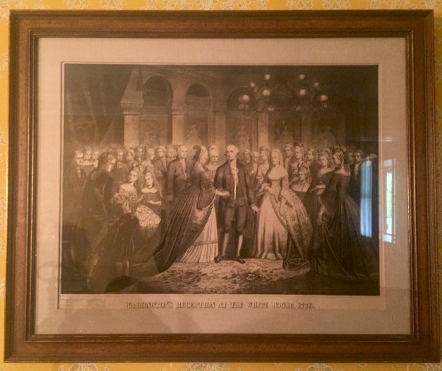
Copy of the framed print Washington’s Reception at the White House, 1776 in the Deyo House’s East Parlor

Washington's Reception, LoC

Full print underneath the matte and frame
Source: “Washington’s Reception at the White House, 1776.” Library of Congress, US Congress, http://www.loc.gov/pictures/item/2006677658. Accessed 20 Apr. 2017.

Physical Description
The print is a lithograph, sized 33.5 inches by 27.5 inches (Trainor). It depicts the historically impossible scene of President George Washington greeting guests in an ornate ballroom of one of the US’s most prestigious buildings, the White House, with his wife Martha standing by his side. The room is very opulent for the White House and resembles more closely the interior of a palace like Versailles. Regarding the guests, close observation reveals that nearly every single one them has the same face, giving the image an eerie quality.

The title is printed in serifed block letters reminiscent of fonts printed on contemporary US currency, with line weights varying to give the illusion of embossing. Below the title, written in delicate calligraphy, is a dedication to the American people, and above in very fine print is, written recognition of a copyright for the print to the publisher, Thomas Kelly. A light gray linen matte and wooden frame with subtly gilded edges display it simply and cleanly, keeping with the Colonial Revival aesthetic popular at the time of its creation (Trainor)

Provenance
This print was conceived by a lithographer named George Spohni (also spelled Spohny and Spohn) in Philidelphia and then published by Kelly in downtown Manhattan in 1867 (Falk 1817, 3128). Since the print is in the style that was popular in the late nineteenth century, what seems likely is that a collector of historical prints purchased it from Kelly, and that it later made its way upstate where it decorated a home in the Colonial Revival style (Kennedy). A descendant of that original homeowner probably decided to give it to Historical Huguenot Street once the Colonial Revival went out of style in the mid-twentieth century. This, however, is admittedly speculative.

Narrative
In the late nineteenth century, Americans became enamored with the Colonial Revival aesthetic, which celebrated historical figures and events in the US’s past. Sometimes, artists took this idealization further by fabricating events and placing these figures in them, as is the case in Washington’s Reception (Kennedy). Regarding the scene depicted, it should be noted that Washington and Martha have been placed in a building that, in 1776, would still have to wait twenty-four years to be completed. It is also worth mentioning that Washington was not elected president until 1789, which means that he and his wife would not have belonged in the White House in 1776, even if it had been standing. Even if the timing in this print was accurate and Washington had been elected immediately following the American Revolution (and the US had simply skipped over the confederacy stage), his inauguration took place not in Washington DC, but in New York City (Maclay 1). The Pennsylvania Senator William Maclay who witnessed the inauguration specifies in his diary that it took place at Federal Hall (1). Contrary to that which is depicted in the print, Washington was in fact not so calm and put-together at his inauguration; in fact, the senator describes him as trembling from nerves and consequently unable at times to read what he had to the Congress (2). After anxiously fiddlin with the papers he was reading from, continues Maclay, Washington apparently made an attempt to incorporate hand gestures to add emphasis to his address, but he came off as awkward rather than engaging. Our revered founding father, it seems, was just as human as anyone else attending the inauguration that day and appears to have suffered from stage fright! The calm, diplomatic Washington in the print is an invention of the lithographer, Spohni.

William McClay Diary Entries

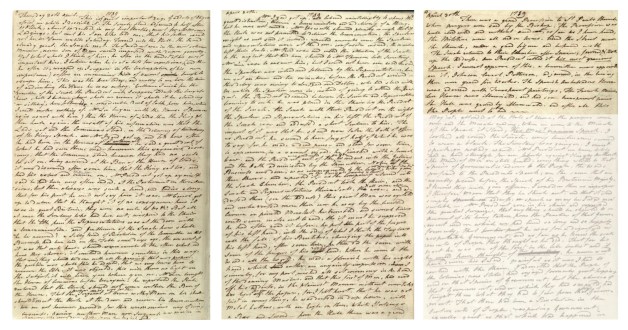
Diary entries by  Senator William Maclay about the inauguration (faded section is an entry for the following day)
Source: Maclay, William. “Journal of William Maclay, April 30, 1789, [Original journal].” Library of Congress, US Congress, n.d., http://www.loc.gov/resource/msspin.pin0102/?sp=1&st=gallery. Accessed 2 May 2017.

Given that this print is evidently rife with inaccuracies, an investigation into the motivations behind making it seems warranted. As previously mentioned, given when it was created, its subject matter makes sense: the postbellum period was a time when Americans reverted to older styles associated with proud events in their nation’s history, and with that came imagery of historical figures (Russo). With uncertainty and violence of war fresh in their memories and the nation still reeling from the war, many Americans longed for stability and a sense of purpose. Great figures from the US’s past provided them with the consolation they sought. In the Northeast, this fixation with the past was paired with a reactionary disdain for and fear of immigrants entering the country from Europe, who, it was believed, were a threat American values (Gyure). These great figures Americans had hanging on their walls fought for a free and safe society that many were intent on depriving immigrants of. This nugget of information might explain the why Kelly, an Irish immigrant, and Spohni, a French immigrant, would have created and published such a mysterious piece (Falk 1817, 3128). As immigrants to the Northeast, they no doubt experienced intolerance, and in reaction, they may have decided to mock the country’s arguably shallow postbellum nostalgia by producing a sort of “political cartoon.” They might have decided to have all the guests have the same face to critique the wave of patriotism that was encouraging intolerant and insular—“un-American”—behaviors, as well as causing Americans to ignore the fact that their country was founded by a group of individuals of differing origins.

A print like Washington’s Reception would have likely hung in the Deyo House’s East Parlor. This room was where the Brodheads entertained guests both formally, and, because the parlor has only one door and is as a result the most isolated, privately as well, according to Jaquetta Haley’s Furnishings Plan: Deyo House (94-95). The fireplace, which is purely ornamental, established the room’s refined and formal atmosphere, which, in turn, called for the showcasing of “heirlooms inherited from earlier generations of Deyos as well as decorative pieces symbolic of their sophistication and broad ranging experiences” (Haley 95). Among a collection of objects of this sort, patriotic prints were to be expected, as they expressed one’s connection to the glory of the nation’s past (Holloway 142). The Brodheads probably had a print like Washington’s Reception that romanticized a great historical figure in US history, hanging in their home. Haley explains that it was important to legitimize the family’s status by impressing guests with these intriguing pieces in an entertaining space like the East Parlor (95). Historical accuracy, it can be assumed, would not have been as important as the impact of an effective—albeit potentially inaccurate—story told by these kinds of prints, so while the Brodheads would have probably known if the print they owned was accurate or not, they probably would not have cared either way as long as it served it purpose in the parlor.

East Parlor Display Pics

How the print is displayed in the Deyo House’s East Parlor

Works Cited

Falk, Peter Hastings. Who Was Who in American Art: 400 Years of Artists Active in America, 1564-1975. 3 vols. Madison (Conn.): Sound View Press, 1999. Print.

Gyure, Dale Allen. “Colonial Revival in America : Annotated Bibliography.” Edited by Dale Allen Gyure and Karen L. Mulder, Colonialrevival.lib.virginia.edu, 2003, colonialrevival.lib.virginia.edu/. Accessed 20 Apr. 2017.

Haley, Jacquetta. “East Parlor.” Furnishings Plan: Deyo House, Historical Huguenot Street, New Paltz, NY, 2001, pp. 94–102.

Holloway, Edward Stratton. American Furniture And Decoration Colonial And Federal. Read Books Ltd, 2013.

Kennedy, Martha. “Library Question – Answer [Question #12435925].” Received by Nathan Bergelson, 19 Apr. 2017.

Maclay, William. “Journal of William Maclay, April 30, 1789, [original journal].” Library of Congress, US Congress, n.d., http://www.loc.gov/resource/msspin.pin0102/?sp=1&st=gallery. Accessed 2 May 2017.

Russo, Courtbey. Personal interview with author. 25 Apr. 2017.

Spohni, George. Washington’s Reception at the White House, 1776. Lithograph. Historic Huguenot Street, New Paltz, NY, 1867.

Trainor, Ashley. “Nathan Bergelson: Dimensions of and materials used in ‘Washington’s Reception’ print.” E-mail received by author, 20 Apr. 2017.

“Washington’s Reception at the White House, 1776.” Library of Congress, US Congress, n.d., http://www.loc.gov/pictures/item/2006677658. Accessed 20 Apr. 2017.

Experimenting with the dying art of letter writing

For my analog experiment, I decided to hand-write a letter. While I am, of course, very used to writing by hand, writing a letter is very different from taking notes in a notebook like I do for my classes; moreover, I can safely say that I’ve only written a few letters by hand in my lifetime. I was raised using computers and am much more accustomed to writing in a word processor, which permits me to rearrange and continually modify my writing as I go along. Writing something by hand does not offer that level customizability at all. Prior to starting, I was completely aware of this, and I knew that I this could pose a problem for me, but I wanted to see if I’d be able to adapt my style a little bit to avoid the pages turning into messes of scribbles. Though I tend to use an abundance of carets (these things: “ ”) when writing on paper, the amount of rearranging and tweaking I to do while drafting is often too much for the slim margins between lines of ruled text to handle. I tried to be more decisive with my word choice, and honestly, it kind of worked, though honestly, I admit it could’ve turned out better.

Setting aside the issue of customizability and versatility during the writing process, something else that I came to realize while hand-writing the letter is that I type so much faster than I write that at times, I was unable to write quickly enough to keep up with the sentences I was thinking up! Several times while writing the letter, I realized that my hand was at least a sentence behind my brain. It was definitely one of the weirder experiences I’ve had as a student, especially as a liberal arts student who writes as much as he does for his classes! I felt lost overwhelmed. That isn’t to say that writing by hand didn’t have its own perks, though.

Pressing my pen into the paper, creating both ink marks and impressions in the surface, is indisputably more satisfying than pushing a seemingly endless series of buttons on my laptop keyboard. I love the cushiony feeling of writing on the top sheet of a pile of paper, plus my handwriting is always neatest when I’m comfortable writing, and I get a (laughably) strong sense of accomplishment when my handwriting at its neatest. Compared to the comfortable surface I wrote by hand on, the hard, angular aluminum shell of my laptop is markedly unforgiving. (This is underscored by the fact that it occasionally causes my wrists to ache.) As I’ve noted above, however, I can write much more quickly and keep up with my thoughts when typing on my laptop, so maybe one could say that it’s a fair tradeoff to be temporarily less comfortable but able bang out my writing faster? I’ve pondered this in the time since I carried out wrote the letter, and I’m still not really sure!

I think that in light of my experience doing this little experiment, I’ll consider writing by hand for shorter forms of correspondence, as well as correspondence with loved ones, because I won’t mind taking the little bit of extra time hand-writing takes. Using analog technology feels more personal because of the fact that it takes longer and is more laborious, and I believe that this means that a handwritten letter communicates love and appreciation better than, say, even the most beautifully written email. The fact that letter writing is becoming increasingly rare also renders the experience of receiving and reading a handwritten letter that much more special. As an object, a letter is so uncommon nowadays that the time and care put into writing one can’t possibly be misconstrued by the person receiving it. Its rarity makes it, potentially, a very powerful way to make a statement.

“Washington’s Reception” lithograph

Images:Washington's Reception at the White House, 1776Source: “Washington’s Reception at the White House, 1776.” Library of Congress, US Congress, http://www.loc.gov/pictures/item/2006677658. Accessed 20 Apr. 2017.

102571-3.jpg102571-4Source: Allmendinger, Carrie. “Nathan Bergelson: SUNY New Paltz Honors student emailing about object to study.” Received by Nathan Bergelson, 10 April 2017.

Caption:

To be done when I have all of my information

Physical Description:

The print is a lithograph, sized 33.5 inches by 27.5 inches. It depicts the historically impossible scene of President George Washington greeting guests in an ornate ballroom of one of the US’s most prestigious buildings, the White House, with his wife Martha standing by his side. The title is printed in serifed block letters reminiscent of fonts printed on contemporary US currency, with line weights varying to give the illusion of embossing. Below the title, written in delicate calligraphy is a dedication to the American people, and above in very fine print is essentially written recognition of an 1867 copyright for the print to Kelly. A light gray, linen matte and wooden frame with subtly gilded edges display it simply and cleanly, keeping with the Colonial Revival aesthetic popular at the time of its creation.

• Add more specific, not immediately apparent details once I’ve seen print in person

Provenance:

This print was conceived by a lithographer named George Spohni and then published by Thomas Kelly in downtown Manhattan in 1867. Since the print is in the style that was popular in the late nineteenth century, what seems likely is that a collector purchased it from Kelly, and that it later made its way upstate where it decorated a home in the Colonial Revival style. A descendant of that original homeowner may have decided to give it to Historical Huguenot Street (HHS) once Colonial Revivalism fell out of favor in the mid-twentieth century. This is admittedly speculation, however, because there exist no records regarding HHS’s acquisition of the print.

Narrative:

In the late nineteenth century, Americans became enamored with the Colonial Revival aesthetic, which celebrated historical figures and events in the US’s past. Sometimes, artists took this idealization further by fabricating events and placing these figures in them, as is the case in Washington’s Reception.

  • Give brief overview of the little bit of info found on T. Kelly and G. Spohni?
  • Look into books on American printing in this era that were recommended by Library of Congress curator
      • Look into possibility that the print is a political cartoon
  • Explain how the print would have fit into a room styled in the Colonial Revival aesthetic, using the current interpretation of the Formal Parlor in the Deyo House as model

References:

Allmendinger, Carrie. “Nathan Bergelson: SUNY New Paltz Honors student emailing about object to study.” Received by Nathan Bergelson, 10 April 2017.

Haley, Jacquetta. “East Parlor.” Furnishings Plan: Deyo House, Historical Huguenot Street, New Paltz, NY, 2001, pp. 94–102.

John G. Waite Associates, Architects PLLC. “Room 111 (Music Room).” Deyo House: Historic Structure Report, Historical Huguenot Street, New Paltz, NY, 1997, pp. 54–56.

Kennedy, Martha. “Library Question – Answer [Question #12435925].” Received by Nathan Bergelson, 19 Apr. 2017.

Spohni, George. Washington’s Reception at the White House, 1776. Lithograph. Historic Huguenot Street, New Paltz, NY, 1867.

Trainor, Ashley. “Nathan Bergelson: Dimensions of and materials used in ‘Washington’s Reception’ print.” Received by Nathan Bergelson, 20 April 2017.

“Washington’s Reception at the White House, 1776.” Library of Congress, US Congress, http://www.loc.gov/pictures/item/2006677658. Accessed 20 Apr. 2017.

This last object I have chosen to focus on in this post seems, at least to me, like a funny choice. It’s not an heirloom, nor is it a piece of jewelry or some other object like that. In fact, it’s a very commercial item—one that was meant to be used and then thrown away, but which I’ve decided to keep and repurpose. I have a good enough sense of this object’s chain of ownership, though it’s been a bit tricky difficult to find evidence explaining exactly why it was designed as it was and where it was made. I assume a little when I encounter these unanswerable questions, but I think that my understanding of the object is good enough that my assumptions are quite reasonable. Overall, the story behind the object makes it quite appropriate, I think, for this post.

So, here’s this it I keep referring to, a now empty Chinese tin for mint-flavored Fisherman’s Friend lozenges:IMG_4036.JPG

I warned you it might seem silly, but trust me, there’s more than meets the eye. A friend of mine traveled to China last summer, bought the tin, and gave it to me as a little gag gift (I’m more prone to colds and allergies than most people). I had the lozenges, and I decided to keep the tin as a place to keep loose change. I never thought about the tin’s life before my friend purchased it, however. I didn’t realize that even before my friend gave it to me, it had, in fact, traveled more than I ever have! I didn’t even realize that the brand wasn’t Chinese. After doing some digging, here’s what I pieced together about this deceivingly unassuming lozenge tin.

The Fisherman’s Friend brand is headquartered in the port town of Fleetwood in Lancashire, England and manufactures all of its lozenges there. These lozenges are typically packaged in a paper bag, and in fact, prior to receiving this tin as a gift, I’d always assumed that that’s just how they were packaged. Upon receiving the tin, I of course noticed the difference, but I didn’t think too much of it. Research told me, however, that in recent years, the brand has gained a sizable international following, and that it is currently trying to enter the Chinese market, which I am guessing is the cause for the change in packaging. It seems likely to me that the brand had reason to believe that this choice of packaging, admittedly nicer than the standard bags we know in the US, would be more appealing for potential new customers in China. The tin itself was probably manufactured in China, as nearly all objects like it are these days, but all Fisherman’s Friend-brand lozenges are still made in Fleetwood, which means that the tin probably moved about the globe like this: first, it was created in China on October 22, 2014 (a stamp on the tin says so), then it was shipped off to be filled with lozenges in the factory in Fleetwood, and finally, it travelled all the way back to be placed on a store shelf in Hangzhou, where it was eventually purchased by my friend. Already by this point, the tin had traveled thousands of miles and changed hands—I would assume—several times, but it hadn’t reached the end of its voyage. Once in my friend’s possession, it traveled around China for a bit, and then continued its journey eastward to its final destination, New Paltz, NY, where I would receive it as a gift and would enjoy its contents, completely ignorant of the amazing journey it had to make for me to one day open it up and take out a lozenge to soothe my throat.

A look into the history of a silver ring

I brought this ring in on the first day of class as one of my “happy objects.” I have decided to think about and reflect on its history and use.

This ring is made of sterling silver, as indicated by a “925” stamped on its inner circular wall. More specifically, this number means that the metal is an alloy of 92.5% silver and 7.5% other metals, which help strengthen it (pure silver is a very “soft” metal and can get banged up shockingly easily) and make it more resistant to tarnishing (that is, the blackening of the surface as a result of interacting with oxygen in the air, also known as oxidation). Though I did have knowledge of silver and I understood the last links in the chain of the ring’s history, the origins of the raw material were beyond me. I had no idea where silver-mines are located or which countries are the world’s major producers of silver. Admittedly, Natalia’s silver earrings from Mexico definitely should have given me a clue because after a quick Google search, I learned that Mexico is the world’s leading producer of silver, and that the US is among the world’s top ten, with silver mainly coming from Alaska and Nevada. I am going to assume in this post that a scrappy, Hudson Valley-located artist would be more likely to purchase materials made in the US.

So, this metal is mined out west somewhere, and then it finds its way across the country, probably by way of an online supplier because there does not appear to be a single jewelry supply store that would deal in raw metal in the Hudson Valley. The jeweler makes a wax carving exactly like the silver ring on my hand, and then goes through the long, delicate process of creating a mold, into which liquid silver is eventually poured and then shock-cooled in water to complete the casting. After some cleaning up and detailing the three bands, which I have always assumed to be patinated (patina is a catch-all term used to describe a thin layer on metal or stone that is of a color different from that of the base), the jeweler sells it to Crafts People, a local art gallery, and on my first visit there, this ring catches my eye.IMG_4020.JPG
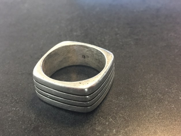
As I believe I mentioned on the first day of class, my knuckle was too fat because I broke my hand when I was younger, so one of the gallery directors—herself a jeweler—ground out the inner wall just enough to make room for my finger. Thus the ring was, in a sense, personalized for me. As I also admitted on the first day of class, I have lost it a good number of times in the three years since I purchased it. Because soap can be abrasive, I try not to wash my hands with it on; however, this means that I often put in on the first shelf or surface I see next to the sink I am about to use, and then I absentmindedly walk away without remembering to put it back on. This being just one example of the way I treat (or rather mistreat it), it is no surprise that despite my taking attempts to keep it away from the harmful effects of soap, it has accumulated a good many scratches and nicks in its surface. I have contemplated sanding it back to its original smoothness, but part of me knows that that would essentially erase the character it has picked up by being worn so frequently and cherished so much by me.

As you can see, the purpose of my ring has yet to change, though I imagine that if I needed to, I could melt it back down and get a good amount for the silver. If I had a scale, I would let you know how much it weighs; nevertheless, I can tell you that for an object of its size, it has quite a bit of heft. Though now it is purely ornamental, in its raw form, the purpose of this ring would shift to a much more utilitarian one. If I pass it down to a child who does not break their hand or have atypically fat knuckles, though, it might one day be worn as a pendant, thereby remaining ornamental, or be repurposed in some other way I cannot imagine at this time.

My shoes!

img_4015

My Clark’s desert (also known by the name “chukka”) boots are the “object” I have chosen to describe in detail here. They are my first non-sneakers I ever purchased on my own, and I got them on Black Friday, three years ago. They are size 9 and about 10 inches long from heel to tip, measure between 4 and 5 inches at their widest part, and are about 3 inches high at the heel. Their suede has gone from a light brown to taupe (now close to matching the color of the cord laces) and has lost some of its softness. From the side, the shoes’ profile is essentially triangular—very clean and simple. As for the toe boxes (the part of the shoe that rests on top of the foot), they have begun to crease, resulting in lines that resemble crow’s feet. The leather near the toe has become scuffed and has acquired a light, white cast due to the snow and salt of winter.

I wear these shoes quite often. Because of this, along the length of the edge of their soles—from heel to toe—they darken from lightly browned to charcoal black. The undersides of the soles are mostly blackish-grey as well; however, the sole rubber is lighter colored where heel and sole meet to form a sort of “corner” (these corners have been spared the discoloration of the rest of the rubber, and are still, for the most part, their original tan hue). In terms of texture, the soles lack ridges or grooves of any kind, and even if they had had them once upon a time, they would have been worn away by now. The rubber below the arches of my feet has thinned, and the once squared-off heels are now worn down to a curve that I can rock slightly backward on.

Regarding the insoles, there is brown leather padding to support my heels and arches, which has been burnished to an impressively high shine by my socks. The insoles beneath my toes are made of some kind of mystery fabric, now worn (noticing a pattern?), but somehow not threadbare. Opposite the insoles are the shoes’ tongues, the undersides of which are each stamped with the words:

MADE IN VIETNAM

LEATHER UPPER

NATURAL CREPE SOLE

in black ink. Amazingly, these letters are still all very legible, despite the condition of the rest of the shoes.

The overall look of these shoes, however beat up they might be, is clean but casual. They do not hurt my feet when I wear them, even for an extended amount of time (though sometimes a little bit afterward). Though I have described them in a way that makes them sound like they are past their prime, the change in color seems to still suit them; in a sense, they have aged gracefully, as I have broken them in. Since they are not stained and do not look dirty, in my opinion, the newly acquired color gives them “character,” and I think they look like they have walked many paths with me, which is true!

Daniel Miller’s “Habitus”: A Reflection on My Mug

IMG_4007.JPGIMG_4011.JPGIMG_4010.JPG

The item I’ve chosen to analyze is my Ile-de-Ré mug that I got as a gift from my boss upon completion of an internship I did on the French island, Ile-de-Ré, in the summer of 2015. This is the same mug I brought in on the first day of class as an object that makes me happy. The mug is decorated with an image depicting a typical street on the island, and whenever I look at it, the corners of my mouth involuntarily start to curl up to form a smile. I recall the gentle, ever-blowing breeze, the wide open sky (no building there was taller than three floors high), the scent of the ocean, and the color scheme to which nearly all houses on the island adhered: white walls, a terra-cotta, shingled roof, and a pair of shutters for every window, each painted some shade of turquoise. This last memory—that adorably ubiquitous color scheme—is rendered in a faux-watercolor on this elegantly crafted, albeit cheap mug, so I never forget how Ile-de-Ré island looked (as if I could really forget such a place). In addition to the beauty of the island, the mug brings to mind memories of how independent and capable I felt when I was in France: I learned to cook for myself, I explored unfamiliar places by myself, and I traveled a good bit, sometimes alone. I associate those feelings strongly with these more sensory memories.

At home in New York, the Ile-de-Ré mug resides with all our other mugs, in a cupboard in the kitchen. When I’m on campus, however, its place is not in hiding, but on my dorm room desk with two other mugs I’ve collected since my time abroad. I typically place these three mugs together in a cluster, and together they stay unless I happen to use one, which, as I am a fan of tea, is relatively often. I’ve noticed that when I make tea, I’m more likely to pick up my Ile-de-Ré mug than my other two; I credit this to its unparalleled ability to calm and console me when I need it, evoking the memories mentioned I’ve described above. Reflecting on the mug reinforces what I already know—that I am a particularly sensitive and sentimental person, the kind of person who cherishes items like a souvenir mug because of how dearly they cherish the memories associated with them. Unlike the other two mugs, the one from Ile-de-Ré is special in that it reminds me of a particularly special point in my life. While it offers physical comfort when used as it was intended, even just looking at the pictures on it can do the trick. Maybe that’s why I keep my mugs on my desk, but all my other tableware in my closet: when I need to center myself, I just look over at it. When I need a cup of tea to relax, I need not search for it in my closet because it’s already out, on my desk, front and center. Admittedly, I’ve never questioned my choice of placement of these mugs until this assignment. Still, the more I think about it, the more it makes sense why I chose to keep them there. After all, what’s the point of owning a comforting item if it’s potentially a pain to get to?

The KonMari Method of Tidying Up

When I did the KonMari Method, I decided to follow Kondo’s advice and started with clothes that are out of season, my t-shirts. I do not have an abundance of t-shirts because in recent years, I have tried to be conscientious of my purchases and have aimed to only buy items I really love; I do not to let myself make excuses. In addition, if I can tell that I am not going to get much use out of an item, I do not make the purchase, even if I really like it. Consequently, I started the exercise with just fifteen t-shirts, total.

IMG_3994.JPG

My starting point

Initially, I was convinced I would not remove many shirts because of how picky I try to be when shopping, but as I started performing the exercise, I realized that I had been mistaken.


IMG_3995.JPG

Halfway through the exercise: the pile on the left has shirts that have yet to be held, the pile on the right has ones that give me joy, and the rejects are back in my closet.


By the end of the KonMari Method exercise, I was left with nine t-shirts that I decided give me true joy—about two-thirds the number I started with.

IMG_3996.JPG

The final nine


When I held most of my shirts, I smiled involuntarily—sometimes triggered by a memory, sometimes by a particular shirt’s color or texture. These undoubtedly give me joy. For six of them, however, my reaction was positive, but not as strongly positive as for the other nine. Without overthinking or making excuses in their defense, I hung them back up, out of sight in my closet. Of these rejects, there were a few for which I realized my feelings are more mixed. One t-shirt, for example, the pattern and color of which I liked so much that I went to several locations searching for one in my size (size XS, which can be hard to find), has started to fade, rendering it increasingly apparent how cheaply it was made. Another has a very unique design that caught my eye in the store, but has never fit me quite as well as I would like.

Overall, I admit that it was difficult to be strict, vetting my t-shirts as if my intention really was to purge them, particularly because I did not start with that many. Throughout the entire exercise, I remained conscious of the fact that I could not afford to whittle them down much without having to constantly do laundry in the summer months. This means that despite the fact that I have practice using the unapologetically decisive mindset necessary to successfully perform the KonMari Method, it was difficult to keep myself from overthinking. Nonetheless, I believe I was quite successful in forcing myself to differentiate between the desire to keep a shirt out of authentic joy and the compulsion to keep it out of necessity.

I think that my attitude about some of my t-shirts comes partly from their look or feel; I love touching a soft fabric, and I love beautiful, vibrant colors. It is really exciting for me to find an article of clothing that has both of these, particularly because men’s clothing is usually limited to dark, somber shades. However, aside from the material of the shirts, what makes some of my shirts special to me are, of course, the memories I associate with them. When I hold certain articles of clothing, I have flashbacks to when and how I got them—running around with friends to find a certain shirt in my size, finding a shirt while bonding with my brother (we used to fight a lot but have more recently started getting closer), and so on. These sorts of associations cause the shirts to give me joy, and so I cherish them that much more.