Taking What’s “Not” Yours: Burning CDs and the Reclamation of Music

For me, engagement with the analogue is not just a rejection of the digital, but taking back what is human—what is made for people by people.

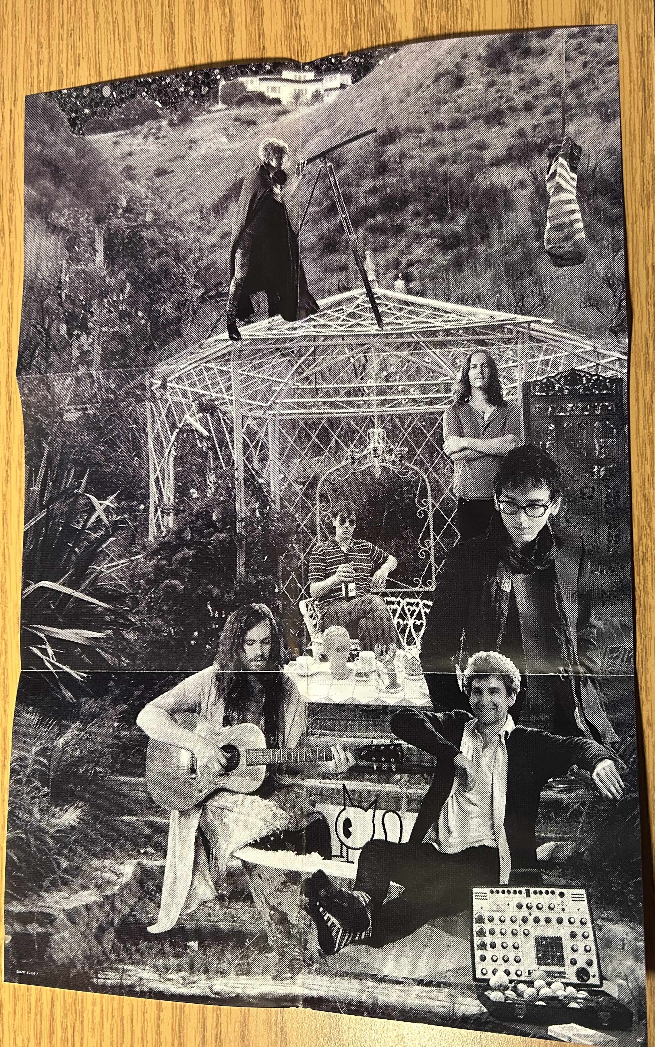
My analogue journey in the realm of compact disc began in middle school when a friend of mine, who was a CD connoisseur, made me some mixtapes. Eight CDs stored in both plastic cases and paper sleeves he’d folded himself, these discs contained hours of music from our favorite bands: Weezer, My Chemical Romance, Muse, and Green Day (quite the taste). The last two CDs were compilations of songs he thought I’d like, basically a rip-off of every 70s rock compilation, but it was the sweetest thing anyone had ever done for me. 

Later on, when that same friend and I started dating and made it to our first anniversary, I crossed paths with the compact disc again, as he handed me a compilation of all of Weezer’s B-Sides, only the obscurest of Rivers Cuomo & Co.’s jams all on one disc. These were songs only found on YouTube at the time, yet here they were, sitting in the palms of my hands.

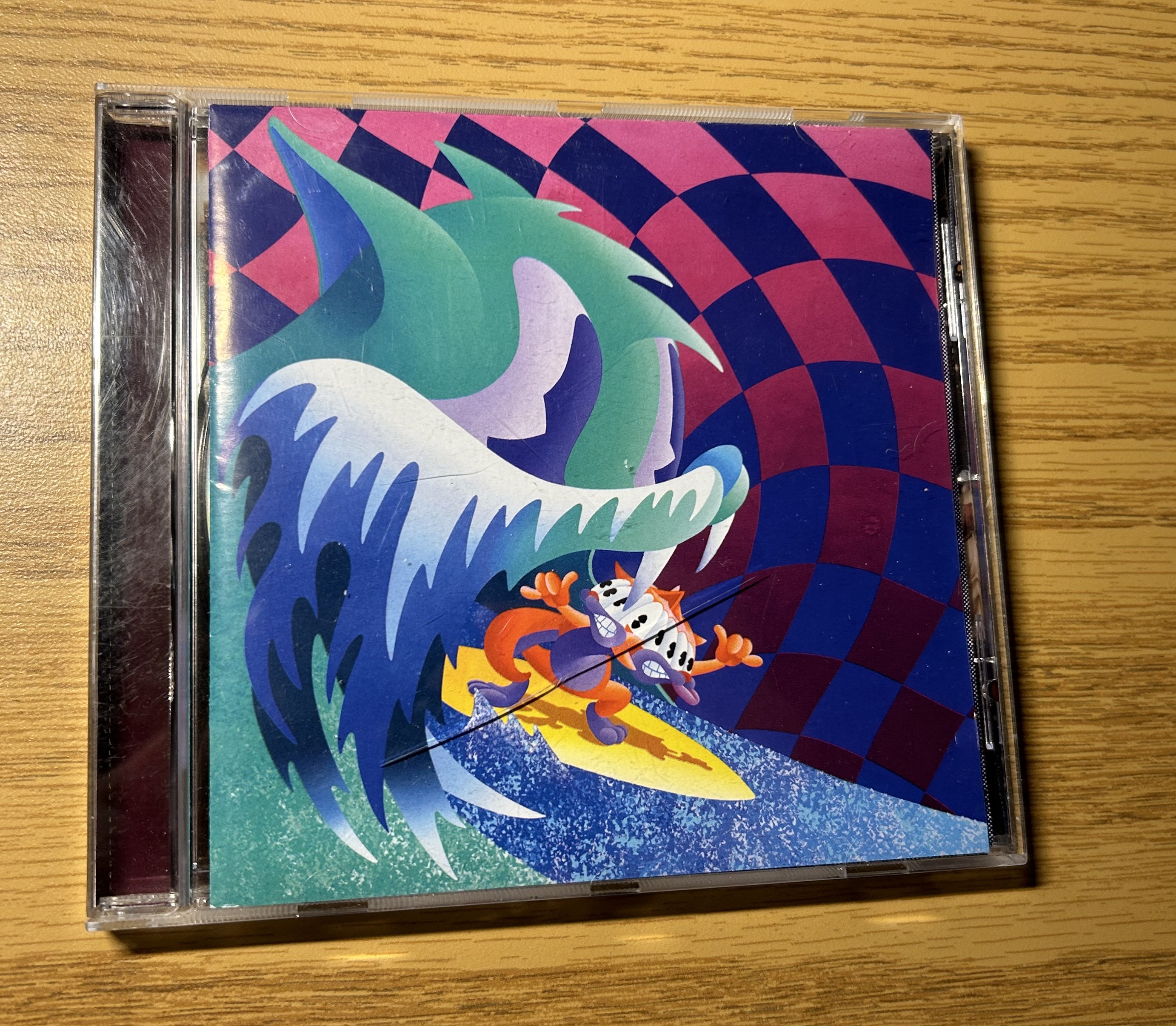
It’s been nearly five years since I’ve last spoken to that friend, having gone our separate ways in life, but those CDs still sit in my milk crate. They exist among other CDs, officially licensed and produced by record labels, more durable and artistically impressive than the simple blank CDs scrawled with Sharpie. And yet, something drew me to those discs more and more over the years. So, when assigned the task of returning to analogue, I returned to the disc.

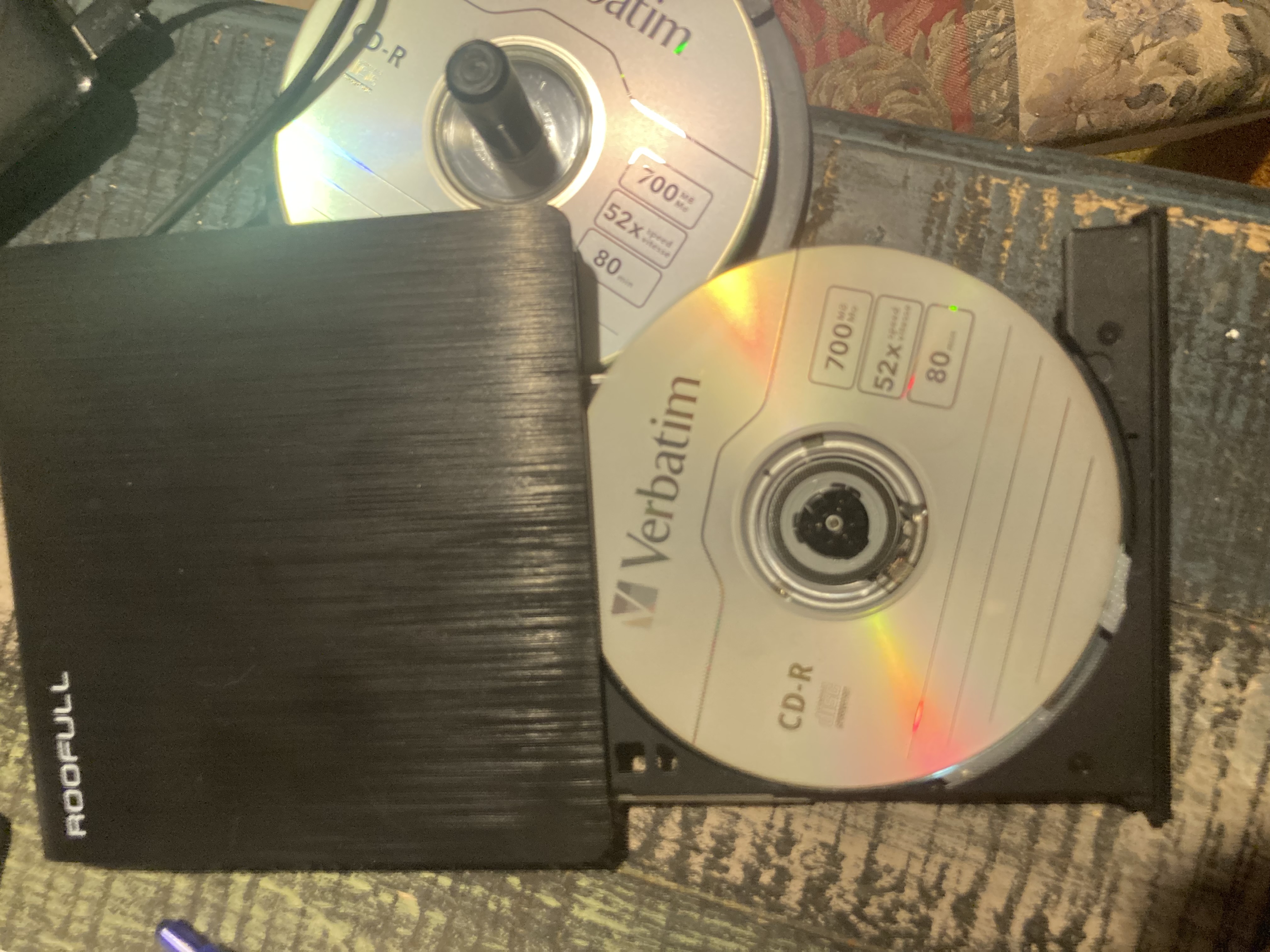
It’s worth mentioning that in the United States, burning discs does not infringe upon copyright law if they are being made for personal use. Selling these discs is where things get tricky, but these discs are made solely for my benefit and enjoyment. So, this week, I busted out the external DVD drive, the blank CDs, and a flimsy jewel case and got to work.

A sample image of the disc drive and blank CD sitting in its spot. It has the ability to store 80 minutes worth of music, 700 megabytes total.

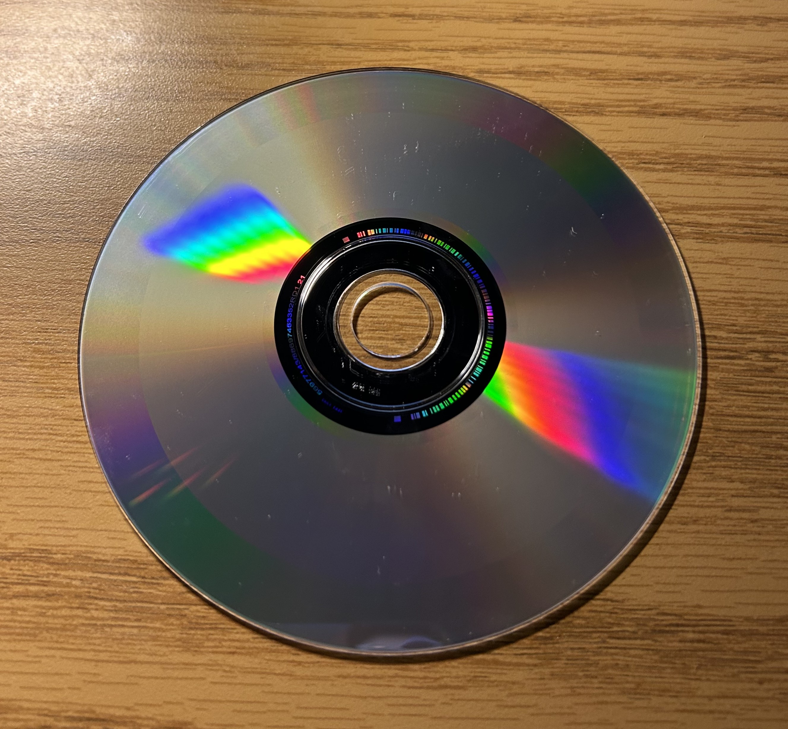
The process of burning a disc is relatively simple—converting mp4s to mp3s, transferring those files into a playlist (usually on iTunes), then converting it onto a blank disc inserted into the DVD drive, and in less than 5 minutes, the product is complete. Sure, it’s not the prettiest piece of art, but pop it into any CD player, and it works like a charm. For this week, I copied The Brobecks’ album Happiest Nuclear Winter onto a disc, an album that can only be found through YouTube reuploads nowadays. When I had some quiet moments alone in my room, I’d let the music play from my mini CD player, idly playing while I did chores or caught up on late assignments (such as this one). It was both an experience of nostalgia (having listened to that album since middle school) and rejuvenation (finding something new I loved about certain songs).

There are multiple arguments to be made in favor of CDs. For one, you’re limited by the capacity of the disc. Unlike music streaming apps like Spotify or Apple Music, which allow you to freely jump between genres, playlists, and songs, listening to a CD forces the listener to really focus on the 80-or-so minutes of music at their disposal, digesting it a lot better as opposed to just jumping from song to song. As someone who used to consume music album by album, CDs are optimal for my listening habits. In contrast to other forms of physical music media, CDs are a lot more accessible—easy to buy, easy to burn, easy to make mixtapes to your heart’s content. Vinyl records, though having an attractive vintage/nostalgic quality to them, are not as accessible to the public. While it’s common for big artists to sell LPs of their latest albums or for record shops to offer wide access to many genres, you cannot go out and make your own vinyl record without paying an egregious price through third-party companies. Customization is lost in this realm, whereas CDs do not require as much work and money.

The biggest argument in favor of the disc, in my opinion, is its defiance against the streaming world. It hands the authority back into the hands of the listener to forge their own playlists without needing to pay a monthly subscription, be inundated with advertisements, or be worried that their favorite music may be wiped from their streaming platforms. It allows for the consumer to remix and create music for themselves, to take back an artform meant for humans to enjoy. And don’t get me wrong, if an artist is selling CDs and I have the means, I will always be inclined to purchase those first, because supporting your favorite artists is what keeps their job afloat. But if I don’t have the means or the music is not widely available in physical form, then I think burning CDs is the way we can reclaim our media and relinquish the chokehold these corporations have over our entertainment. It is how we show our love for ourselves, for one another, and the media we value beyond monetary means.

For me, I bounce between both worlds, listening to music on my phone on the go, but when I’m alone in the comfort of my own home, I find myself much more inclined to pop in a disc and just enjoy the tunes.

1964 Goldwater Miller Campaign Pins

These are campaign pins preserved from the 1964 Barry Goldwater and William Miller of the Republican party. Giving the modern onlooker a glimpse into the past, these pins help contextualize the political engagement of New Paltz in its local, state, and federal elections as well as provide insight into the campaign efforts in the area.

A campaign pin placed against a measuring tape, spanning 1.25 inches in diameter. There is visible wear and tear on the pin, though its image, colors, and slogan are still legible (Photo Courtesy of Historic Huguenot Street).

There are seven campaign pins spread across a white tablecloth background angled in various directions. They span 1.25 inches in diameter—white with a red border and black-and-white images of the candidate and his running mate, Goldwater and Miller, though the outer edges show signs of weathering given their age (roughly 60 years). Above their heads in blue and white reads the Dutch phrase, “EEN PLOEG VOOR VRYHEID,” roughly translating to “A Team for Freedom/ Liberty.” The pins are composed of thin metal and are stored in a cardboard tube, which is marked by a red, white, and blue sticker labeled “EEN PLOEG VOOR VRYHEID GOLDWATER MILLER.”

A close-up image of the union label stamped onto the campaign sticker on the side of the cardboard tube where the pins are stored (Photo Courtesy of Historic Huguenot Street).

Though the Historic Huguenot Street currently owns this, it was donated by a member of the community. Information surrounding that chain stops there. One replica of the pin is currently being sold on popular commerce site eBay, with the seller located in Greenbackville, Virginia. Its container—a cardboard tube—only contains one identifying label, which traces its roots back to a union called the International Union of Painters and Allied Trades, with Local 820 “representing sign & display workers, paint manufacturing and other industrial workers,” according to the union’s website. Local 820 falls under District 3, which serves Western Missouri and Kansas, identifying the origins of these pins in these Midwestern regions. The origins of the Dutch phrase do not produce any leads either.

The 1964 Presidential Election came at a tumultuous time, less than a year after the assassination of former President John F. Kennedy. Lyndon B. Johnson was selected as the Democratic Party nominee, while Barry Goldwater, an Arizona Senator, was selected as the Republican Party nominee.

Goldwater was controversial at the time, as he was seen as a much more extremist candidate. He was highly critical of Republican moderates, against big government involvement, and infamously voted against the Civil Rights Act of 1964. Nevertheless, he won the bid, stating in his Republican National Convention acceptance speech, “Extremism in defense of liberty is no vice” and that “moderation in pursuit of justice is no virtue.”

One example of an article published by The Oracle on October 23, 1964, highlighting the efforts of the Young Democrats Club in mobilizing voters (Photo Courtesy of Myself).

When it comes to national campaigns, local chapters and organizations bear the brunt of the education and mobilization processes, whose efforts were often reported on by local newspapers. Taking a look at SUNY New Paltz, the Social Science Club worked to mobilize students to vote. An archived paper from The Oracle, the SUNY New Paltz student-run newspaper, dating back to November 6, 1964 details the campaign efforts on campus. From the Social Science Club emerged two groups—the Young Democrats and the Young Republicans. Between October 20 to October 28, the two groups worked to sway voters in the direction of their party’s candidates. “The [College Union Building] tables were stacked with literature, bumper stickers, and bowls full of campaign buttons. In all, about 2400 buttons were given out.” It was not confirmed whether the campaign pins owned by the Historic Huguenot Street are the same pins as the ones distributed, but nonetheless they belong to the same campaigns. The two groups served as informational centers, with the Young Republicans group reportedly, “[playing] tapes of ‘Let’s Put Barry in the White House’ and ‘Keating, Keating.’” The Young Democrats, as noted in the October 23 issue, “have volunteered their time to work in the New Paltz area for the election of Lyndon Baines Johnson and Hubert Humphrey.” Much of the work these two groups engaged in contributed towards similar things: voter registration, ballot information, and engaging with local politicians. Campaign materials, such as pins, were used to further engage the voter bases at the university level. Even though many could not vote (the minimum voting age was set to 21 until 1971), education was at the forefront of their efforts. 

An image of the November 6, 1964 article published in The Oracle titled “Social Science Club: New Paltz Sweep for Johnson” (Photo Courtesy of Myself)

Zooming out a bit, the presidential campaigns in the town of New Paltz were largely spearheaded by their respective party chapters—New Paltz Republican Club and the Democratic Club of New Paltz. The New Paltz Independent and Times, a local defunct paper, detailed the various events these organizations would host. One example is that the Democratic Club hosted a Torchlight Parade and Rally as well as a Voter Registration Drive (seen in the October 7, 1964 article), whereas the Republican Club hosted an event on October 13, 1964 for the SUNY New Paltz Young Republicans Club, bringing in Bernard Kramer, the secretary to Republican Congressman J. Ernest Wharton, to speak on Wharton’s policies and platform. Kramer also “reiterated [Wharton’s] support of the entire Republican ticket from Barry Goldwater down the line.” It was not uncommon for local politicians to cross these lines and endorse every member on their party’s ticket, from federal to state to local. In an editorial piece on October 28, 2024, the Democratic Club wrote to “urge [voters] to vote on November 3 for the entire Democratic team,” endorsing the Johnson-Humphrey ticket as well as every other Democrat. There was an exceptional amount of effort poured in on behalf of political organizations to ensure that every candidate on their party’s ticket was campaigned for.

In another publication, New Paltz News featured many overlapping stories in addition to a 1964 Voters Guide compiled by The League of Women Voters, a “nonpartisan organization working to promote political responsibility through informed and active participation of citizens in government.” The guide, published in the October 22, 1964 issue, listed out every local politician specific to New Paltz’s districts, providing short general descriptions of the candidates as well as their answers to questions that the League had asked, providing a database for voters to refer to on the ideas and policies of each candidate. This demonstrated how educational efforts were not just evident in the events happening in town, but the newspapers themselves.

The New Paltz Independent and Times and New Paltz News reported on the results on November 4 and 5 respectively. The town of New Paltz voted in favor of Johnson, leading by 59% in all four districts, reflecting the same Democratic percentage of Ulster County at 59.1%. Johnson ultimately won New York and its 43 electoral votes. At the national level, Johnson won 486 of the electoral votes, winning the election in a landslide. 

By looking through these three papers, they offer a better lens in analyzing the historical context surrounding these pins. They were part of not just the Republican party’s campaign, but a larger mobilization effort on both parties to advocate and campaign for all candidates specific to New Paltz. Campaign pins were a way to demonstrate support and further carry the messages of the politicians across communities. These educational efforts can be reflected on our own modern advocacy networks, with nonpartisan groups such as the New York Public Interest Research Group (NYPIRG) working throughout the semester up until election day to register voters, educate students on voting options, and provide resources on candidates and ballot information. Despite the 60 years that separates us from the Goldwater Miller campaign, the preservation of these campaign buttons illustrate the long-lasting work of local political organizations to sway, but ultimately, educate voters.

Works Cited

Holden, Charles J. “The Republican National Convention That Shocked the Country.” TIME, Time, 17 July 2024, time.com/6991064/rnc-history-1964-republican-convention/. Accessed 4 Nov. 2024.

International Union of Painters and Allied Trades. “Locals IUPAT District Council 3 Serving Western Missouri and Kansas.” International Union of Painters and Allied Trades District Council 3, 2014, iupatdc3.com/locals/820. Accessed 4 Nov. 2024.

Leip, David. 1964 Presidential General Election Data Graphs – New York by County. Dave Leip’s Atlas of U.S. Elections, 1999, uselectionatlas.org/RESULTS/datagraph.php?year=1964&fips=36&f=1&off=0&elect=0. Accessed 4 Nov. 2024.

McGee, Suzanne. “How Barry Goldwater Brought the Far Right to Center Stage in the 1964 Presidential Race.” HISTORY, 20 Oct. 2020, http://www.history.com/news/barry-goldwater-1964-campaign-right-wing-republican. Accessed 4 Nov. 2024.

New Paltz News. “Johnson Wins in New Paltz.” New Paltz News, 5 Nov. 1964.

The Democratic Club of New Paltz. “Vote on Nov. 3.” The New Paltz Independent and Times, 28 Oct. 1964.

The League of Women Voters. “1964 Voters Guide.” New Paltz News, 22 Oct. 1964.

The New Paltz Independent and Times. “Democratic Club Met October 1st.” The New Paltz Independent and Times, 7 Oct. 1964.

—. “Johnson Elected in Historic Landslide.” The New Paltz Independent and Times, 4 Nov. 1964.

—. “New Paltz Republican Club to Host College Students.” The New Paltz Independent and Times, 7 Oct. 1964.

—. “Wharton Record Outlined at Republican Club.” The New Paltz Independent and Times, 14 Oct. 1964.

The Oracle. “Social Science Club: New Paltz Sweep for Johnson.” The Oracle, 6 Nov. 1964.

—. “Young Democrats.” The Oracle, 23 Oct. 1964.

The King Rat Vs. Holding On (to every part)

It wasn’t the fact that he was working all day, going door-to-door with catalogs buried under his arm. It wasn’t the fact that he hadn’t eaten since breakfast, and it just turned 7pm. It wasn’t even the fact that no bus was willing to pick him up for the next hour due to inclement weather.

It was the fact that he found himself back here in the underbelly of this city. The collective sweat, breath, and human heft all amalgamating into a stench that didn’t linger—it clung. Clung like a damp cloth to blistering skin, like a bad slick coating your throat, layer after layer until it solidifies, suffocates. Mihail loathed it with every ounce of his being, and he hated these subway platforms for it.

He didn’t mean to let his eyes wander, but having his head hung down made him all the more able. Just barely protruding from the rail track, covered in the same slick and soot on every surface of the tunnels, he could make it out. Qualitatively, it was a rat, though it was a generous label given its condition. 

Matted, slick fur shielded most of the gore, perm-pressed against the metal beam, three-times the length of what it should’ve been capable of. Each groove across its pelt was an unpopped joint, a snapped bone, a jut in places that shouldn’t be cut. A dried-intestine scored the outer edges of its body to the sides of the beam. Teeth yellowed, then blackened. And God, he was pretty damn sure that an eye was still intact. Every composite material was right there, and you could almost make it a rat again if you peeled and molded it just right.

As more people flooded the platform, the more Mihail found himself itching. His eyes darted from each new person who stepped into his field of view. God willing, only two more minutes until the train came. He stood about five feet from the platform’s edge. Sweat coated the inside of his shirt collar, clinging to him as the stench of bodies, pushing and piling their way into this space, his space, unabashedly, fragrantly flagrant. Taking note of every new character entering his peripheral, his eyes always returned to the tracks and the planate corpse, fists planted firmly against his sides.

The rat, God, could he even call it that? All the right pieces were right there, but it was missing something. All the right pieces were spatially close, but what’s a life if they can’t work in unison? All the right pieces were identifiably, quantitatively present, but the heart was gone.

Mihail found that in trying to step back, he couldn’t move. Maybe there was something slick against his shoe—grease or vomit or some animal shit—that kept him stuck to this spot. Or maybe it was the bodies crowding in closer, keeping him fixed. Every part of this subway clung to him, just as it clung to the hot metal tracks. Every body, every being, every sweating, bleeding, dying creature on this platform moved in perfect exhaustive motion as one single entity—an entity that would not let Mihail go.

And how could he not feel his own bones contort, crack and bend pliably so beneath the leathery tendons and tissue. How could he not listen as his own organs squelched and popped, vessel by vessel, and how everything was now moving inside, twisting and churning in an orbital motion, contained only by his thin, waning membrane—all of those parts inside his, designed to make up him. A him to make up a resounding them, and a them to make up a we, screaming, then silent.

When Mihail opened his eyes, he was no longer looking down, but up, with his one eye angled high enough to see the unperturbed faces of the city, the stench, and my God, how it clung. One by one, the heat waxed itself across the pelt, the cartilage, the dried flesh, the fresh slick—they were all his, but they were not him. 

And it was loud, louder than a chorus of locusts or a wave crashing against a cliffside. And my God, it wouldn’t stop. Not a single piece of him could move, clung to that beam as every bit he had rung in discordant glee. The light grew brighter and brighter, and yet nothing. He could not command a single part to move, not because of this state, but because there wasn’t a him anymore. He could only witness, watch, then wait. A twitch, a spasm, a jolt, and then he was back on the platform.

The train doors hissed open, and Mihail’s legs fell forward, finding their way to an open seat. His hands rested the bag on his lap, as his spine slumped forward, and his head leaned back against the wall. As more bodies piled in, so too did the stench follow, but Mihail couldn’t even recognize its cling. All he could perceive was 32 tons of solid metal swallowing every part he had whole. All he wanted was to just make it home in all pieces. All he could do now was let his body sprawl.

MGMT’s “Congratulations” and the World of Compact Discs

There has been a revival in the last few years of physical media — a return to bulk. Vinyl record collections, ancient video game consoles and cartridges, digital cameras accompanied by stacks of photo albums, they’re making comebacks, and my media of choice is the compact disc.

The front cover of the compact disc of MGMT’s Congratulations, released in 2010. There are a few scratches and cracks in the jewel case, but the contents are unaffected.

This is my CD of MGMT’s sophomore album, Congratulations. I bought this album on Apple
Music for $9.99, but I’ve also purchased this disc for $6.98 on Amazon in March 2021. Oftentimes, I try to shop local for my music, but for those harder-to-find albums, I turned to the online retailer in a moment of need. And now, as I hold the case in my hands, tracing the seafoam-green and blue waves, I find myself looking at the many multitudes that collide and mold together to create this product, that product being soundwaves, an intangible object. For me, I break down this product in three ways: the disc, the case, and the art. These three physical components are the driving forces that create this marketable CD.

Firstly, the compact disc. Invented in 1979, the compact disc was a sleeker, shinier new alternative to the clunky, inefficient vinyl discs and cassette tapes. They were introduced to the public in 1982, dominating the music market for years up until the late 2000s, when digital databases and streaming services rendered the CD industry nearly obsolete. However, there is still a sizable market for physical media like the compact disc that implores bands to sell copies for their most adoring fans.

Compact Disc manufacturing is an interesting process in itself, utilizing complex machinery and materials to essentially create a master disc (the original) which is then used to press onto discs of polycarbonate, copying data onto one after the other and making playable CDs. These particular disc factories can be found in regions like the United States, Canada, the EU, Japan, Mexico, etc.

The back cover of MGMT’s Congratulations CD, featuring a few minor scrapes and cracks in the jewel case.

Tracing the origins of this particular compact disc turned out to be trickier than I thought. The album is distributed by Columbia Records, a sub-label of Sony Music Entertainment. At the very bottom of the case, the only origin story given is a simple “Made in Mexico.” The CD does not pinpoint a particular city nor a particular distributing company. Sony does not list out their specific manufacturers publicly either, meaning I can make educated guesses as to where this CD was produced.

One potential lead can be within Sony themselves and Sony Digital Audio Disc Corporation (DADC), the manufacturing division that handled Blu-ray discs, DVDs, and CDs. They had a plant in Mexico City up until 2015, when the plant was closed. Though it’s a plausible explanation, there is no direct information linking Congratulations and this particular factory together.

Scouring this particular thread in a music forum led me to discover one company, Technicolor, formerly a disc manufacturing plant in Guadalajara, Mexico, was a major manufacturer of compact discs and DVDs. They supplied and pressed discs until 2020, declaring bankruptcy (citing the COVID-19 pandemic as a major factor) and splitting from Technicolor SA to create Technicolor Creative Studios with the original company changing their name to Vantiva. The plant was in operation from 2002-2022, taking on the brunt of Sony’s disc production after major factory closures across North America. Technicolor has been credited as the pressing manufacturer for some of MGMT’s other albums like Oracular Spectacular (2007) and Little Dark Age (2018), according to Discogs, an online music database and marketplace, hence why they are another plausible source of my CD.

CDs can be packaged in a variety of ways and vary in strength and durability. This particular reissue came in a jewel case, a hard, transparent plastic shell with a raised section to hold the disc securely in place. They were created in 1982 by Peter Dooson who worked for Philips, a Dutch manufacturing company and are typically produced en masse. The case is made of polystyrene and is only a bit heavier than the disc itself, providing a safe way to store discs.

Finding details on this particular jewel case is difficult, as they are not able to be traced to a particular manufacturing plant. However, many disc pressing companies (like Sony DADC) also provide packaging and printing services, meaning this jewel case most likely sourced from the same plant where the disc is pressed.

While the jewel case and compact disc make up the bulk material of the final product, it is the art that makes it unique. Starting with the front cover, Congratulations’ album art was created by Anthony Ausgang, a lowbrow artist living in Los Angeles whose primary subjects are cats. According to his personal blog, Ausgang stated that, “While painting the cover [he] was not allowed to hear any of the advance tracks, so [he] had to listen to Oracular Spectacular while working. Once [he] did hear the new tracks, [he] was extremely happy that the image worked so well with them.” The psychedelic, new-wave, synthesized sounds of the songs are situated with this album cover, which is just as equally trippy and colorful. The remaining artwork, photography, and design of the CD was led by Sony Music Entertainment’s art director, John Cheuse. This art fills in the transparent space of the jewel case and provides the consumer with additional paper material (lyrical content and a poster-size photograph of the band).


In doing research on this CD, my research has led me down many interesting rabbit holes regarding CD manufacturing, distribution, and the overall dismal truth that physical media is in decline. When looking at Congratulations in its disc form, I am implored to explore it beyond its audio purpose, to analyze the time, craft, and care that went into designing and producing every part of this product. Physical media as an object serves not only the purpose of archiving data, but representing multitudes of stories that come to create something you can hold in the palms of your hands.

Čierny kríž from Medjugorje

If there’s something you can learn from Slavic stereotypes—alcoholism, the post-communist brutalist architecture, chain-smoking cigarettes—the Christian devotion is one of the more truer ones.

It’s hard to imagine my Slovak heritage divorced from religion. Even a common parting word, zbohom, means “with God,” and it is a word that comes so naturally to me when hugging my relatives goodbye. Even as an agnostic, it’s hard to sequester myself from Catholicism. Yet, it isn’t just my tongue, but the objects that cling to my walls, that hang from my bedposts, that sit in my wallet, reminding me of our religious roots. One object that resonates with me is our black crucifix.

Black Crucifix, taken off the original wall, standing on my bedroom night-table.

The crucifix, standing around 25 inches long, 12 inches wide, is made from oak wood. Two pieces overlap to form the base, holding up a small wooden figure of Jesus Christ. He faces the right, clad in only a garment wrapped around his waist and bearing the crown of thorns. Inscripted in another piece of wood are the letters “INRI.” Compositionally, it is no different than any other crucifix, yet this one was an immigrant in my home, hanging in the kitchen for the first nine years of my life before moving to the hallway of our new home for the next ten (and counting!). It is an object that now exists in an unremarkable space, yet represents a deeper history of our Catholic Slovakian family.

My family comes from a small village in Northwestern Serbia in a province called Vojvodina. Both my mother and father’s families immigrated here in the 19th century, leading to a collision of cultures and languages that resulted in a Slovakian-Serbian speaking region. A few empires and civil wars later, the Serbian village is still inhabited ethnically by Slovaks. My mother, who grew up in this village, could speak both Slovak and Serbian, navigating her tongue between the cyrillic script and Slovakian alphabet. My father is a native New Yorker, born and raised in Astoria, Queens, but he still frequented the village every summer. Both were raised catholic; both were raised speaking Slovak. Those two identities brought them together in union.

An image of Serbia, highlighting the Vojvodina province where my family is from. Source: toursmaps.com

But the story of the crucifix does not start here (though we will be returning); it begins thirteen hours away (allegedly by bus) in a small village called Medjugorje in Bosnia and Herzegovina (formerly part of the larger Yugoslavian empire). This is one of numerous pilgrimage sites for Catholics, having been established as such in 1981 after the apparition of the Virgin Mary.

The year was 1982, three years after my great-grandfather died. My great-grandmother, my Babička, at the time was a nun, living in Subotica and cooking meals for the bishops in a church. She was invited to live and work in Medjugorje, which had only begun to gain traction by that point. She took their offer, moving across soon-to-be-drawn international lines, and working as a caretaker for troubled youth. My Babička worked there for ten years, feeding and housing those youth in the hopes of rehabilitating them. It was during this period that she was given the crucifix from a local priest, though due to her old age and fading memory, the exact context and timestamp is not entirely certain. The crucifix did however make its way to our village in Serbia, along with my great-grandmother, once the Yugoslavian war broke out. It found a new home on her living room wall, along with countless other rosaries, statues, and books from the mountain. My Babička continued to visit Medjugorje, but she permanently settled back in our village, holding onto and eventually gifting these objects.

Something worth noting about this crucifix is its black paint. It is no accident that this is the shellac used, because this is a replica of a much larger wooden cross on top of Medjugorje. Though faded now, the black is meant to symbolize the darkest of sins, painted by those who touch its wood and soon after seek penance. Our family’s crucifix is matte black, a bit faded on the backside, but it still physically and symbolically maintains its color and meaning, as it hung from my Babička’s wall for twelve years.

The original black cross in Medjugorje. It is weathered from years of onslaught from the natural elements, but still an important cross for visiting Catholics to seek penance.

It is April 2004, and my parents are back in our small village, visiting my mother’s grandmother, my Babička, just one month before they were set to wed. It is here where the crucifix falls into my parents’ hands. It was a Catholic exchange, one not too unfamiliar within my family, but symbolically, its meaning had now changed. The matte black paint, meant to bear the weight of their worst sins, was now meant to prompt them to reconcile and to bear each other’s crosses as an act of love for each other and God. My Babička injected this new meaning into this object, handing it to them to bear and support this new crucifix in their new family til death. Fourteen years later, they filed for divorce.

For me, this crucifix exists in two contexts, pre- and post-divorce. Post-divorce, in the year 2024, it stands alone in my father’s home, sitting just above a light-switch, filling the blank blue wall between the bathroom and bedroom door. The crucifix has lost its luster, collecting dust and scuffs instead in the years of natural wear and tear. For my father, it is a reminder of his Slovak heritage and Catholic faith; for me, it is a reminder of the broken family unit betraying my Slovak and Catholic roots. It sounds grimmer than it actually feels, but looking at this cross—its inscriptions, its blemishes, its fine-wooden detailing—ultimately, it’s a part of me. It is a Yugoslavian Catholic reflection of myself and this new meaning I make of it, as time continues to pass and the crucifix still hangs.

The black crucifix in its original spot, above the light switch in my hallway, between the bedroom door and bathroom door.

Vintage 1981 7″ Garfield Plush

Garfield Plush front view

When moving into a college dorm, there are only so many items you can fit into a handful of milk crates. Books, mugs, and posters are staples, but there’s only so much personality you can cram into a 6’ by 4’ living space—intentionality is key. One little buddy that came with me to this small public university was my vintage Garfield plush.

Made in 1981 in Korea, standing at 7 inches tall, weighing no more than a copy of Turtles All The Way Down from the local library, this plush lives on my desk, seated next to the six-year-old dollar store bamboo plant and a coin jar I repurposed from an old ice cream container. I purchased this version of Garfield from eBay for $10 back in April 2022. I find familiarity and comfort in this plush, hence why I will refer to this Garfield as he.

Garfield sitting in his usual spot, between the bamboo plant and coin jar among other objects across my college dorm desk.

The first thing to know about this Garfield is that he is orange. Not a dark orange like a tangerine, or a rich orange like a pumpkin—his orange is lightened by years of wear and tear, leaving him a bright yellow-orange. This is more noticeable when he is sat in areas of dull colors. Just under his eyes, across his face, his cheeks are a light tan color. His ears, head, body, legs, and tail are dusted black to make up his stripes, appearing very light but still noticeable. 

Another thing to know about Garfield is that he’s soft to the touch. His fur very short and coarse but clumped close enough together to resemble the texture of a tufted rug. If you were to squeeze him in any portion of his upper body, it would be the same as squeezing any other plush toy. However, when squeezing Garfield near his legs, lower body, or tail, he is much denser, and he makes a crunching sound from inside. This is the heaviest part of him, as the stuffing there is made of shredded clippings and ground nutshells. It is how Garfield can sit upright. Only his feet and tail are moveable, though they are firm stitched to return back to their original position once let go. Otherwise, he has very few moving parts.

From the corners of the base on either side of his ears, three black strands of thread stick out, making up his whiskers.  He is completely furry, save for his eyes and nose. Those are hard pieces of plastic stitched and glued into the fabric. His circular eyes are painted, glossy and half-lidded, with minor scuffs and chips; they are only slightly separated by a thin line of fur, disconnecting his eyes, a contrast to typical comic depictions of the cartoon cat. Garfield’s nose is a much smaller oval shape and a very light pink. This nose is disconnected from the eyes, but at the very bottom, a thick black thread emerges, diverging two ways from that point and stretching a curl across his face, making up Garfield’s smile. That very same type of thread makes up his whiskers (mentioned previously) and marks the indents between his toes.

Garfield Plush side view

Now this all sounds like the making of America’s famous cartoon cat, but what makes this particular plush different is that he is a chef. Garfield wears a small white bib, a piece of felt sewn onto a white ribbon tied around his neck in a double knot. Though it has the capacity to become undone, the bib remains. In magenta text, center-aligned and in all-caps, the bib reads, “I LOVE LASAGNA!” He also had a hat, a small, white, thin piece of fabric stitched to make a chef’s toque. The hat has no stuffing, stitched into the back of Garfield’s head and right ear. Though the original plush had more stitches, they have since broken, and the hat is only held by two white threads, one in his ear, the other just halfway down his head. 

Being a vintage plushie, this particular Garfield is also made of what he is not. Newer/minted versions of this plush still retain the original tag, a red paper tag held by a thin piece of plastic hooked into his ear. The tag featured the comic version of Garfield, with a thought bubble reading, “Take me home…feed me.” On the back, instructions and other information on caring for the plush is listed. This tag did not come with my Garfield, but it is one I knew he once had. (Seen below is an eBay listing for this Garfield that has the original tags).

This vintage Garfield plushie is one of tens that circulate the eBay market, but I was drawn to him for his size and charm. He was the perfect pal to have throughout high school, and now to bring to college. He brings me back to a time when I was 11, voraciously consuming every comic I could all the way back from 1978; he reminds me of my special interest from so long ago, coming back in a new way, in a new body, in a new little chef’s hat.