Smelted Aluminum Ingot

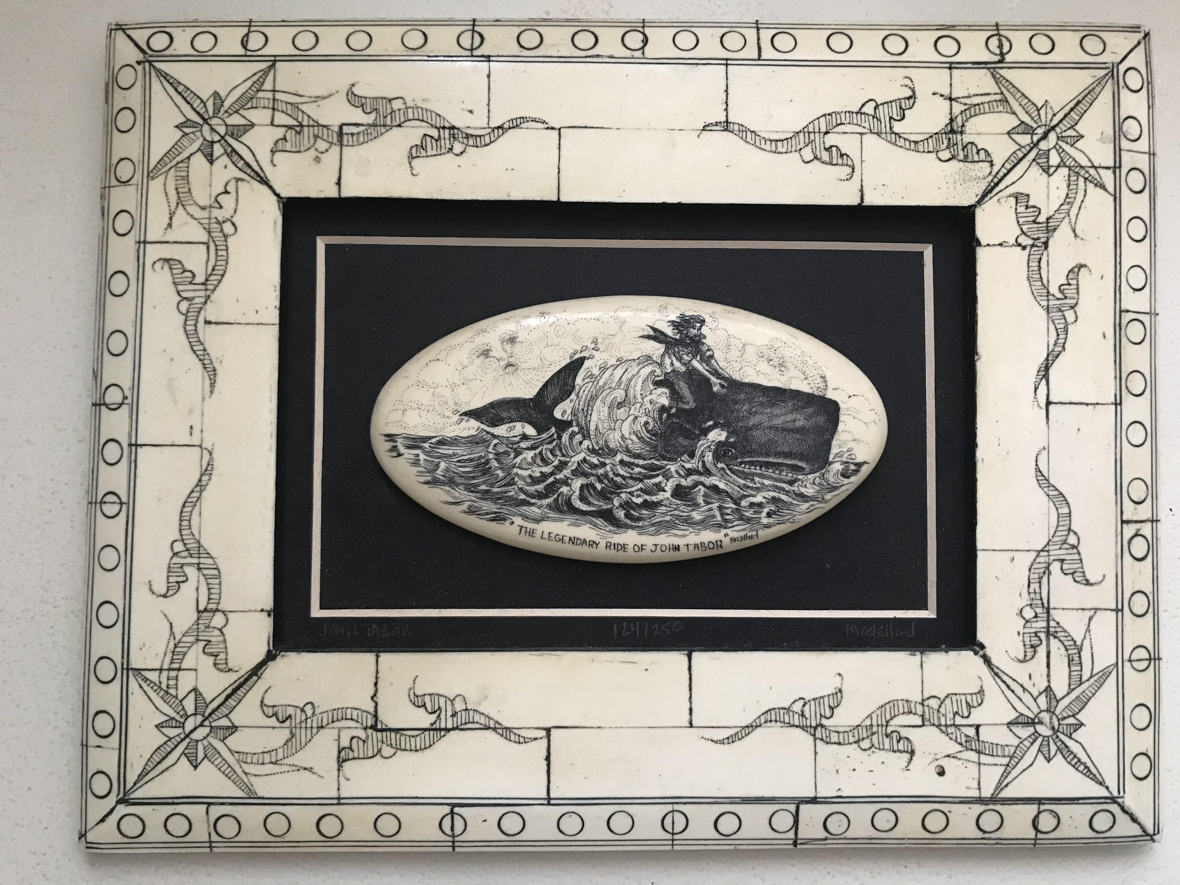
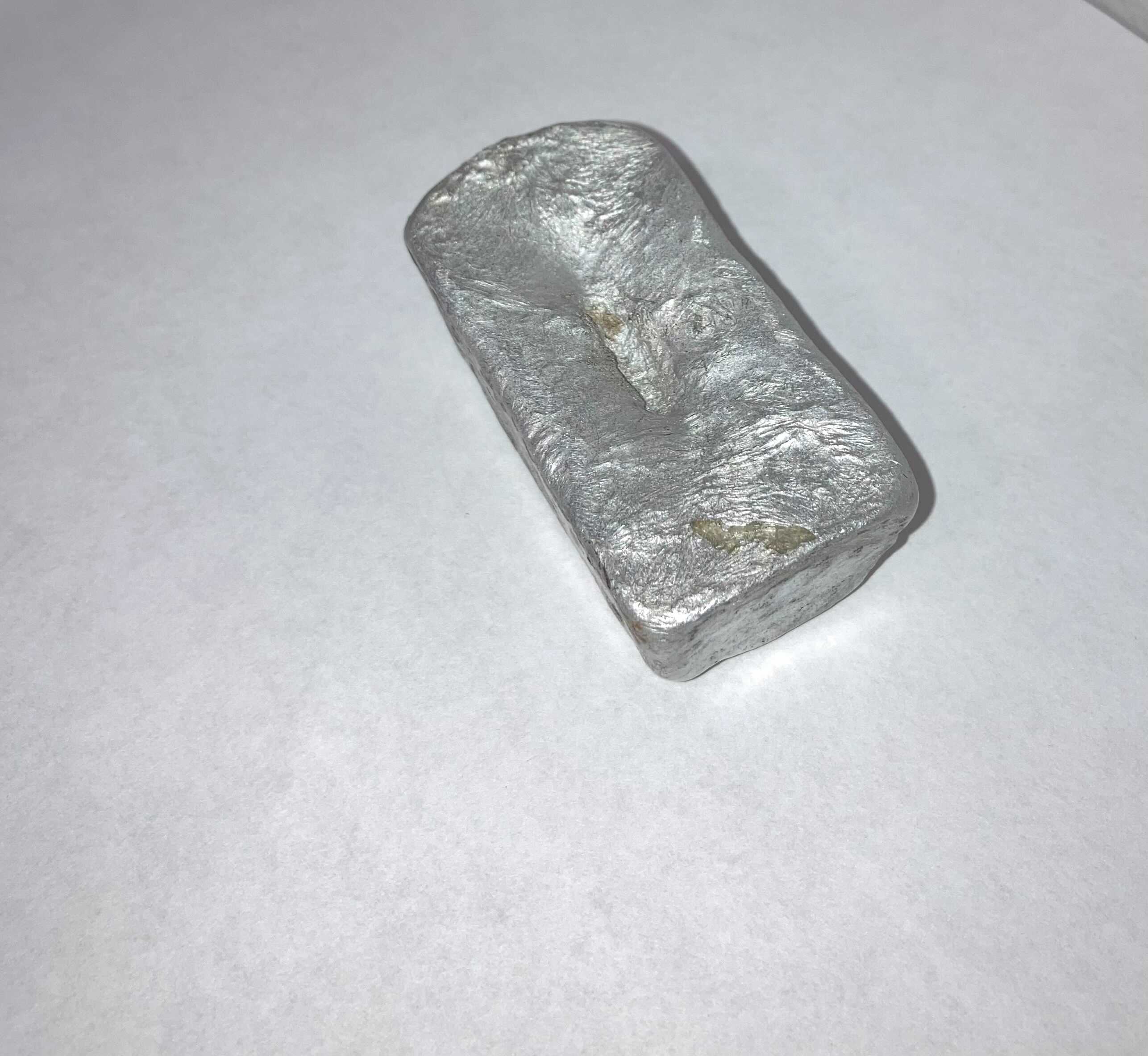
The object I have decided to select is an Aluminum ingot. The dimensions of the ingot measure about 2.3 inches at the top and 2.6 inches near the base. The object is small enough to be held comfortably within the palm of one’s hand. The shape is typical of a standard metal ingot. The ingot shows some bubbles and ripples, especially on the bottom and the sides. There exists a small amount of corrosion and black marks. One of the faces of the ingot is slightly extended, on this side there is a small brown-bronze mark. The ingot is mostly the trademark silvery color of aluminum, but shows black and yellow marks in certain areas dude to residue and oxidation. This ingot is composed primarily of aluminum, primarily sourced mainly from aluminum beer and soda cans; These cans were mostly found in the forest behind my home. The other sources include some junkyard scrap, and some broken computer heatsinks.

            The process in which this ingot was made involved the use of a homemade, charcoal powered furnace. The process of constructing the furnace consisted of filling a bucket with a mixture of plaster, sand, and silica powder; these are all highly heat resistant materials and can withstand the high temperatures. An indentation was made with a smaller vessel and left until the filling hardened somewhat. Afterwards a hole was drilled in the side, and once it was fully hardened, a metal tube with an air outtake was placed through the hole. Our crucible was essentially just a fire extinguisher cut in half; just a sturdy steel cup to hold metal. We put charcoal at the bottom and used the air outtake to heat up the hot coals and bring the crucible to temperature and we put cans in until they melted. Once the metal was all liquid, we poured it into an ingot mold to cool.

            This process was rather painstaking and time consuming, but it was a great experience working with my friends to create something like this. It took a lot of technical ability, and some dumb luck granted, to create this ingot. The ingot wasn’t our final objective, it was simply done so we could have some clean metal to make other objects later down the line. The difficulty involved in creating this ingot adds to the meaning of the object. We considered simply buying some source ingots to use for our crafts, but we figured making our own would be the right thing to do. Inadvertently we ended up cleaning a lot of the litter and refuse in the woods.

            We used the ingots for various things, and we fashioned all sorts of different items by casting the metal in foam cutouts buried in sand. The foam burns away leaving a hole for the metal to seep into and fill up. We each made our own trinkets: One of my friends made a set of knuckles, another a casting of a sculpture, and I made a model sword. All of these items didn’t really hold any significant value, and the thought behind them was nothing more than intrigue, but the process that shaped them added a sense of completion.

The Legendary Ride of John Tabor!

The object I wish to explore is a Christmas gift I received from my Aunt Laurie a few years ago after her trip to Norway. The framed medallion, considered a form of scrimshaw, depicts a man atop of a whale, breaching the surface of an ocean. Beneath the carefully carved, intricate scene has the words, “THE LEGENDARY RIDE OF JOHN TABOR” followed by an illegible signature of the author. 

The medallion is surrounded by a rectangular frame, measuring at about 10” x 7”, while the medallion is merely 3 inches. While this form of art is considered scrimshaw, which is artwork carved into an image of ivory, however, I am under the impression it is a form of faux ivory due to the small writing on the back that claims that this is one piece out of 150 pieces. Ivory, now considered unethical and difficult to obtain, is hard to identify without using a blacklight or burning a part of the ivory. With a more careful investigation, I discovered the carvings must have been darkened with color as a result of underglazing, which highlights the indentations made in the faux ivory. The carvings are intricate and incredibly thin. The depth of each line is hard to measure, because of how shallow each stroke is. The darker parts of the carving, such as the whale or the shadowed parts of the wave, have a palpable texture to them.

The background of the scene depicted on the medallion is incredibly light and intricate. The carvings are especially shallow, and created with a pattern of dots, while the foreground is created by a series of lines, ultimately creating a depth to the piece of artwork. There is a face embedded within the background, ever so lightly, as to bring attention to the man, who I’m sure is John Tabor. The man is carefully created with careful, thicker lines as to bring emphasis onto his face, and leaving much lighter portions in order to distinguish his body from the whale. The whale is very very dark, having been done with a cross-hatching technique to distinguish his body from the ocean. The whale is dark, giving me the impression that the whale is a sperm whale. Additionally, the sperm whale has the defining large, square head, which is reflected in this drawing. 

This scrimshaw depicts the story of John Tabor, who is a character in the book “Etchings of a Whale Cruise,” written by John Ross Browne in 1846. The story is considered a Nantucket story because of its intense focus on whaling. John Tabor is depicted to be riding a whale in the novel, as well as being one of the profound characters. In consideration of how the sperm whale is a major target for whalers, I am assuming this was a depiction of how John Tabor had to, in all of his masculine glory, physically grab the whale in order to catch and kill it for his whaling expedition.

The artist who created this scrimshaw must’ve found the story to be quite compelling, given that this piece is one of 250. Because this was a gift, I am not entirely sure it’s origin. Despite many attempts at research, I was unable to find where it was made originally, how it was sold to my Aunt in Norway and why she chose to give it to me. But I am aware that it is associated with whaling, and inspired Herman Melville’s famous novel Moby-Dick. Because Norway is on the shore, and has its own association with whaling, boating and sailing, I am sure it is a crossover between the two cultures. I would love to explore this piece further, and I am tempted to ask my Aunt Laurie how she got her hands on this object and if she has any further information on it. 

An Heirloom Ring

Image 1: The ring viewed from slightly above
Image 2: The ring photographed with a quarter.

The object I’ve decided to describe is my great-great-grandmother’s engagement ring. Her name was Edna Greoss, the ring was given to her in 1916 by her husband Geoge Maier. Both of them being from German immigrant families living in Brooklyn, New York. They had one son, Joseph Patrick Maier born on Saint Patrick’s day in 1913. Joseph was their only child as George died fighting a fire in 1919, just three years after their marriage. Edna would wear this ring until her death in 1984 when she was 87. Before she was buried, Joseph took the ring and later gave it to his wife Kathryn Meringolo. When my great-grandmother Kathryn died, her jewelry was divided amongst her children, with my grandma, Arlene Botte receiving Edna’s engagement ring in her share. This would then be given to my mother, Marie, as she is the only one amongst her siblings who cares for jewelry. 

The ring itself is rather simple, with a small diamond and a thin yellow gold band. Starting with the central stone, one can see that the stone is cut in the traditional diamond shape, with a wide, flat head at its top. The diamond’s head is about an ⅛” wide and then angles down slightly at its sides. This then leads directly to where the stone angles into a sharp point at its bottom. The diamond’s width from top to bottom is also about an ⅛”, however is difficult to see within the rings setting. This cut would be very traditional and quite popular in 1916 at the time of its creation. The diamond itself is strikingly clear, however it lacks the same iridescence, exactness, and almost splintered look that may be found in a modern diamond. This is because this diamond was hand cut by the jeweler as opposed to the machine cut diamonds that are popular in engagement rings of the last 50 years.  

Image 3: The ring viewed from fully above.

The setting the diamond is placed in is also rather traditional for the time. The gold prongs that hold the stone snuggly in place rest in four corners, creating a square around the diamond, though the edges are rounded. With the prongs around it the diamond reaches 3/16”. The prongs themselves are segmented into three sections each by two lines cut into the metal. These three segments are all rounded, coming together into one unsegmented strip of metal that connects to the actual band of the ring. On the top and bottom of the ring, between each pair of prongs there are 2 pieces of gold that look as though they would wrap around the prongs, however this is a mostly superficial feature that acts as a visual and protective barrier to the diamond. 

Further describing the setting, one can see directly on either side of the diamond, a separate piece of metal, thicker than the band, though only 1/16”. These pieces of gold reach from the diamond down to the ring’s band. Where it connects to the band, it is wrapped by two thin circles of gold. This piece, what is called the gallery, is what makes up the bulk of the ring’s setting, lifting the ring up slightly from its band. Where it lifts from the band there is a slight gap between the setting and the ring, just large enough that you would be able to see slightly through it. When looking straight at the ring you can also see that this setting is decorated by two lines on either side of the diamond. The lines taper, with them being thickest at the stone, getting thinner as they get closer to the band. 

The band itself is incredibly thin, being barely wider than 1/32”, slightly thinner than a normal iPhone charger. It has slight dents here and there, due to gold being such a soft metal, though it still remains a perfect circle. While there may have once been an original engraving on the inside of the band, that has been lost. This would have happened in the time of Kathryn owning the ring. One can see by the barely visible line in the band that she had the ring made smaller, cutting out the original engraving and later having a small letter “K” engraved into the ring’s side. However, there has been no more interference with the ring’s structure, now resting at a ring size 5, being about ¾” wide overall.

Since we were children, my sister and I debated who would get great-great-grandma Edna’s engagement ring. After many petty arguments the ring has come into my possession. The argument was admittedly solved because it fit me perfectly while it was too small on my sister. However, I am just glad to have such an important heirloom so that I may pass it on to my own children someday.

Crystal Bead Bracelet

Image 1: The beaded bracelet

I decided to write about a bracelet I received from my nurse right before I had surgery. I didn’t know her too well, we had only met once prior when I had gone to the hospital for pre-surgical testing. Maybe she saw how fidgety and nervous I was about a simple blood test, and figured I needed some sort of grounding before walking into a major operation. The bracelet came in a navy blue gift box, and a piece of cyan paper that identifies the different crystals on the bracelet, and what their purposes are. According to the paper, this bracelet is meant to improve balance and release positive energy.

Image 2: The paper listing the different crystals on the bracelet

At a glance, the bracelet consists of 24 beads on a pearly white elastic thread, and in the middle, there is a metal charm. The bracelet is 2.5 inches in diameter when relaxed, fits in the palm of your hand, and can stretch a considerable amount to account for different wrist sizes (I’ve never tested its true limits, as I have tiny wrists).

The beads on the bracelet are perfect spheres, and click softly against each other when it is worn. there are six different types of crystals on the bracelet: clear quartz, amethyst (purple), peach aventurine, carnelian (orange), goldstone, and rhodonite (pink). The beads come in pairs, and there are two pairs of each crystal on the bracelet. The beads are arranged in a way so that each pair of the same beads is located on the opposite side of the bracelet from one another. Through the clear quartz beads, you can see the string that keeps them all together. Some of the crystals (like the carnelian and goldstone) are more opaque than the others, and the goldstone specifically has a glitter-like shimmer. Not all of the crystals look the same, one of the rhodonite stones is darker than the others. An indicator that the crystals on this bracelet are real is that the bracelet is always cool to the touch before I put it on. Perhaps that is what makes it good for releasing tension and grounding the wearer, the coolness against the skin is a constant reminder of the crystals’ presence.

Between a pair of clear quartz beads and pair of peach aventurine beads is a small charm made of a dark grey metal. It’s cool to the touch, but not as cool as the beads of the bracelet. There are two parts to the charm: the part that sits next to the beads on the bracelet, and the disk that dangles below it. The part that wraps around the bracelet has a pattern of small bumps and smooth lines, with a line of larger bumps in the center. under it is a small ring where a thin jump ring connects it to the small disk that hangs off of the bracelet. On both sides of the disk, there is a small engraving of a tree trunk with six curvy branches, surrounded by abstract swirls meant to represent leaves. the trunk and branches are carved a bit deeper than the leaves, but both are deep enough that it’s noticeable when you run your thumb over it. It makes itself known by clicking against the beads above it with even the slightest of movements.

Image 3: A close-up of the metal charm

While this may not be the most-worn accessory I own, I know I will always have it when I am in need of physical or mental grounding. If it was with me at the scariest time of my life, I know it will stay a part of me for times to come.

A Memory Box

Front of jewelry/music box

Before me I have a jewelry box, about 12.5” long and 10.3” inches wide. With measurements it can be hard to envision, but this is no average-sized jewelry box. Next to a box of cereal or a bottle of dish soap, the box looks abnormally large – even though the cereal box is slightly taller. This is a jewelry box with some heft! There is a thin layer of dust atop the box and on the edges of the bottom molding. The brown wooden jewelry box is worn, small scratches found on nearly every individual surface, even smaller chips on the corners. On the left-hand side of the jewelry box, there are five small drawers, each about 4” wide and 1.5” deep. The first drawer has a foam ring-holder that feels unpleasant when my fingernails make their way across the surface.

Dusty top of jewelry box

The drawers have decorative handles, which probably sparkled and shined when the jewelry box was new. Now the handles have lost their color – they may have been gold-plated or a sparkling silver at one point, but now they are a dull gray with specks of black. Each drawer has a small, rectangular outline painted on its front in a faded gold, about 3.3” in diameter. These rectangular accents have inverted corners, giving the design a more refined look. On some of the drawers the paint has not lifted at all; while on others, the paint has begun to wear away, chipped and stripped. On the right-hand side of the jewelry box there are two compartments, the first a door about 9” long. The door has the same rectangular accent around its edges, and within that accent there is a plastic window into the compartment. This plastic window has another muted gold design, which upon investigation is painted on the inside of the plastic. The design feels rough against my fingertips. This compartment is meant for necklaces and chains and has a small mirror at the very back of it. The box is too cluttered to see myself clearly.

First and fifth drawers open, necklace compartment open – blurred so the focus can be on the first drawer.

The second compartment on the right-hand side of the jewelry box is what makes this box more than just a jewelry box, and more like a memory box. Before I can tell you more about this sixth drawer, I must describe the back of the box. The back of the jewelry box has a small, shiny sticker that says, “Quality Products Designed for Jay, Jay Import Co. Inc. MADE IN TAIWAN.” On this same, plain surface, there is a small crank or “winder” that one might find on a music box. There are two visible screws underneath this crank. I turn it, wondering if it still works… to my surprise, it does (though it did give me some resistance at first)! That sixth drawer? When opened, it plays a beautiful lullaby – one that I rediscovered in August, played on an instrument called a Kalimba, and immediately recognized but could not place. This jewelry box doubles as a music box, one that I loved so dearly during my adolescence that you can see it was opened often – the drawer does not fit perfectly within its mold any longer, being slightly crooked when closed.

Close-up of sixth drawer

This jewelry box has not been used by me since I was in high school, at least 6 or more years ago, and has since been in my younger sister’s closet. However, this is a box with history, filled with memories of a different time in my life. Before me, my mother owned this box, a gift from her mother – my grandmother, Rocio. A tiny sticker of my preschool photograph adorns the window on the right-hand side of the box. Underneath that sticker is a sticker of Santa Claus I surely placed there – and later tried, but failed, to peel off. There seems to have been another sticker underneath that one which was successfully peeled off, at least to the point where you can no longer see the image. Opening each drawer one-by-one, I was taken back in time. I found a crisp, bright $2 bill in the first drawer – this is a lucky $2 bill I received from my stepfather’s coworker when I was barely a teenager, maybe 12. In the second drawer, I found a pair of earrings I wore to my junior prom. The third drawer held rubber bracelets from my Twilight days – “vampire girl” written across one. The next drawer held a silver jewelry box with my name written on it in my mother’s handwriting. Inside that box I found a small, gold pin that says “Mother” and underneath it has a heart with the initials “M.V.” engraved on it. I cannot easily recall knowing anybody with those initials.

Back of jewelry/music box; manufacturer label and music box crank visible

The fifth drawer on the left-hand side held two student IDs – one from eighth grade and another from tenth grade – a pride ribbon pin which I wore on my gown during my high school graduation, and several gold charms that can be put on a necklace. In the sixth drawer I found a dog tag which belonged to a close friend, given to me in middle school, and the tag for a mood bracelet. My necklace compartment holds a pearl necklace, a necklace made by an ex-boyfriend, and a carved-wooden turtle necklace I bought at Oktoberfest in Bear Mountain in 2013. Interestingly enough, I had been thinking fondly about that exact necklace last week, wondering where it had gone.

My Grandma’s Engagement Ring

For this assignment, I have decided to describe my maternal grandmother’s engagement ring (image 1 and 2), which she randomly gifted me recently.

Image 1: Grandma’s engagement ring compared to a quarter

The ring is most likely from the 1950s, however I am unsure of its exact age but this is an approximation based on the information that I do know. The ring itself is a little bit smaller than the size of a quarter (Image 1) with the diamond being smaller than a pencil eraser. The ring has two separately twisted pieces of gold metal making up the band. I am unsure of what the band is made of, but upon closer inspection of the ring it looks like there is a “14k” engraved on the bottom of the inside of the band (Image 2) , which is most likely an indication that the band is 14 karat gold. 

Image 2: Close up of the engraved “14k” on the inside of the band

Like previously mentioned, the band has two separate twisted pieces of metal that stay together along the sides and the bottom of the ring, but as the twisted pieces continue towards the top of the ring they begin to separate allowing for the diamond to be placed right in the center (Image 4). The twist in the band can be compared to when you twist a piece of yarn between your fingers, not two pieces being twisted together, but just one to give off the illusion that there is more than one piece being twisted. While the whole band is made up of these twists, the bottom of the ring includes a small section where the band flattens out (Image 3), which is either an indication of wear and tear or something that just happened in the production process. 

Image 3: Visual of the diamond’s placement on the band

The color of the band is a light gold color that is very similar to the color of the chairs in Element 93 or, to provide a more widely known comparison, it is an almost pale yellow tan color with darker sections where the twists in the metal are.

The diamond itself is about less than half the size of a mechanical pencil eraser, allowing it to fit in-between the two sections of twisted metal perfectly. The diamond itself is not placed directly between the two sections, instead it is slightly risen above the band (Image 4). While the diamond lacks any sparkle out of direct light, it sparkles more when is placed in direct light and comes alive, allowing for the simple beauty of the piece to show. 

Image 4: Image of the separation of the diamond’s placement in the band and the diamond’s rise.

While the reason for my grandma’s gifting of her engagement ring is unknown, the family history behind the piece is significant. The ring was given to my grandma by my grandpa during their engagement. While the beginning of their marriage was good, as time went on the love in the marriage began to dissolve, and this unhappiness of course led to a divorce. After time went on both my grandma and grandpa got remarried to better people who fit each of them better. So while the ring is connected to a mixture of unhappy and happy memories attributed to a failed marriage, the ring meant enough to my grandma that she wanted to gift it to me rather than sell it.

Kim Blum, Waterbottle Description

I have chosen to technically describe my waterbottle. This is an object I’ve brought with me everywhere for the past 4 years. Despite the lack of any historical significance, this bottle has witnessed both large and small intimate parts of my personal life. 

The bottle measures at 10 ¾ inches in height, with a 1 ⅝ inch radius. The body of the waterbottle is a stainless steel metal, a silver color. The outside metal body is thinly covered by a navy blue paint. On the body, there is a silver geometric line design. The geometric design is the result of the navy paint color being removed, to reveal the contrasting silver steel color of the bottle underneath. This is possibly the result of a laser removal process. At the bottom of the bottle, the silver letters S and M (the bottle company’s logo) are revealed in the same manner, sizing at about the size of a thumb print. When running your fingertips along the side of the bottle, you can feel the fine ridges where the paint layer has been removed for the design. The bottle has a few notches, scratches, and dents, mostly at the bottom of the bottle where the edge of the bottom and side surfaces meet. At the bottom end of the bottle, there are three circle ridges centered inside one another. The text, “Hand Wash Only, simplemodern.com, 22oz Summit” follows the circular circumference shape of the bottle bottom. The body of the waterbottle itself has no curves. It is a long cylinder shape, sized to fit inside the palm of a hand perfectly. There is one ridge at the top of the metal bottle, created for the edge of the body to meet the screw-on plastic cap. 

The cap of the waterbottle is thick black plastic. The cap has a cylinder base, with a handle extending outwards at a 90 degree angle. The handle does not move or rotate in any capacity. Rather, it is a full extension of the main cap base without any seams. The cap can be unscrewed to access the bottle, for filling and emptying. To drink, the cap has a small spout at the top, where the user can unscrew a small ridged cap to access. The spout can be measured to the size similar of a quarter. The cap has scratches and dents everywhere, hinting towards it’s age and use. 

There is one singular sticker on the waterbottle, placed at the top half of the bottle. The sticker is rectangle shaped, with curved corners. Centered on the sticker, a brown and white dog smiles. The dog is framed by a thin purple circle outline. The background behind the dog’s circle frame is a red and white diagonal striped pattern. The sticker clearly has wear, inferring the sticker has existed on the water bottle for quite some time. The top right corner of the sticker is completely worn off. The colors of the sticker are faded, possibly from water damage or sun damage. To the touch, the sticker has lost any glossiness it might have had, and has worn down to a paper texture.

The bottle is empty, resulting in a deep hollow echo as it knocks against anything. However, these hollow sounds are temporary- lasting until I thirst again.

More Than a Fancy Piece of Wood

View of the bar from the front
View of the bar with its middle and right compartments open, showing the storage space and shelves
Angled view of the side/front of the bar, where one of the legs can be seen

The object I decided to discuss is a bar that was handed down to me from my parents. Literally, it’s a sort of wooden cabinet, but it had been marketed as a bar (a place to store liquor), and had only ever been used as such. My parents bought it when I was about 2 or 3 years old from a furniture store that is no longer in business. They acquired it as one of their first of many beloved pieces of furniture when they bought their first home.

The bar stands at about 32 inches high, and a few millimeters shy of 40 inches wide. It stands on four short legs, each about 4 inches tall and resembling a gourd. The bar consists of 3 storage spaces. The center one is the largest and the two on either side are smaller and identical in size.

The two side storage spaces are semi-cylindrical cabinets that open with metal knobs that have an almost trapezoidal shape. These cabinets each have two shelves. Each shelf has a metal gate about 3 inches high on the outer perimeter for keeping the contents secured inside. The side cabinets each have what appear to be a hand-painted design. The design consists of two geometric images. The outermost is a thin golden rectangular line with small golden details in the corners, which consist of delicate tendril-like curls in either direction. The innermost image, about an inch or so from the other, is a 1-inch-thick black rectangular border with a golden three-pronged flower pattern within. The black border is rimmed on the inside and outside with a gentle line of gold.

The cabinet in the center has the same interior layout as the two smaller ones but on a much larger scale and is a full cylindrical shape. It too consists of two shelves each enclosed by 3-inch-high metal gates. It opens and closes like a Lazy Susan; you push the door and it swivels around 360 degrees to reveal the interior. The hand-painted design on the center has the same two geometric images as on the smaller cabinets but on a larger scale. They are both in the shape of a square rather than a rectangle. Inside the innermost square, there is a beautiful design featuring a vase of flowers, circled with a round border of thick tendril-like curls. These curls are like the ones in the corners but thicker and more pronounced. The colors of this image consist of light browns and muted greens, blues, and reds, which all fit in with the rustic, antique style of the piece.

On the center compartment there is attached a latch. My father installed it when I was in high school and prone to mischief so he could put a lock on it. The latch still remains although the lock no longer does. There are chips on the top of the wood in the form of perfect circles, likely where my brothers and I would place our drinks without coasters, despite my parents attempts to prevent that. There are other various scuffs and marks from all sorts of childhood hijinks.

After almost two decades, my parents decided it was time to part with one of their first pieces of furniture, a wooden structure that represented a milestone in their lives and which had witnessed their family grow. It retains the character to prove it. Now it sits in the living room of my first college home, which I share with three friends. It still serves as a bar, and also as our TV stand which was only supposed to be temporary. But once we got used to looking at it every day, it didn’t seem right to make anything else the centerpiece of our living room.

And it retained even more character in its new home. There is a red paint drip mark at the bottom of it from one of the many crafts my housemates and I have gotten into. I think specifically it was from the bloody hand print tapestry we made one Halloween.

This piece of furniture, while visually and physically unique, holds stories that can be realized through its physical characteristics. I plan to hold onto this piece of furniture that has watched me grow up, for a very long time. I hope for it to develop more character over the years and expand its little collection of tales.

My grandmother’s Visa

The object that I chose was my grandmother and great grandmother’s immigration visa. This object has a personal connection to my family, but also a connection to The Hare With Amber Eyes, as this takes place in parallel to the events discussed in parts one and two of the book. I have the digital scan of the visa, but since it is so old I try to avoid touching it. Knowing my mother, she probably has it tucked away somewhere in one of our many filing cabinets.  

The visa is a hundred years old now. It is stamped with the date 13 Jan. 1921. The pages are old tan paper that look like they have been stained with tea, and they curl and crumple at their edges. The booklet is bound together by two very old and rusty staples. There are so many layers of paper, writing and ink that it is hard to make out any of what has been written on it. It is written in a jumble of French, Romanian, and English. One of the clearest stamps on page eleven in the right side of the booklet reads “American Consulate Bucharest, Rouman” before cutting off. There is also a fee stamp, like one used for postage, also from the United States consulate that has “$2” written in bold font. That is worth about thirty dollars in today’s money. The visa lists them as coming from Bucarest, Rumania by way of France, and the fine print underneath warns that the documents will expire in two months, but it is covered in stamps. Behind all of this text is a faded red pattern that is smudged with the green stamp ink. The French and Romanian text above indicate that “This page is reserved for visas”. On the left page the same red pattern and visa reservation are there. There are three stamps on this page, two of them green and one a transparent white. They are almost completely illegible, but you can catch a few Romanian words here and there. There are also several things scribbled in cursive handwriting, but between the language barriers, age, and layers of ink, it is very difficult to read. The last thing on this page is the most interesting, it is a photograph of my grandmother Chaika, soon to be Clara, and my great grandmother Chana, who will become Anne. The photo is on its own separate piece of paper that has been pasted in. It has its own yellowed and crumpled edges, and features a sepia portrait of my two relatives. My great grandmother is wearing earrings, I will have to look for them next time I am home. My grandmother looks glassy-eyed and has a shiny bow in her hair. She is seven years old at this point. 

My great grandmother, Annie Meyerson and her daughter, Clara, immigrated to Boston from Bucharest, Romania (although it is listed as Bucarest, Rumania on the visa). She had lived in Romania for about three years while trying to secure passage to America. Prior to that she lived in Kodima with Clara, my grandmother, and her husband Isidore, my great grandfather. Kodima is a town in Russia (present day Ukraine) in the Galicia region outside of Odessa. At the time about half of its population was jewish, my relatives included. Antisemitism was on the rise at this point and there were pogroms in and around Odessa. These pogroms forced my family to flee, and they eventually ended up in Brooklyn.

My Aunt’s Black Stratocaster

When I was six years old, I gave up the guitar. Figured it wasn’t for me. I had played it for only a little over a year, most of which had been full of steady enjoyable progress and musical bliss. But, in the way of a mind working with a barely developed prefrontal cortex, one bad experience was enough to knock me off the proverbial horse. I won’t go into the details. Suffice it to say, I couldn’t handle the paternal pressure. Besides, i’ve never been good at sticking to one thing for an extended period of time and when I decide I’m done with something that decision is more or less set in stone. Or more accurately, deep within my synapses. 

So imagine my surprised when an black and white Stratocaster was forced into my hands by my Aunt Sarah and, at its touch, ten years of neurological connections were fried in an instant. She had had it since she was my age, sixteen, but somehow the guitar was pristine. Well not quite pristine, but at that point I wouldn’t have noticed the slight divots pressed into each nickel-silver fret. I plugged into one of the unused amps that were scattered around the house, took at least a minute to get my hands in the right position after a decade of inactivity, and strummed a single G chord. The sound tore through the hallways, reverberating of the walls and killing any remaining doubt about this sleek, six-stringed instrument.

I can’t say I’ve managed to keep the guitar in the same condition as my Aunt. The black laquer of its body is covered in fingerprints. The hand sized space between the bridge and the fretboard has an almost worrying accrual of dandriff. The plastic covering now grips the mother of pearl pickguard façade less like an infatuated lover and more like a mother trying to keep ahold of a wayward child. The strings, although I feel as if I changed them just yesterday are already staring to tense and fray. And most subtlety, but perhaps most demonstrative of my indulgent affection, is that those six divots in each fret on its long rosewood neck have deepened. 

You likely wouldn’t guess that the instrument is made almost entirely from wood, because the sheen of the black finish gives the material of the body the look and feel of some high quality poly-fiber plastic. Somehow its frame still maintains a certain softness to it that allows it to sit in my lap and be cradled by my hands for hours. Eventually, the guitar almost feels like a musical limb of my body as it fades into my hunched form. The neck is hard but smoothed and sanded so thoroughly that it also doesn’t feel much like wood.  

At the lower end of the fretboard, hiding under the strings are four rows of small metal nubs peaking out from the white pickguard form the guitars pickups. Some of those nubs are touched with dusty red rust. Further down the board we come to a bridge crowded with the saddles responsible for holding the strings at the correct high above the fretboard. They always look a bit desperate to me, shivering each time I strike a chord, as if they’ve taken on a job they can’t quite handle, but insist on preforming anyway.  

Moving up the board we can see that the strings eventually end. Tied up and threaded through the holes of little metal towers. The towers are arrayed in a diagonal line with the tower farthest from the guitar’s center holding the thinnest cord and the closest tower holding the thickest. A curious but necessary arrangement. Compared to the saddles opposite from them, the towers appear strong and stately. Calm and confident in their duties. 

Perhaps most important of all is the sound of the thing. When played by itself, the guitar seems meek, unsure. Good for playing sweet, though slightly flat, dewy morning tunes. But as soon as the amp cord slides into the output jack, the instrument gains the power to start a riot. Even with the settings at low on both guitar and amp the sound is more than enough to fill a room. And as the melodies rip through the air and flow from its body into mine, I can tell it’s chomping at the bit to fill something bigger, a building or even a stadium. A journey I fear I’m incapable of taking it on.