Proof of Purchase and Presence: A Ticket Stub from San Sebastian’s Plaza de Toros

IMG_0570

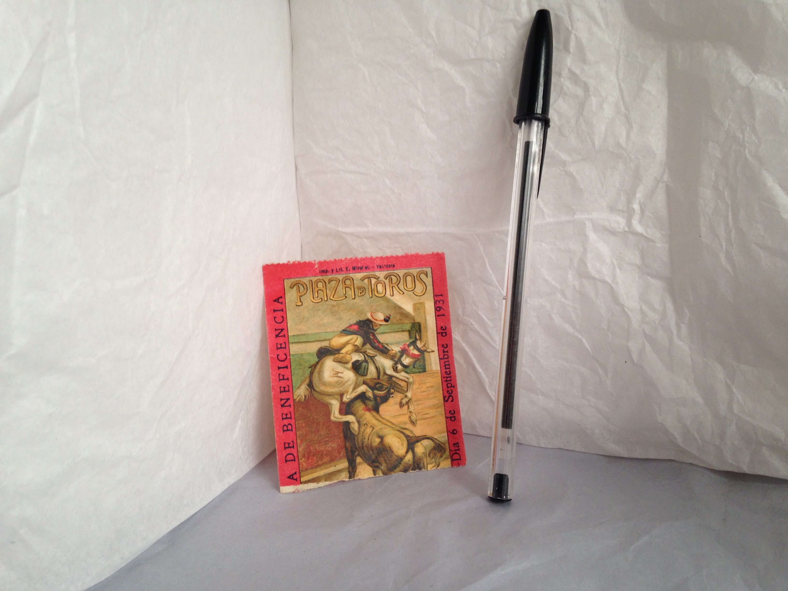
Front side of the Ticket

IMG_0573

Reflecting on a Struggle

When I told my mother that I was enrolled in a class studying the role of objects in shaping both our personal lives and our cultural heritage, she immediately offered to dig up as many family mementos as possible. One of the several items that she excitedly passed along to me on a recent visit is a ticket stub, dated September 6, 1931, for an event at the Plaza de Toros in San Sebastian, Spain. It was likely purchased by my great grandparents (my mother’s father’s parents), Stella and Emilio de Jauregui-Blanco, while they were living in France.

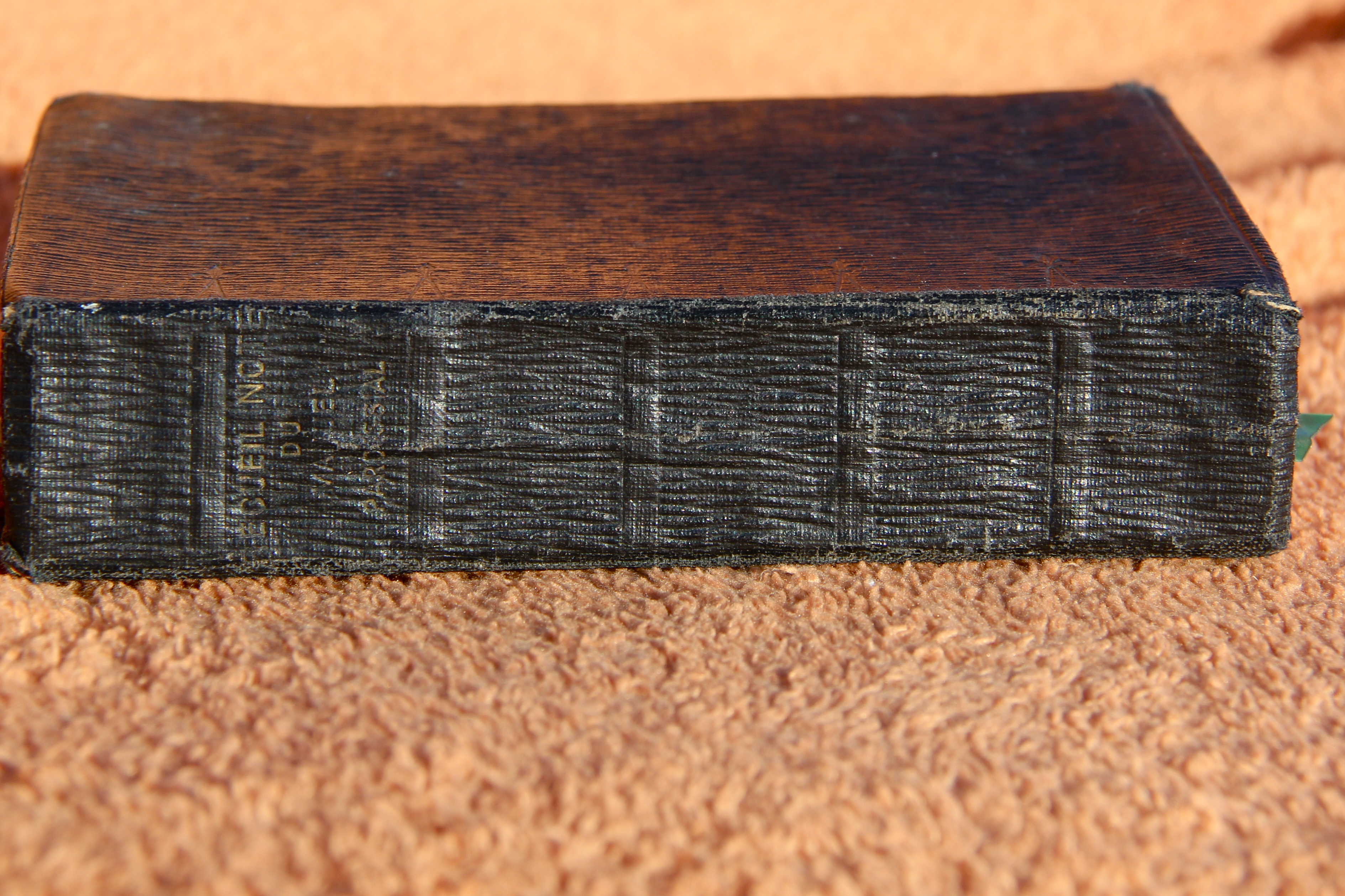
Just shy of three inches long and two and half wide (for those who prefer exact measurements, the dimensions are 2” by 2”), the ticket stub is no bigger than a gum wrapper and just as thin. It appears to be printed on paper. Yet, despite its thinness, this paper is surprising strong. When given a gentle tug, the ticket does not rip as one would expect, but springs back, not unlike a dollar bill.  It is possible, that, like dollar bills, the paper is combined with cotton or linen, making it more resilient to wear and tear as well as better able to absorb and retain ink during the printing process.

Indeed, it is the printing on the ticket that transforms it from a mere scrap of paper (a gum wrapper to be tossed away) into a cultural artifact signifying not only a purchase but also a presence. One side of the ticket features an incredibly detailed tri-color print of a man mounted on a white horse trying to evade the rush of a muscular grey bull. The horse’s eyes have been blindfolded with a red bandana and, if you look quite closely, the bull’s shoulder is shaded with a little bit of red, imbuing the scene with a palpable tension. At the top of the scene, a dramatic font proclaims in shades of yellow “Plaza de Toros.” I am tempted to imagine that the ticket is for a bullfight not unlike the one depicted, but nothing else on the ticket directly suggests this.  The only clue to the circumstances of the event appears in the red margins that border the scene. To the left of the bullfighter, and running perpendicular to the scene, are the words de beneficencia, “of charity,” suggesting that perhaps this was a charity event of some kind. However, the beginning of the phrase, which might have revealed the beneficiaries of this charity at least, has been ripped off, possibly by a ticket collector as my great grandparents made their way into the Plaza.

IMG_0571

Reverse Side of the Ticket

The reverse side of the ticket appears to be an advertisement for shops (almacenes) in the area. The red italic script in the lower half of the stub promise fabrics (tejidos), silk/screenprinting (sederia), and leather goods (peleteria) at the best prices (a los mejores precios ). It is interesting to imagine whether or not my great grandparents paid any attention to this advertisement, choosing perhaps to go to the address listed in bold red letters (the first half has been ripped off, leaving me lost, unable to trace it exactly) to buy trinkets for their son, my grandfather, who would still have been quite young at the time and not ready to attend a potentially dusty, crowded event at the Plaza.

Emilio de Jauregui-Blanco, a citizen of El Salvador, would eventually move his family back across the Atlantic, finally settling in Guatemala. Moving is a daunting process under any circumstances, and I can only imagine that a transatlantic move would be especially so, requiring the family to choose what they absolutely would not part with and what could stay behind in Europe. Somehow, this little ticket stub made the cut, successfully traversing both the ocean and three generations to make it into my hand. Certainly, it has little or no monetary value, nor will it ever grant me access to an event in the Plaza. However, what it does have to offer is far more meaningful. It offers me a physical link to my great grandparents. And, while I cannot say for sure what exactly they did on September 6, 1931, I can tell you it was significant. I have the ticket to prove it.

IMG_0579

Some Perspective

Claddagh Ring

This ring’s home is around the index finger of my right hand, though for the longest time it had been worn around that hand’s middle finger. It is a size 7 and when taken off, the shape of the ring is circular, despite its slightly irregular shape, likely due to wear. I was given this ring nine years ago, nearly to the day, (my birthday was on Friday!) when I turned 13. My grandmother gave me this ring as it represents our Irish heritage, it being a traditional claddagh ring. photo 1-2

The ring is made of silver and is very simple in design compared to the plethora of claddagh rings I have seen since owning it, now that I am aware of their commonplace in not only Irish culture but American culture as well. As mentioned before, the ring is ever so slightly bent, perhaps from wear over nine years of ownership and my own personal mistreatment of the gift, me being at times an irresponsible owner.

unnamedThe focal point of the ring is the iconography that makes it specifically a claddagh ring. The band forms two hands that come together from either side to hold a heart that wears a crown. This ring is very modest in its design compared to an array of ornate variations that can be found. The hands that clasp the heart appear as though they stem from a wrist clothed in a shirt—there is a line that appears vertically across the silver band to emulate a shirt cuff accompanied by horizontal lines—almost like faint scratch marks now that have worn down significantly—to look like the folds of the cuff. The hands are positioned such that the thumbs are holding the heart from above while the rest of the fingers are drawn together below the heart with an open space between the thumb and fingers. There are faint markings to mimic the separation of the individual fingers though they appear haphazardly and are not evenly distributed to create all the fingers. These lines too are faint, requiring close inspection. The heart itself is somewhat oblong, favoring a more horizontal shape with rounded edges rather than a strong vertical, pointed heart shape. Between the heart and the crown there is a space but it is not completely open unlike the space between the thumb and the fingers. Rather, it appears as a cavity within the metal. The crown that sits atop the heart has a simple band with the top of the crown marked by seven lines to show the arches. All these pieces come together to make the claddagh, representing friendship, love and loyalty characterized by the hands, heart and crown respectively.photo 3-2

The ring’s diameter is 2 centimeters, the backside of the band is .3 cm and it is 1 cm from the base of the heart to the top of the crown. The outer, backside of the band, the side not on display while worn, is regular in width and without detail. When inspected closely, the outer band is laden with imperfections. Faint scratches, none that actually cut away at the silver but just scratch the surface are detected, likely from constant wear of the ring and coming in contact with other objects that would disturb the metal. The inside of the band has a scratch or marking of some kind on the right side when observing the ring with the front facing forward. On the left side of the inner band, there is a faint marking that appears to be numbers that have significantly worn away likely due to constant wear. The numbers appear to read “325” which leads me to believe they signify a serial number for the make of this style ring. There are other minor markings, perhaps scratches or imperfections in the making of the ring that are found on the inner band, close to the printed number.

photo 2-2I’d like to determine what type of material the ring is made out of since it has been susceptible to scratches and markings over time and has tarnished little over nine years. I know that it is a very common style ring as I’ve seen them all over gift shops and specialty stores both in the states and in Ireland. Despite it being so common, I’m excited to look into the history of the claddagh symbol and how it grew so feverishly in popularity over time. Having traveled to Ireland and visited the city where the design originated, I’m eager to learn about the possible customs and traditions associated with the ring and how its usage has changed over time.

Ball Mason Jar

Although Ball Mason jars seem relatively plain, this one packs a lot of personal meaning through its purpose. It is, however, used universally for canning and preserving, and Ball jars have been around since 1884. Soon after, they became a household item. Although all Ball canning jars are glass, they come in many sizes and styles, some have jellied finishes, some the “plain” design, size ranges from 4 ounces to 64 ounces, mouths can be wide or regular, lids metal or plastic. The Ball canning process has diversified itself.

My jar exudes simplicity – it is the standard quart size, regular mouth, metal canning lid, with a plain finish. Plain, in this case, means that the glass was made with an easy measuring system in both metric and standard. For the standard measurements, every four ounces are denoted by a horizontal line which is one inch long and every eight ounces is denoted by its numeric value in addition to the line.20150126_094725The ounces are displayed on the right, and the left displays the number of cups. Thus, I find this jar to be ideal for any person who spends a lot of time in the kitchen, saving someone time in the cleaning of measuring cups.

The jar stands seven inches tall and three and a half inches wide. The mouth of the jar is two and three quarter inches. The lid is made of two pieces. The sealing component is metal and sits on top of the mouth of the jar. The band twists over the seal and acts to securely close the jar. Both of the lid components are dependent on the other to properly seal the jar so that the contents stay fresh.

20150126_09464920150126_094643

The band of the lid has ridges along the top portion which are visible on the inside and outside of the band. On the inside, it acts to properly seal. On the outside, it adds a bit of character to the lid and also serves as an ideal place for particles to reside, making the cleaning process less than pleasurable.

The “plain” finish has an elaborate design of a variety of fruit (pear, apple, cherries, and plum – which is disproportionately larger than the other pieces of fruit) enclosed in an oval which has an olive branch border. 20150126_090541The design on this portion of the jar is evokes a taste of Tuscan living, and a culture in which food and making your own food is both common and a treasured way of life. The design alludes to the main purpose of the jar: practicality in the kitchen.

Despite the (what I find) appealing appearance of the design of the fruits, the jar holds a practical purpose – namely, keeping food fresh. My family has traditionally used this style of jar for making cracked Sicilian olives, and it is containing an nominal amount of said olives that the jar entered my home. In addition to the nostalgic feeling it evokes of my family canning activities, it is also an icon of my present activities. Over the past year or so, the jar returned from retirement and has traversed many miles since its first arrival to my home some five to ten years ago. Almost weekly, the jar accompanies me to work (a goat dairy) where it is then filled with fresh milk. The Ball Mason jar is iconic at the farm, although quart sized aren’t as popular as the half gallon in more recent months. Since the milk is raw, a canning jar is quite ideal for retaining freshness, especially when using the metal lids and bands instead of plastic lids. Additionally, the material of both the jar and the lid (glass and metal, respectively), appeal to people concerned with their carbon footprint and amount of waste they dispose of. Being able to reuse the jar, even from one purpose to another, like canning to storing, saves both money and resources. I believe this attribute appeals to people who are more prone to like simple and back-to-basic items. Therefore, the design, or one could possibly argue the lack thereof, also serves as a marketing tool to people of a certain mindset. 20150126_085634

Rider Waite Tarot Deck

A.E white and cards Tarot and book

My Rider Waite tarot pack travels from location to location within my house. I have had a few decks before this one, but so far it is my favorite. Although I have been interested in tarot since my younger years, it is not until recently that I’ve begun to study them more seriously. The tarot pack comes with a book entitled The Key to the Tarot which was written by A.E White at the time of its creation in 1910. I am still a novice, and like those whose cards I read, each image holds new mystery and discovery.

The TaThe Key to The Tarotrot cards are flat and rectangular in shape. Like traditional playing cards they are made from layering paper, creating a product called pasteboard that is then used to print the cards (madehow.com). On the back of each card is a cerulean blue and white design of roses and tulips. The cards themselves are 5” by 2.5”.  As you can tell, the size of a deck makes it very portable.  The accompanying book is the same length with a width of half an inch.  The cover of the book is deep blue with gold mimicking the design on the cards with an inner rectangle displaying the title and author. Also within this rectangle is the ouroboros, a snake eating its own tail, which is a symbol for eternity. The pages have experienced slight water damage, but are still legible.

The tarot consists of a 78-card deck. These cards are broken up into two groups: The Major Arcana and the Lesser Arcana. The Major Arcana is made up of 21 trump cards numbered with roman numerals. There is another card in this part of the deck that has no number, but is usually assigned the number zero; this is The Fool. The image of The Fool is represented by a fair young man precariously close to a cliff. Behind him, a dog scurries at his heels but it is unclear whether the dog means to harm the man or warn him of the The Fool.imminent danger. In his left hand is a white rose and in his right he carries all his worldly belongings. The back drop is yellow with a white sun.

In the Lesser Arcana there are 56 suit cards. Suit cards, similar to a traditional playing deck, are part of 4 different groups consisting of fourteen cards each.  These are: Wands, Cups, Swords and Pentacles; each of these suits has their own King, Queen, Knight and Page. On the front of each card is a depiction of a particular scene which conveys the situation at hand and the emotions associated with it. Each suit has its own element and connotations.  For Instance, the suit of wands is typically associated with the element of fire and spirituality.

Let’s look at The Nine of Wands, which is represented by a man preparing a battlement. He looks distressed as he holds one staff in his hands and looks on at the other eight which he has positioned to block out enemies. Without The Key to The Tarot, one may conclude that this card signifies strength in the face of opposition on their own. However, not all cards are as straight forward as they seem and for this reason the book is essential for full understanding. Waite also provides instruction on how to position the cards in the traditional Celtic cross method at the back of the book.

9 of WandsThe purpose of a tarot reading is the quest for divinatory truth by the “Querent”, who is the person the cards are being read for. In the time that this tarot was first devised very few people would have owned their own set. The history of the tarot extends before the creation of the printing press.  Before then, each image would have been painted on the front of the card by hand (Eden 3). The world has grown smaller since then. A doctrine that Waite says in theory has always existed (Waite 53) is now accessible to the masses for the low price of $20.49 on Amazon.com.

My interest in these cards is not a belief in any real ability for them to predict the future, but in the archetypes and symbols that each card represents, which I find both fascinating and elusive. I do believe most people whose cards I read create their own interpretation of the images. This speaks to the human psyche’s relationship with materials and symbols. Since the dawn of man we have sought to assign meaning to life and all of its treasures and disasters. The tarot cards create a tangible representation of that continuous search.

“Playing Cards.” Madehow. Advameg Inc., 2015. Web. 25 January. 2015.

Waite, A.E. The Key to The Tarot. London: Rider Books, 1910. Print.

Gray, Eden. A complete Guide to the Tarot. New York: Bantam Books, 1970. Print.

Small Cross

DSCN0287The object I chose for this particular project is my grandmother’s cross necklace, as I find it the most intriguing. The necklace is made of a hard, sturdy, silver-colored metal. Since it hasn’t tarnished at all since my grandmother owned it (and is just a touch darker than any silver jewelry I’ve seen) , I’m doubtful of its being made of pure silver; perhaps a silver alloy or steel is the more likely composition. The cross pendant measures roughly 2 1/4 inches high and 1 1/4 inches across, and it sports a design of slanted hatch marks reaching upward/downward from the center and overlaid by a much thinner, smoother cross. Deeper, more noticeable hatches are visible at somewhat regular intervals along the branches of the cross–eight in total on each of the three short branches and 23 on the long branch. Each branch of the main cross ends in a slight flare, and v-shaped notches that meet the ends of the small top cross are cut out of the centers of each one. In the middle of the piece, where the branches of the cross are connected, is a smooth, opaque oval stone, forest green in color except for some tiny flecks of red here and there, and encased in a setting made of little silver arches. This setting does not hold the stone in place; rather, it looks as if the stone is attached to the piece with some kind of glue or clear jewelry cement. The chain attached to the cross is actually two smaller chains linked together so that the individual links stagger, giving it a “stacked” look.

DSCN0290DSCN0291

The cross pendant and chain are connected by a thin, triple folded metal band serving as a decorative jump ring. When I wear it, it reaches to about mid-chest length.

This necklace was given to me when my grandmother died (I was in the third grade at the time), but in the hustle and bustle of dealing with the aftermath of her death, I never thought to ask anybody how it had found its way into my grandmother’s possession. About a year ago, I approached my aunt–who was very close with my grandmother–and asked her if she knew anything about it. She didn’t even remember having ever seen it. Curiously, this piece lacks any markings, stampings, or other identifying marks displaying its country of origin, its material composition, or the name of its manufacturer. Given that most commercially-produced items have been marked in this fashion for some time–our family even has a few heirlooms dating back to my grandfather’s infancy that are stamped with the factory of origin–I found this to be a bit strange. Image searches on the necklace and general research about jewelry makers in upstate NY (where my grandparents lived) turned up no results. I’m considering taking it to a jeweler to gain some insight into when and how the piece was made, but regardless of how much or how little I discover about its history, it will always be a significant symbol to me as it connects me to a side of my family I know very little about.

Starting with a Story

To give proper description of the thought put into the creation of my first object — the recipe on an index card — I must tell a story to give the full flavor of history, time, and love within a family.

A mother and daughter are in the kitchen. This kitchen is made up of delicious smells, creative meals, and the altruistic effort of bringing people together around a table. To my dad and his siblings, their grandmother and mother are the best cooks they have ever known.

The characters in this story are all part of one big Italian family that would take many pages to truly explain. Here are two names to start with:

Big E – My dad’s grandma, his mother’s mom

Nanny – My grandma, my dad’s mom

I have grown up with the stories of how Big E and Nanny whirled around the kitchen throwing together food for hours at end — ravioli, pizzelles, eggplant parm, the list continues as your mouth produces more saliva.

I know my part in the story. I write. I listen and I write down the memories of people over a dinner table. Memories that transcend from dinner to that time my dad had to make peanut butter and jelly sandwiches so that his sister could “neck” her boyfriend in peace and that other time when Nanny packed a frozen leg of lamb in her suitcase because they were travelling somewhere for Easter that possibly would not have the best priced leg of lamb and the stories continue to spill out with the laughter.

Other than chocolate cake with marshmallow frosting, or carrot cake without frosting, or raspberry rugelachs, really and truly pineapple bars are my dad’s favorite dessert! And so the recipe is recorded on a 4’’ by 6’’ index card. The top red line is faded in more spots compared to others, the blue lines are faded, and the color is browned by time and use. There is a crease down this middle from being folded in half, stored and opened again and again. I love this. It is stained, faded, and creased… yet the words live on. The card is visual proof this recipe has been loved many times by many people.

I chose this recipe for a symbolic reason too. The ink on the slightly stained index card is my grandmother’s handwriting. I chose a recipe because my mom enters the story with the love of learning. She has spent time observing and helping Big E and Nanny cooking, Aunt Carol baking, or even Poppy carving meat. This recipe is a flimsy, old, and dilapidated piece of paper. But the obvious use shows the love and the love reveals the history. Reveals the story.

20150125_122016

My mom gets her love for learning from her mother. My nana is a natural teacher because she is always willing to learn.

The publication date of When Things Fall Apart is 1997. But truly… how do you accurately give a date to ideas that are thousands of years old? In factually describing this book, I can give you details on the tangible material.

AND

I can describe the material contained within the pages. The conceptual material that has affected millions of people for thousands of years.

The golden lettering glistens in the sun when I take the book outside. The maroon line meets a calm yellow color. There are slight smudge marks and the edges are scuffed up a bit. The first chapter is titled “Intimacy with Fear.”

“Fear is a natural reaction to moving closer to the truth.

Pema Chodron dedicated her life to the words held in this book. The significance her words have depends on the life of the reader. To me this object is a gesture. My nana reached out to give me this book. She thought of me and thought of what might help me.

My life is a dedication. That is something my nana has taught me. She has helped me know myself and to not be afraid to continue to learn about myself and about the world. It is scary when things fall apart. It is terrifying to think you know evil within yourself and to get lost in your own head or get lost in negativity with other humans. She has given me the gift of love. Love is truth and truth is beauty. I am dedicated to the ones I love and I can be dedicated when I take the time to heal. This book is a material form of a deeper gift. The gift that cannot be explained or captured in words. My family taught me to be truthful and to truthfully heal. This book represents the love to learn, the willingness to grow, and the fearlessness to be truthful even when the truth seems scary.

The Sammarinese Ring

IMG_3107 (1)

The object I chose that best represents my family history and me is a small ring. It is not an antique having been passed down to me through my family nor does it hold any real worth besides the forty euros I spent on it. But, the memories it holds for me are irreplaceable. I bought it over the summer in a jewelry store in San Marino. When I bought the gold ring with a magenta gem stoned colored focal piece, the adjustable band was sized to fit around my finger perfectly. The thin gold band connects to a gold circular perimeter that encompasses a magenta piece cut into a circle with triangular cuts on its surface. The gold circular perimeter is molded into two circles of tiny beads. The perimeter has four clasps that hold the circular focal piece keeping the ring in tact.

I bought the ring while on a trip last summer. It was a trip I had been waiting my whole life to make. My mother’s parents came to America in the 1950’s from San Marino. While members of my family have been able to make trips back to San Marino, I had never been fortunate enough to visit my grandparent’s homeland. Because I had never been to San Marino and experienced our culture for myself, I always felt this disconnect from my family and our culture.

However, San Marino has a sort of trip available to descendants who live abroad. The trip is sponsored by the government of San Marino making it free for me to make the trip I had been waiting for. So, in June I traveled to San Marino and spent four weeks soaking in the culture and beauty of my grandparent’s homeland. While in the main city center, I came across a few stores that carried Marlú jewelry. I felt as if this ring kept following me around San Marino and finally made the decision to purchase it my last week in San Marino. With the ring and my time in San Marino coming to an end, I could also feel the gap between my family and culture closing.

When I look at the ring, it brings me back to those four weeks. I think of the friends I made from Argentina and France who also participated in the trip. I think of Claudio trying to help me print my train tickets and his hotel where we stayed and ate most of our meals. I think of Sarah, Ava, and Arianna who I traveled to Florence and Venice with after getting no sleep and trying to navigate the European transit system. But, most importantly the ring makes me remember all of the beauty and happiness that San Marino provides in its people and architecture.

Red Wings Jersey

This jersey that sits before me is in near pristine condition, as it is so rarely worn and usually hung back up after being just a few hours off of its hanger. Looking at the jersey straight on, the first noticeable attributes of the thing are inherently very clear; the jersey is a mixed combination of a dark scarlet or bloody crimson with very plain white trappings. The center piece of the jersey is the Detroit Red Wings logo, an antique car wheel, perhaps a wheel from a Packard or another classic motor city car with feathered, elegant wings branching off of the center rim of the wheel. The symbol itself is mainly outlined in that plain white, with nearly every detail like the spokes, the wheel well and the feathered etchings embroidered in such a way that they have a distinct patch-like but smooth texture to them. The scarlet seeps into the emblem and fills in the empty spaces in between the spokes, the rim, and the feathers, creating a very striking image from a distance as in the right light, the wheel looks as if it shines. The emblem is stitched very heavily onto the jersey itself and sits rather high on the chest about four or so inches below the collar. At the bottom of the jersey, a thick white tapering about three inches in length is similarly stitched onto the jersey and the contrast of the scarlet and white again adds to the shimmering effect of the wheel from a distance. The jersey is also porous to allow players to let excess heat escape from the thick cloth and every single part of the jersey, minus the collar and the emblem has these pores.

The sleeves of the jersey are fairly thick and end quite abruptly despite the jersey being made for a large, hockey playing man. The alleged reason that they end mid forearm is to prevent the cloth itself from wrapping around the player’s hands and restricting their ability to play but when you wear the thing, your forearms tend to get chilly. Ironic how that works. Each sleeve features one white stripe roughly eleven inches from the cuff and each stripe is about two inches or so in length. On the reverse side of the right sleeve, is the player number 9 which is another patch but it’s made of a much more silky material and again this patch is the same white color as all the other detailing of the jersey.

Looking into the neck of the jersey is a thick tag that reads “KOHO. AUTHENTIC ON-ICE GAME JERSEY. CENTER ICE AUTHENTIC. CHANDAIL AUTHENTIQUE.” This tag is mostly black with grey embroidering on the edges and the KOHO label is outlined in gold. Attached to this tag is a smaller white one with a Canadian flag on it that reads “MADE IN CANADA. FABRIQUE AU CANADA. HECHO EN CANADA. 48” and underneath this tag is another even smaller one that reads “48”.

Flipping over to the back of the jersey, the final emblems and patches are quite prominently displayed. A large KOHO patch sits less than an inch from the cover and is embroidered with scarlet and white, the letters of the word being white surrounded by a field of scarlet. About an inch and a half underneath the KOHO label is the name of player number 9, “HOWE”. The name is made of the same material as the small arm number and each of the ends of the name are slightly frayed from sitting against chairs. Finally about two inches underneath of that is the player’s number, 9 again made of the same silky material and very prominently displayed against the field of crimson. The patch is roughly twelve inches long and the 9 is cut in such a way that it looks as if it were composed of a bunch of trapezoids.

The reason why the jersey is so significant to me is far more simple than most would think, as it’s become very much a coat of arms of my family and it to me at least represents the relationship between myself and my dad. Like I explained before, my parents divorced when I was about eleven years old and as such I don’t see my dad a whole lot, as he moved to California to work. So in the ensuing decade, any time I got to see my dad was significant to me and through inheriting the replica jersey, it’s like I have a piece of him near me at all times.

IMG_20150124_154517

The Beaded Necklace

The object that I have chosen to discuss is a necklace that was passed down to my family a couple of years ago. This piece of jewelry was unbeknownst to me until a couple of weeks ago.

Inside this gold box lay a piece of jewelry that has remained in my family line for little less than a century. This piece measures approximately 8 to 10 inches long and the chain itself is about one and a half to two inches wide. This necklace is entirely embroidered in blue, silver, gold, and hints of brown glinting beads. The necklace Featured image
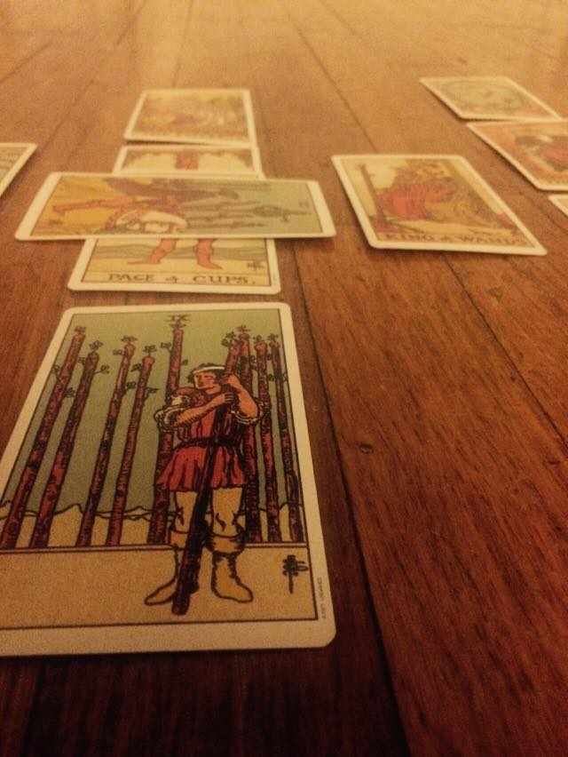
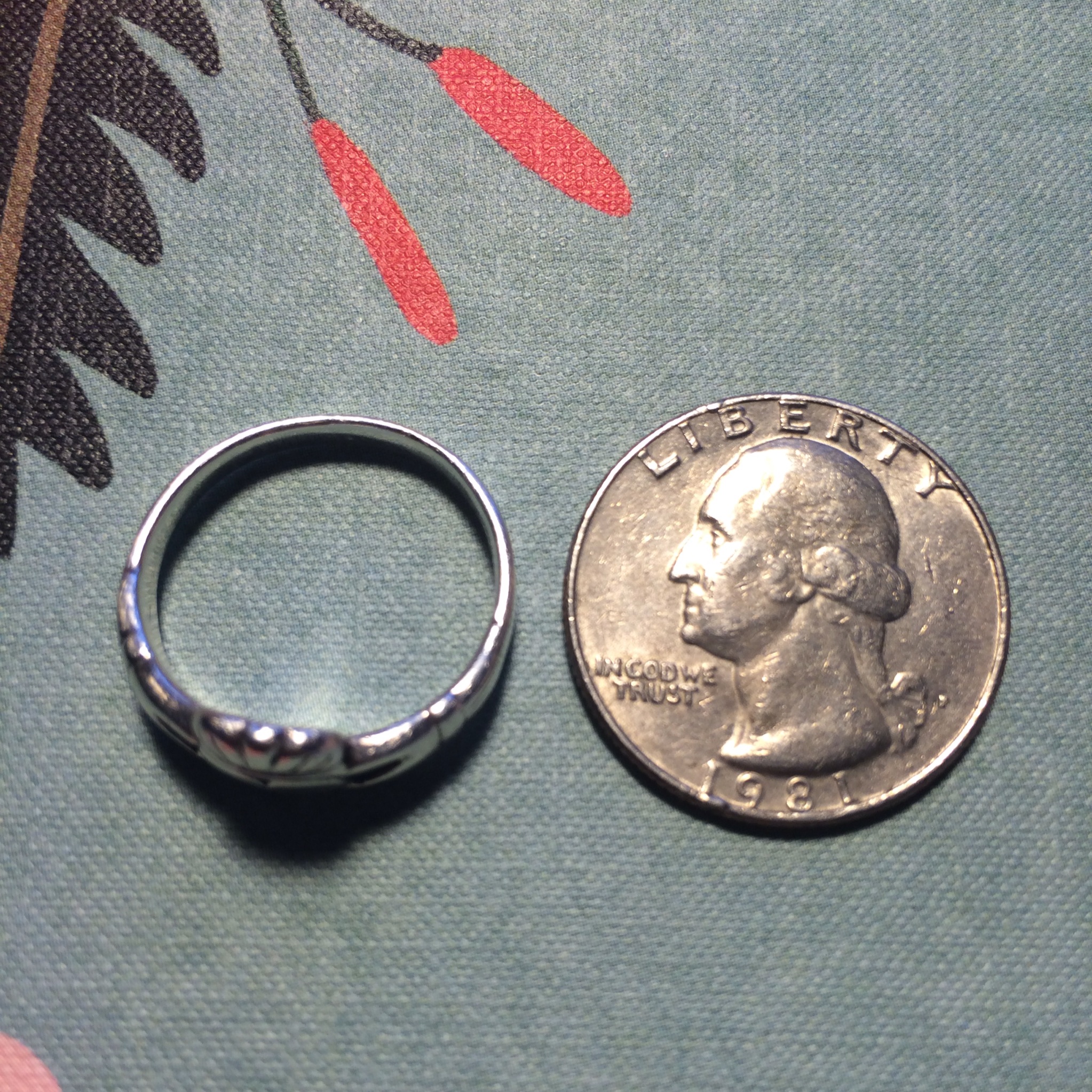
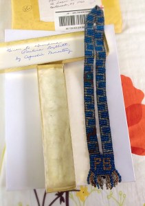
was mainly made with blue beads, but alternates in a maze-type pattern of silver beads with minor gaps of brown beads. Toward the bottom of the necklace is inscribed the initials PB, which stood for Paulena Byllott, my great grandmother. Just below her initials, the very bottom of the necklace is lined with beaded tassels.

Inside the golden box writes ” Given to Grandma Paulina Byllott, by Capuchin Monastery.” This necklace was a gift to her from a Monastery in Detroit, Michigan.

Up until the evening after our first class this necklace was sort of mystery to me. I knew it was a piece of jewelry worn by my great grandmother, whom I am partially named after (Caryn Paulena Byllott), but there was not much context behind who had given to her or why she might of received such a beautiful gift. However, through further investigation I was informed that a letter was sent to my family along with the necklace describing just that.

Paulina Byllott, who I mentioned above, was born in 1868 and immigrated to America in 1886 from Germany. She married in 1887 to August Byllott and lived on McDougall ave, which was walking distance from the St. Bonaventure Monastery. Apparently, they were both great benefactors and supporters of the monastery and the Capuchin Friars there as well. For years they walked to the Monastery at 6a.m. for Sunday Vespers and my Great grandfather, August was a occasionally an usher too. Additionally, August was a blacksmith by trade and made iron hooks that were affixed to the church and used to hold the doors open. Around the turn of the century this gift was bestowed upon Paulina by the other Capuchin Friars for her work and dedication to the church.

This necklace was sent to my family by relatives, whom I have never had the opportunity to meet, from Michigan. Two sisters, now in their nineties, who I have been told hold practically hold all the information regarding my heritage on my fathers side of the family.

Up until this point I have been rather blind to my heritage due to early passings of my grandparents and lack of communication among extended family. However, wIth this tidbit of information that I have recently received about this precious necklace, I am inspired to continue to discover more knowledge about my roots! I am planning on writing to these women in Michigan to voice my curiosity and interest in the past with the hopes of learning more and also making new connections with these members of my family.

1937 French Prayer Book

IMG_3715The black leather bound prayer book measures at 6 inches x 4 inches with a thickness of 1.5 inches. The front of the book is a simple, dark black. Adorned with five fleur-de-lis running down the front side of the book, the book shows some wear and tarnish. To any onlooker this book would seem meaningless from the outside. However, engraved faintly on the jacket in grey ink reveals “Requeil Note du Manuel Paroissial” or Parish Missal. The leather book is rough on the outside with vertical lines running across the book revealing a tough texture.

IMG_3753 By examining the book from the exterior, the pages are a bit auburn with traces of red. This prayer book was published in 1937, completely in French. The pages are worn in and seventy-eight later, are all in tact. The interior of the book is a flourishing mystery. This French prayer book belonged to my grandfather on my father’s side, Marguerite Renée  Costes.

Marguerite grew up in a suburb of Paris called Gagny, and this book would have accompanied her almost everywhere as for church was extremely important to her.The prayer book was given to my grandmother as a gift for her First Communion that she received at the age of 12 or 13. I don’t know who gave her the prayer book, but I’m pretty sure, after talking to my dad, that it was a family member.

IMG_3719On the second page of the book, my grandmother signed her name in beautiful neat script “Madame Costes.” The ink reveals perfectly shaped letters, and an air of pride in singing her name: that my grandmother was extremely proud to own this book. I love examining her signature. She put a dash before and after her name, as to proclaim its proud presence.

My father always tells me how beautiful and disciplined my grandmother’s handwriting was. Although only a simple ink writing, my grandmother seems to come alive through her signature.

IMG_3732Inside the book reveals a mixture of hymns and prayers. Within the 636 pages are a plethora of music notes and illustrated images accompanying many of the hymns. When I came across the prayer book, it contained a bookmark that opened to page 436 and this page is so fascinating to me. The page opens up to a hymn entitled Le ciel a visité la terre(Heaven visited the Earth) by the French composer Charles Gounod. After some online research, I came across a YouTube recording of the song from the 1950s that you can listen to here: https://www.youtube.com/watch?v=6dQIpFSTJZs .

I listened to this hymn on repeat as I wrote this blog post, I found it to be very beautiful. Alongside the hymnn lies an etching of an angel playing a guitar. An innocent and serene image, placed alongside a song about the sky and land gives off a very comforting feeling. The amount of detail and artistry that went into these various images throughout the book is striking. My grandmother was a trained concert pianist and I’m sure she played many of these songs at home for my father and his brother.

IMG_3725My grandmother held onto this book for her entire life. During the early 1940s, this prayer book accompanied her throughout her days attending Church. This book survived the Nazi occupation of Paris. My grandmother’s house was overtaken as a base for the gestapo during the Nazi occupation of Paris. My father told me that my grandmother had studied German in school, so when her family came home to discover their house was overtaken by the Nazis, my grandmother went to the Gestapo and demanded their house back in German.

Her courage and strength was monumental. And in the end, the Nazi’s gave my grandmother her home back. The fact that this prayer book accompanied my grandmother during this difficult time in her life reveals so much to me. This book must have provided my grandmother with hope and solace during those hard times, and I can’t imagine what she was going through. Music remained a steadfast passion and love for my grandmother throughout her life. This tiny little prayer book is an extension of that passion for music and song that my grandmother carried with her throughout her life.

By holding onto this book,I love to think about my grandmother’s life and her talents as a musician, mother, and individual.