My House Keys and Their Memories.

The object I chose to elaborate on and describe was from our first meeting in class: the keys to my house. They are 16 inches long and end at the clasp of the stretch-out twine, and another four inches are added via the attached mechanisms.

a frontal view of the keys

A heavy handful, when moved, makes a jangling noise. Beginning at the top of the twine, the lanyard is adorned with various materials, including enamel, metal, and plastic; all these textures and materials are formed into a specific shape. Fused to the back of the metal shapes are small needles completed by a rudder backing to keep them in place once poked through the material.

The twine itself is formed by a soft and sleek blend of fabrics. Imprinted into the twine are a series of patterns with the words “Van Gogh” perfectly spaced along the rope. In the background lie bits and pieces of the recognizable painting Starry Night. Blues, yellows, blacks, and greens all form in spirals as the painting takes shape at a glance. At the end of the lanyard is a linked half-circle metal shape, a circular clasp is attached, and a lever to the side allows the clasp to move within itself—open and close.

The attached keys *please don’t call the number, it is not ours anymore*

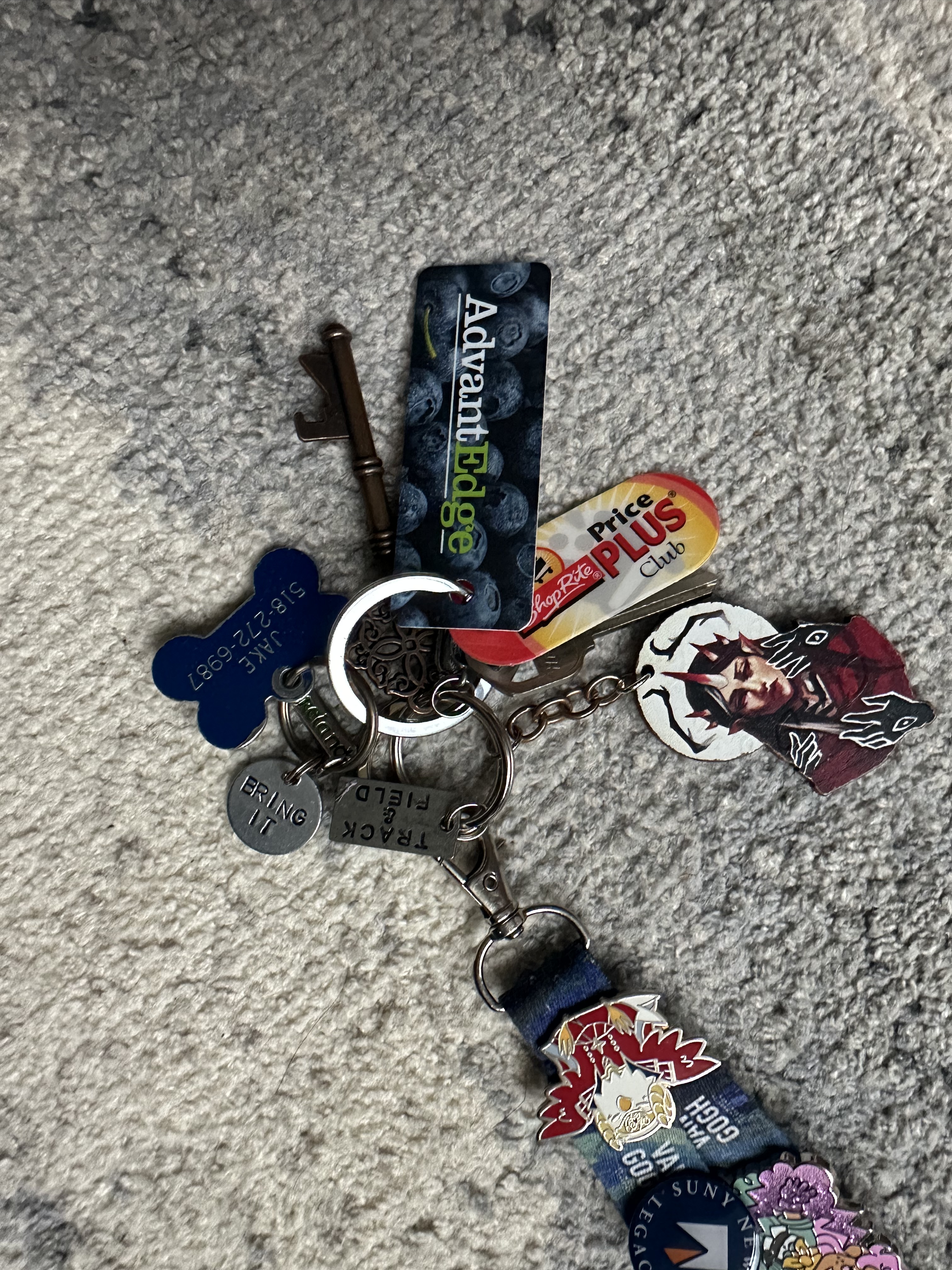
Shackled to the rope, are four circular rings, each able to be pulled to hook onto one another. A golden ring with six consecutive loops fixed together holds a humanoid figure with horns, brown hair, and black hands. The figure looks below, a stick-like design is presented over in the circular frame. Subsequently, another hoop is next. Three loops are locked together, one holds a key in the design of a lost artifact, bronze in color, and another is a bright silver key made from metal in the shape made for a lock, sharp and spiky by nature, with a windowish design on top. Alongside these forms, a circular metal says “BRING IT”, stamped by human hands likewise; a second medallion reads “Track & Field”. Alongside these two metal forms is a third bone-shaped metal tag, that reads “JAKE 518-272-6987”. Beside these metal medallions lie two oval-shaped plastic cards. They read “AdvantEdge” with “Advant” in white and “Edge” in green, with blueberries enveloping the background. On the flip side, there is a barcode and numbers on a white background. Paired with the second smaller card, adorned in red and yellow, reads “ShopRite Price Plus Club” with a shopping card logo. Similar to its partner, it has a barcode and numbers on the backside.

This section of the keys holds a minor part of its story, as it contains little moments from my life so far within the key rings. The small sports medallions all represent and are gifts from my senior nights of my played sports: “BRING IT” for my time as a goalie in lacrosse, and “Track & Field” for my time as an indoor and outdoor thrower. The shopping cards are all new, as they hold the rewards for my times shopping at nearby grocery stores — now as a college student. The dog tag belongs to my first pet, Jake. It was his first tag, and he has outgrown it. The number is an old landline my family doesn’t own anymore. Having this piece of him with me reminds me of him at home and how I miss him at college. The decorated keychain was a small gift from my brother on Christmas by my favorite artist Annadrawsstuff. Lastly, the keys, while one of them is my real key I use to enter my house, the other “older” looking is actually a bottle opener from a wedding I worked at. It was a party favor left behind, so in case of use, I took an extra.

Backside

Last but not least, the main element is attached in small quantities on the lanyard: pins. Nineteen in total, all ranging in sizes, shapes, and textures. Some are recognized shapes, while others are not so much. Starting from the bottom, near the metallic clasp: in a bird-like shape, a bird is posed with outward wings wearing an outfit of red and blue. It has a yellow crown and horns on its head; this is a character from a game I’ve played. Above is a small circle, dark blue with the SUNY New Paltz logo in the center, and the text reads “SUNY NEW PALTZ LEGACY” — my uncle/godfather attended the school, thus I am a legacy. Moving up, a butterfly sparkly, blues, whites, blacks, and moon phases adorne the bug – this was from a craft fair. Next, a large dark human figure wearing red and black holding scissors, they have a snarky face – this is a character from a show I watch. Above a white cat with a sword through its head, hovering over a dice with a 1 labeled on it; surrounding the cat, it reads “It’s fine. I’m fine. Everything’s Fine” – a pin that shows my love for D&D. Higher, another graphic depiction of a black and white cat with its paw outstretched, with letters that spell beans, under a spilled coffee cup in liquid spells “CAT CAFE” – a pin for my first time at a local cafe Beans! On top of this pin is a leaf-shaped dark and green plant with the letter NYBG – my first time at the NY Botanical Gardens. Next, a very tiny silver depiction of the Colosseum, engraved with small outlooks – this was from my trip to Italy. Next, another white cat is chewing on an orange fish – a gift from a friend. Lastly, on the right side is a color tube of paint, its cap black and body in an explosion of color with gold dots – this was a gift from an old art teacher.

Lastly, on the left side going down: there is an image of a yellow dog wearing a top hat, holding a mug in a dumpster on fire, with the quote “This is Fine” — a pin of my favorite internet meme. Below is a colorful pin with the logo for MoMA, my first time at MoMA. Under a black and white moth with flowers and leaves — another gift from a friend and my love of moths. Beneath a running red rabbit with wheat stocks inside — a purchase from a local thrift in New Paltz. Down a small shield-like shape, a golden touch lays inside with text reading “National Honors Society” “CSLS” — a member of the NHS for my academics in school. Below that pin is another human figure with pink and blue flowers around them, green hair and green clothes, holding a monkey spitting fire — another character from a show. Third to last is a similar circular shape with the New Paltz logo reading “New Paltz Honors Program” — I’m a member of the honors in my college. Second to last is a small, pink, shiny ribbon in the shape of the breast cancer awareness logo; this represents a fight for my friend’s mother, in which she sadly lost when we were young; we always partake in a walk for her every year. Lastly, another human figure, wearing a light blue dress, a white corset, and a yellow bandana; they have pink hair and pink lighting shooting from them. This creates a full circle around the Lanyard.

While I wish to explain and dive in more into my pins, there is only so much I can write for now as a first work in writing about objects. (I’ve definitely gone on for too long.) However, this collection has been with me for a long time, and each day a new pin may be added, which then means a new memory has been made.

Isabella Barcher

Great-Grandmother Olive’s Tablecloth

Top view of full tablecloth

The object I have chosen is a tablecloth embroidered by my late great-grandmother Olive, found by my sister during one of her many escapades through our cluttered, object-filled basement. Olive would make one of these tablecloths whenever her children or grandchildren moved out and into their own homes, hoping her gift would be of use in an unfinished home. These children, including my great-aunt Flo, whose house I now live in, opted for folding and putting away these clothes for fear of tarnishing their grandmother’s hard work. This is how Olive’s gift wound up buried in piles of old letters and trinkets until my sister unearthed it and claimed it as our new kitchen tablecloth.

The white, rectangular cloth is 65 inches long by 45 inches wide. The soft, vintage cotton is thin enough to allow light to shine through, especially when pressed against a sunny window. There is a distinct lack of holes in the fabric, no evidence of a mistaken stitch or accidental pulll of fabric. The outer perimeter of the cloth is decorated with half circles of small white stitches with lines that connect the edge of the cloth to the stitched circles, imitating the look of lace. From use and time, these loops have been misshapen and pressed, leading to some being larger or more spread apart than others.

Close Up of a Corner of the Tablecloth

Embroidered thread of blue, green, brown, pink, and yellow line the edges of the cloth. The embroidery is done in a pattern of small x’s, x’s which you only see when examining closely; from far away, they blend together into the design. The patterns done in blue, pink, and yellow are the same; the first three stitched “x’s” make a circle, which is placed within a second, larger circle of the same color. Both these circles are embraced by a half-circle-shaped group of stitches, resembling a simplistic yet colorful rose.

To each side of these roses is green embroidery. Unlike the blues, pinks, and yellows that circle around each other and remain consistent in shape, this green reaches out in different directions; there is always one long string of green stitches with shorter lines departing from it, coming together to form leaves. The green meets the embroidered brown, a collection of stitches that form small swirls. The swirls, one larger than the other two, face in towards each other. Just as they reach their peak, they collapse in on themselves.

This design repeats itself, the flowers changing between blue, pink, or yellow, the green and brown remaining consistent. In the center of the tablecloth is a similar design of flowers and leaves, organized into a rectangular form. In each of the four corners of this rectangle sits an imperfect circle of embroidery; yellow, orange, blue, and two different shades of pink form the shapes of roses, although larger than the ones boarding the cloth. Green thread branches out from the spaces between the flowers, continuing the look of leaves. The brown thread is again embroidered in the shape of swirls, although this time the swirls loop together in half-circle shapes to form an ovular border. Within this oval are small, blue stitches; some of these stitches are singular, while others are done in sets of four in the shape of a diamond. 

A Close-Up View of the Corner of the Center Design

The tablecloth is not a perfect white. There are some oil stains (admittedly from a messy snack of garlic knots that my sisters and I shared) and an unknown deep blue stain in the bottom corner of the cloth, about the same size as one of the smaller flowers. When turned over, the knots and stitches that hold together the design make it clear that, although the stitching is not messy, this was done by hand, without the help of a machine. Although I may be unsettling my ancestors through the staining of this object they tried so hard to keep as perfect as it was the day it was finished, Great-Grandmother Olive intended it to be used. Sitting at my kitchen table with my sisters, mom, and grandmother as we eat on this cloth is a celebration of our dear Olive’s work. She would be happy.

Una Taza de Café 

The comforting aroma of fresh coffee fills the morning air as my mom brews my grandmother her daily cup of coffee. As long as I can remember, my grandmother, Lola, would start her day with a hot cup of coffee in her signature cup. The cup is made of delicate white porcelain with a faded gold edge from years of use. Measuring two and a half inches tall and three inches wide, the size proved perfect; even in her final years, the cup fits perfectly in her frail hands. Even as Lola began to forget who she was and what was important, her cup of coffee in the morning remained consistent and something she always remembered. The saucer the cup lays on is 5 inches long, sharing the same delicate white porcelain and faded gold edge, with a slight chip on the edge from decades of love and use. The cup and plate both feature green and magenta roses, adding a floral accent found on many of Lola’s belongings.

Along with her cup and saucer is the rest of her collection of stuff to make coffee. Her colador, or cloth filter, measures eight inches long and four inches deep. The colador’s handle is white, with the cloth stained from coffee and a gradient getting darker towards the bottom, where Lola would use her hands to twist out the fresh coffee. There are two pots: the metal pot measures six by six inches and three inches tall, and the glass pot measures five by five inches and 3 inches tall. The metal pot where she would boil and stir her fresh coffee grinds has a rough feeling to it; there are cracks all around the silver body and a rusting handle. The glass pot is heavier and stained with a light brown film; there’s a spout on the edge, which she would use to pour out her freshly boiled milk. Finally is her tall kettle pot, storing all her freshly brewed coffee for the day. It stands just shy of six inches tall and five by five inches wide. There is some discoloration and fading of the metal, sharing the same rough feeling as the metal pot, and the handle stays held together with black tape. Lola would use all these items together in perfect harmony, as the sounds of the coffee grinding and boiling water created her melody. 

This set was eventually passed on to my mother. Entering the later stages of her life, Lola came to accept the kitchen was no longer a happy place for her but rather a source of stress. My mom wanted to give Lola the same sense of love and security she felt growing up, so she took care of her. Every day, she would use the same items to make Lola her coffee, remembering Lola’s joy in the kitchen and her smile while doing what she loved. Lola passed when she was 99 years old, after decades of the same routine, I wonder what everything looked like when she first got it. I wish I could ask her more about the story behind these items, why the handle has tape on it, or how her plate got chipped. Her cup now stays in the China closet in the dining room. It is one small piece of her, and it serves as a reminder of many things. It is a reminder of family, the safe place they create for you, and the love they have to care for you. A reminder to not take things for granted. That one day, we won’t be able to do what we love and will need to turn to the people we love for help. One day, you won’t be able to make your cup of coffee. 

Recording Memories: The Chi-Lites Album

Searching, digging behind numerous other records and vinyls in the back of my mom’s old storage unit, fighting against dust mites, is the first memory I have of this item. 

“It should be in there somewhere!” My mom had exclaimed from the opposite corner of the room, elbow deep in old vinyls and other items that were far too old to even name or even put an original story to. With my mother’s urges, I eventually found it, a black, surprisingly shiny, vinyl record with four men on its cover.

The disk itself was slightly poking out of the plastic casing, its scent being that of slightly burnt rubber — or something, amongst the record’s ribbed surface. But, regardless of its smell, my mother was quick to take it from me. After all, this was a record from her favorite childhood band.

That was nearly 10 years ago. I haven’t seen this record since I was 16. Since then, I’ve gone through my last two years of highschool, and 3 years of college. But it’s still just as shiny as I remember. 

My mother was excited when she heard about this project. she’s an avid collector and loves to show off her little trinkets. I chose to base it this project on memories that I recall my mother having about an object. Something older, something that has lived through much more than I currently have. 

For some reason, this record is what came to mind.

This record is approximately 12.25 inches long by 12.25 inches wide, with its thickness behind similar to that of a cellphone without a case (half an inch). The vinyl itself is much smaller, approximately 10 inches wide, with an inky black surface weathered away by years of past use. The casing is shiny with only a few scuff marks on its leftmost side. 

The record itself is black with a white and yellow band in its center of mass. On this band, the words “The Chi-Lites: Greatest Hits” are displayed in bright red letters. The record’s ribbed surface is slightly scuffed, having some of the original ridges worn away from years of use.

The front cover of this record, under the large “The Chi-Lites” title, features a photo of four men smiling as they look towards the camera. The names of the members of this 70s R&B group are as follows: Robert Lester, Eugene Record, Creadel Jones, and Marshall Thompson. 

These men make up the band called The Chi-Lites, a band that was put together in 1959 by Marshall Thompson, the group’s lead singer. On the record, the four men are shown all smiling. They are oriented in a diamond formation, with two of the members being at the same orientation on the left and right sides of the cover, and the last two members being on the top and the bottom of the piece. 

Robert Lester is the man on the leftmost side. He’s adorned in a faded yellow-brown blazer. He has a mustache, glasses, and is smiling.

Up top is Eugene Record, wearing a red hat and a large smile.

On the rightmost side is Creadel Jones, wearing a white hat and white suit with a brown tie.

On the bottom is Marshall Thompson, the band’s lead singer, who is wearing a white hat with a black stripe, and a black suit with a red undershirt.

Behind the men, there is a grid-like background, with the grid shape being dark in color, with white lighting protruding through the gaps in the grid.

On the bottom left corner of the record, there is a disc symbol with a lightning bolt. This lightning bolt symbol highlights the “Ultra Range Sound Process” utilized to create this record. This process is characteristic of Brunswick records, the record company who created this record.


On the back of the record is a series of record discs featuring the band’s other top hits. These hits, including “Have You Seen Her”, “Have You Seen Her”, “A Letter To Myself”,“The Coldest Days of My Life”, “Stoned Out Of My Mind”, and “Oh Girl”. All of these songs are exemplified on the golden records that are shown on the back of the record in a 4×4 grid pattern. This pattern takes up approximately half of the space on the back.

I’ve only heard this record being played. It’s my mother and this record that truly lived it — the record having corners fraying, peeling, and worn by age and constant touching. This record is a, no pun intended, record of something my mother lived for when she was younger. These were her songs. Everything this record is undoubtedly hers and all that she wished to be when she was my age.

This item is primarily a dark-colored, medium-sized record from 1972. But, even with dust coating its surface, the smiles of the members are blinding.

The Necklace I Treasure

By: Charlie S.

About a year and a few months ago, Eric made me a necklace out of some string he had lying around in his room. To me, this was a grand gesture of love and appreciation for our relationship even though we have a decent distance between us most times during the year. This necklace always reminds me of him and the memories we made when we were not so far apart.

Approximately 14 inches measuring from knotted end to knotted end, the necklace falls perfectly in the concave crater created by the merging point of my collar bones. The string, most likely made from cotton, has a rougher texture in relation to other textures of string, but has softened the more I wear it. It used to be bright white, but over the long year in my possession the twine has turned brownish-yellow from my constant insistence to keep it on at all times. There is a large knot on either end of the necklace, its purpose to keep the twine from unwinding. The ends of the knots have developed short, frayed tufts of freed twine that stick straight despite being soft to the touch. The bulk of the necklace, made from three individual pieces of string, is a braid, for the reason being that Eric is unknowledgeable in how to craft any other kind of strand out of twine. Its simplicity is obvious, but the tightness of the braid itself has maintained very nicely from the tediousness of Eric’s fingers, keeping the individual pieces of string taught in the making of the necklace.

Even though it functions as one piece of adornment, the necklace is made up of two separate parts: a longer, older gift, and a shorter attachment that came with something eye-catching. The longer piece of braided necklace was gifted to me about 2 months before our first parting for the academic year. The shorter segment of the necklace, that Eric carefully crafted a few months later, was created with the purpose of being a “unique” addition to my already existing piece of remembrance. Eric managed to attach a token to the separate, smaller segment of braided twine with some sort of knot I still cannot understand (and Eric is unable to explain). I believe this might have been a thoughtless recall of Eric’s knotting skills from his days as an Eagle Scout. The segment holding the token, somehow, precisely coiled itself around the original twine necklace, perfectly centered, and has cemented itself in that exact position. 

Eric eventually mentioned to me that the thing hanging from my new favorite necklace is a New York City subway token. This token being an object I had never known about until it was uttered into existence. Although the token was unfamiliar to me, I believed it to be interesting enough to wear around my neck for all to see. The token is round with a visible thickness to it, but not so thick that it is too clunky to wear around one’s neck. There is a pentagonal shape cut out from the middle, making it a perfect necklace charm. It appears to be smaller than a quarter, but slightly larger than a nickel. On the front facing side of the token it reads: “New York City Transit Authority.” The beginning of the statement is separated from the end with a small raised diamond, floating, spaced evenly between the first letter “N” and last letter “Y”. Behind the lettering is a diamond grid pattern that makes the words stand out against the monochromatic metal token. The words are surrounded by an outermost ring of smooth, unprinted metal and an inner ring slightly thinner than the outer one. Further within the slightly thinner ring is yet another ring, pressed flat enough to notice a difference in height between that and the previous ring. Repeatedly, there is then one more final ring that is the thickest in width and is raised to the same height as the outermost and inner raised rings. The final portion of the token is the center, where the pentagon shape has been pierced through a more flattened part of the token. On the opposite side, the alternating ring pattern is consistent with that minted on the front. The coloring of the backside is more greenish in contrast to the silvery front, most likely due to its age. The back also has another, differing set of words reading: “Good For One Fare.” This time, there are not one, but two raised floating diamonds: one separating the “G” in “Good” from the “O” in “One” and another separating the “R” in “For” from the “E” in “Fare.”

I have realized through this description I feel more of a connection to this necklace than some of my other pieces of jewelry. Because of the nature of its existence, this necklace never fails to make me smile each time I feel the cool, yet smooth token between my fingers. It reminds me that there is someone out there that cares about me.

White Beehive Tealight Candle

The object I have chosen to discuss is a white beehive tealight candle that I have owned for nearly a year. I bought the candle as a souvenir at the New York Botanical Garden in the Bronx. I thought it would make a pleasant display piece in my room, reminding me of the great time I had that day. 

The candle is a product of Rite Lite Ltd., which has been a leading manufacturer of occasion-based Jewish gifts, decorations, and more since 1949. Many of their white honeycomb beeswax candles are used for Shabbat and Jewish holiday celebrations. They are all allergy-free, petroleum-free, and biodegradable. The New York Botanical Garden Shop is a retailer of their products and includes their pure natural beeswax candles. By checking their website recently, I’ve noticed that they no longer sell this particular candle anymore. 

Frontal View of the Candle

Top View of Candle on Its Side

The candle has a rounded bottom and stands at 2.19 inches in height and 1.75 inches in diameter. It’s constructed in 7 tiers, where each tier gets smaller as it moves up from the base to the top. It is modeled this way so that it can resemble the shape of a beehive. The entire surface is adorned with honeycomb-like patterns that evoke the natural roots of the eco-friendly candle. Three parallelograms are engraved into the wax within each honeycomb, which is the shape of a hexagon. 

 The object also features a miniature, golden figurine of a honey bee lying on its surface. The bee has six legs and five sections indicating its abdomen. It also has two antennas and a set of long wings with two forewings and two hind wings. The bee’s body measures 0.875 inches in size and its wings measure 1.1875 inches. The bee’s body and wings are both made from a translucent, plastic material. The body has a golden hue of yellow, resembling the appearance of natural honey. The wings, however, appear as basic clear plastic. There are small linear markings on the wings of the bee, which were likely made during the production process. The candle itself is molded from a soft wax that is very delicate. If given enough pressure, the wax could be deformed by hand. The back of the candle is slightly dented, likely due to its fragility and being moved around. 

Bottom of the candle

Post-It and Craft Tape Attached to Bottom of the Candle

Beneath the candle is the coiled pattern of the wax as it is wrapped in a beehive shape. This feature is covered by a piece of a light blue Post-It that is cut out in an irregular circle. The circle was made to protect the bottom of the candle so that the natural wax doesn’t leave a residue on my desk. On top of the Post-It, there is a piece of ripped crafters tape with the date “9/20/23” and the number “326” written on it in black pen. 

The wick on all of Rite Lite Ltd.’s natural beeswax candles, according to their  ingredients list, is composed of 100% cotton and are lead-free. The top of my candle, however, has no wick. This unusual detail, including the date and number listed beneath the candle, are tied to the story from when I brought this souveniur back to school with me.

I went to the New York Botanical Garden with my roommate through the honors program at SUNY New Paltz. At the time, this outing was one of our first bonding experiences as roommates. We had only known each other for a couple of weeks, having met during Welcome Week and by living together for a short time. When browsing at the gift shop together, we both fell in love with the candle and agreed that it was essential for me to buy it. 

The beehive candle found a lovely home on my desk near all of my golden butterfly cutouts and faux leaves decorations. My roommate thought that it matched the aesthetic of our room very well. Unfortunately, its place there didn’t last long since it was taken away in the next Dorm Room Check. 

The candle was confiscated since they are a fire safety hazard in the rooms on campus. Although I bought the candle solely for decoration, I didn’t realize that having an unlit, wicked candle was forbidden. 

I had numerous conversations with the Resident Assistants and Directors trying to retrieve my candle. It held sentimental value to me and the day I spent with my roommate. After some time, they gave me the candle back but required me to cut the wick off. 

Even though the resident officials informed me about the potential risks of the candle when handing it back to me, the consequences of owning it still followed me and my roommate for months. Throughout the fall semester, we received several emails about our prohibited item and were even told to attend a private meeting with the Resident Director to discuss the seriousness of our situation. 

Owning the candle caused a lot of issues between us and the resident officials, yet my roommate remained kind and patient throughout it all. Despite not owning the candle herself, she didn’t allow the inconvenience of attending the fire safety lectures to affect her opinion of me. 

I see the candle as a symbolic representation of our friendship and my roommate’s character. Her patience and forgiveness during the situation allowed us to become great friends over time. She never got upset for having to face the repercussions of my own mistake. Instead, she chose to leave this moment in the past, which allowed us to bond over how much we had in common. Now, the candle has taken a deeper meaning than a small souvenir from our trip; it symbolizes our loyalty to one another. We’re always there for each other through moments of laughter, sadness, accomplishment, or distress. The bottom of the candle dates the time my candle was confiscated, which started the never-ending series of conversations with the resident officials. Today, my roommate and I can laugh about the situation and how my innocent mistake created our origin story as compatible roommates. 

Works Cited:

“Bee Parts: Anatomy and Senses of the Bee | Celebrating Nebraska Pollinators | PBS LearningMedia.” PBS LearningMedia, 2022, ny.pbslearningmedia.org/resource/celebrating-pollinators-bee-parts-anatomy-gallery/celebrating-nebraska-pollinators-image-gallery/. Accessed 6 Sept. 2024.

“Hanukkah Candles – Beeswax, Assorted Colors.” NYBG Shop, 2024, nybgshop.org/hanukkah-candles-beeswax-assorted-colors/. Accessed 6 Sept. 2024.

“View :: Rite Lite Ltd.” Ritelite.com, 2024, ritelite.com/Products/ProductView/Category/SHAB/4829. Accessed 6 Sept. 2024.

Vintage 1981 7″ Garfield Plush

Garfield Plush front view

When moving into a college dorm, there are only so many items you can fit into a handful of milk crates. Books, mugs, and posters are staples, but there’s only so much personality you can cram into a 6’ by 4’ living space—intentionality is key. One little buddy that came with me to this small public university was my vintage Garfield plush.

Made in 1981 in Korea, standing at 7 inches tall, weighing no more than a copy of Turtles All The Way Down from the local library, this plush lives on my desk, seated next to the six-year-old dollar store bamboo plant and a coin jar I repurposed from an old ice cream container. I purchased this version of Garfield from eBay for $10 back in April 2022. I find familiarity and comfort in this plush, hence why I will refer to this Garfield as he.

Garfield sitting in his usual spot, between the bamboo plant and coin jar among other objects across my college dorm desk.

The first thing to know about this Garfield is that he is orange. Not a dark orange like a tangerine, or a rich orange like a pumpkin—his orange is lightened by years of wear and tear, leaving him a bright yellow-orange. This is more noticeable when he is sat in areas of dull colors. Just under his eyes, across his face, his cheeks are a light tan color. His ears, head, body, legs, and tail are dusted black to make up his stripes, appearing very light but still noticeable. 

Another thing to know about Garfield is that he’s soft to the touch. His fur very short and coarse but clumped close enough together to resemble the texture of a tufted rug. If you were to squeeze him in any portion of his upper body, it would be the same as squeezing any other plush toy. However, when squeezing Garfield near his legs, lower body, or tail, he is much denser, and he makes a crunching sound from inside. This is the heaviest part of him, as the stuffing there is made of shredded clippings and ground nutshells. It is how Garfield can sit upright. Only his feet and tail are moveable, though they are firm stitched to return back to their original position once let go. Otherwise, he has very few moving parts.

From the corners of the base on either side of his ears, three black strands of thread stick out, making up his whiskers.  He is completely furry, save for his eyes and nose. Those are hard pieces of plastic stitched and glued into the fabric. His circular eyes are painted, glossy and half-lidded, with minor scuffs and chips; they are only slightly separated by a thin line of fur, disconnecting his eyes, a contrast to typical comic depictions of the cartoon cat. Garfield’s nose is a much smaller oval shape and a very light pink. This nose is disconnected from the eyes, but at the very bottom, a thick black thread emerges, diverging two ways from that point and stretching a curl across his face, making up Garfield’s smile. That very same type of thread makes up his whiskers (mentioned previously) and marks the indents between his toes.

Garfield Plush side view

Now this all sounds like the making of America’s famous cartoon cat, but what makes this particular plush different is that he is a chef. Garfield wears a small white bib, a piece of felt sewn onto a white ribbon tied around his neck in a double knot. Though it has the capacity to become undone, the bib remains. In magenta text, center-aligned and in all-caps, the bib reads, “I LOVE LASAGNA!” He also had a hat, a small, white, thin piece of fabric stitched to make a chef’s toque. The hat has no stuffing, stitched into the back of Garfield’s head and right ear. Though the original plush had more stitches, they have since broken, and the hat is only held by two white threads, one in his ear, the other just halfway down his head. 

Being a vintage plushie, this particular Garfield is also made of what he is not. Newer/minted versions of this plush still retain the original tag, a red paper tag held by a thin piece of plastic hooked into his ear. The tag featured the comic version of Garfield, with a thought bubble reading, “Take me home…feed me.” On the back, instructions and other information on caring for the plush is listed. This tag did not come with my Garfield, but it is one I knew he once had. (Seen below is an eBay listing for this Garfield that has the original tags).

This vintage Garfield plushie is one of tens that circulate the eBay market, but I was drawn to him for his size and charm. He was the perfect pal to have throughout high school, and now to bring to college. He brings me back to a time when I was 11, voraciously consuming every comic I could all the way back from 1978; he reminds me of my special interest from so long ago, coming back in a new way, in a new body, in a new little chef’s hat.

Cat on a Cozy Chair Tiny Teapot by Rose Ruocco

This ceramic teapot sits at only 3 inches tall and 5 inches wide including its handle, with a volume of roughly 22 cubic inches. It’s extremely light and delicate to handle, with a smooth, glossy surface all around.

from the front

The pot is shaped as a chair, with curling armrests and a creased back. The chair is white with a floral pattern, with repeating pink petals and green stems that continue onto the spout and the handle. On the right side of the chair lies a one inch pillow, pinched in the center, with a green trim and pink interior design. To the left, a round one inch cat loafs, completely white except for its painted face- two eyes, a dot of a nose, a small curling mouth, and six whiskers, three on each side. All of this comes together to depict the scene of this white cat sitting nicely on a cozy chair.

from the top and from the back

On the bottom of the object, a small gold “made in China” sticker sticks, and engraved in the ceramic are the words “TEA-NEE TEAPOTS CARDINAL INC. c 1995” and a “B” that resembles a type of signature in the bottom right corner. There is also a dark spot in the left bottom corner.

from the bottom

This tiny teapot was found by me in the abandoned downstairs kitchen of my grandfather’s two family home. He was helping me find any old pots and pans I could take from him for my new apartment, and while tracing my eyes over the scattered toys and papers left on the kitchen table, I spotted the white cat’s tiny face. I showed it to my grandfather, who replied “Oh yeah, look at that” as if it was the first time he’d seen it. I asked if I could take it, and he happily gave permission.

A clue to who may have used this teapot lies in the engravings at the bottom. Though I previously suspected it was solely my grandmother’s, the date 1995 suggests that perhaps my mother was the owner, though she only seemed to half remember the object when I showed it to her. Regardless, there is no true way of knowing and there are endless possibilities of who may have purchased it or who it was from, like one of my grandmother’s friends or close family members.

Now with it in my possession, it sits neatly on the corner of my desk, amongst various other knickknacks and figurines. When peering inside the vessel, its age and its history of use can be predicted by yellow discoloration, and the years of non use is shown by the dust and small debris lining the bottom. Despite my cleaning it, I don’t believe it’d be very safe to drink from after spending a large bit of time sitting in the musty downstairs of my grandfather’s house. Because of this, it seems its days of being used as a teapot have ended with me, or perhaps until it belongs to someone else.

Rose Ruocco

Mother’s Yearbook

I didn’t realize that my dad’s old yearbook collection would come to great use of mine when starting this class. Digging up my mom’s old yearbook from her graduating year of 1987 was mesmerizing to me. I never bought any of my yearbooks from high school, which I painfully regret now looking back at this fond memory. I was able to sit down with my mom and reminisce in what it was like for her in high school. Knowing that my family history started in Kingston and most of us still live there today is extremely intriguing. Having everyone gone to Kingston High School, it’s crazy to look back at what’s changed and seeing what’s been there for generations. My high school memories are years I am very fond of but being able to relive them through my mom was truly special to me.

When taking a closer look at the book itself, it’s about 12 inches in length to 9 1/2 inches in width and 1 inch in depth. It has a cream colored base with a maroon engraving of “Maroon 1987” and a distinguished maroon bordered rectangle on the front cover. As the book is 37 years old it has a worn look to it. It has developed a yellowish tint, specifically inside the maroon rectangle on the front and yellow-brownish spots along the middle and edges of the book. There are a very minor cracks and dents which is impressive for how old the book is. It was safely kept on a bookshelf in my dad’s house for 37 years. I’m impressed by the upkeep of the book, especially the pages in which the book is 320 pages long. They are thick felt pages that have a squeak when grabbing or turning the page. They are very glossy in which they reflect brightly when under strong light.

It’s crucial to remember that the yearbooks in this time were in black and white. In pages 1 through 15 of the yearbook, they give us some vibrant colors that are very expressive to the pictures that were used. Most are candid photos of students involved with the school whether that’s inside or outside the campus. The school portraits are everything that I’d envision an 80’s yearbook to be. Everyone in their senior portraits look like ghosts and had the most insane 80’s hairdo. My mom wasn’t fond of how her hair looked in the 80’s so she’s definitely embarrassed by this photo. My mom’s name is Robyn Finch and had short brown hair with curls that were given to everyone in my family but myself. She was wearing her black v-neck gown with a white strand of pearls around her neck for her senior portrait. Her head tilted slightly to the right as she looks past the camera with her piercing green eyes that were given to me.

One of the very first pages of the book is a picture of the Broadway side entrance of Kingston High School. The image was taken at night so the medium sized black lampposts with four sphere shaped lights in a diamond is shining the light upon the entrance. With a castle like figure, two vertically striped tan columns are withholding the triangular shaped roof with black embroidered letters that spell out “Kingston High School”. The doors that are at the end of two brick staircases is a rectangular shape with a semicircle on top grand entrance. The semicircle is divided into three sections with glass panels in between, just above the matte black doors that have eight square glass panels as well above the golden handles. Layers of brick are aligning the door and underneath both columns next to the black lampposts.

In discovering all the in and outs of my high school, it’s so fascinating to me that every person in my immediate family has history here. Being able to rediscover the activities including the sports teams and the music program is something that I’ll always carry with me. Not that I’m so certain I’ll be living in Kingston for the rest of my life, I know that I’ll always have a place to call home.

Heater and Cool Fan

ShirEl Wolfstein

Front View of the fan, Black electrical cord wrapped around the base.

Aerial view with front facing down, Control panel.

Back view

I decided to examine a fan my mother gave me on the first day of college with settings for both hot and cold. I see her specifically looking for a fan that is able to emit both temperatures such a subtle and thoughtful gesture, as I had told her that college dorms tend to be sweltering year round yet she still wanted to make sure I was warm and had options. Sitting in front of my little heating fan reminds me of her space heater when I was little and had barely any heat in her room, tucking our toes in fluffy socks in front of the heater while she did our nails and told us stories. What a subtle way to bring me comfort, but so effective. 

The fan is a matte gray plastic, the surface texture smooth, the shade of gray light with a warm undertone. The sides are rounded to match the motion of the blades but the top plateaus for a surface on which they dials lay. Around the two knobs is a black matte plastic piece with symbols in light gray describing the settings. One knob controls whether the fan is off, blowing cool, heat, and extra heated air, and the other is designated to determine the intensity of the blades and therefore air blowing. Between them is a small circular light. It is red and allows the user to be cautious should the fan be hot. 

Along the right side of the fan, given that the fan is facing forward, are small indented stripes like ribbing seated horizontally.  The left side is completely smooth, save for the indentations made for screws littered around the perimeter of the main fan. 

There is a small crack bisecting the two halves of plastic that make up the front and back half of the main plastic casing. The front piece of plastic that serves as a grate before the fan blades has a unique pattern, with lined arcs curving towards the left as they stand almost vertically. There are other pieces that mimic parabolas with their open side at the left, and one solid line extending horizontally like an equator to the grate. Directly at the center of it all sits a circular logo of the seller.

The back grate vastly differs from its counterpart. The plastic is arranged in evenly spaced and weighted rings, with arcs extended counterclockwise towards the outermost border and originating from the solid plastic circle sitting in the center of the grate. This circle remains blank aside from screw holes lined up vertically. 

The fan has a small flared base to ensure the device can stand alone and keep the fan secure. The black wire of the fan is most of the time wrapped up on the thinnest part of the base, keeping the fan as small as possible, taking up as little space as I can in my already very cramped form rooms.