UCB Comedy Sticker

The item I have chosen to describe is a sticker that I acquired this past June at the Del Close Marathon in New York City.  The sticker is specifically from The Magnet Theater, where I spent the majority of my time during the 10 hours in which I attended the improv marathon.

The sticker measures 4” long by 3” tall and is less than a 32nd of an inch thick.  The front of the sticker has a very plasticky feel and, while it looks flat, if you run your finger over it you can feel that the plastic is raised in several places.  The item appears bent in several places and no longer lays completely flat. The back of the sticker is covered by a material that feels similar to cardstock. Two pieces of this material cover the back of the sticker and can be peeled away to reveal an adhesive substance that will allow for the sticker to stick.  However, the white cardstock material remains intact.

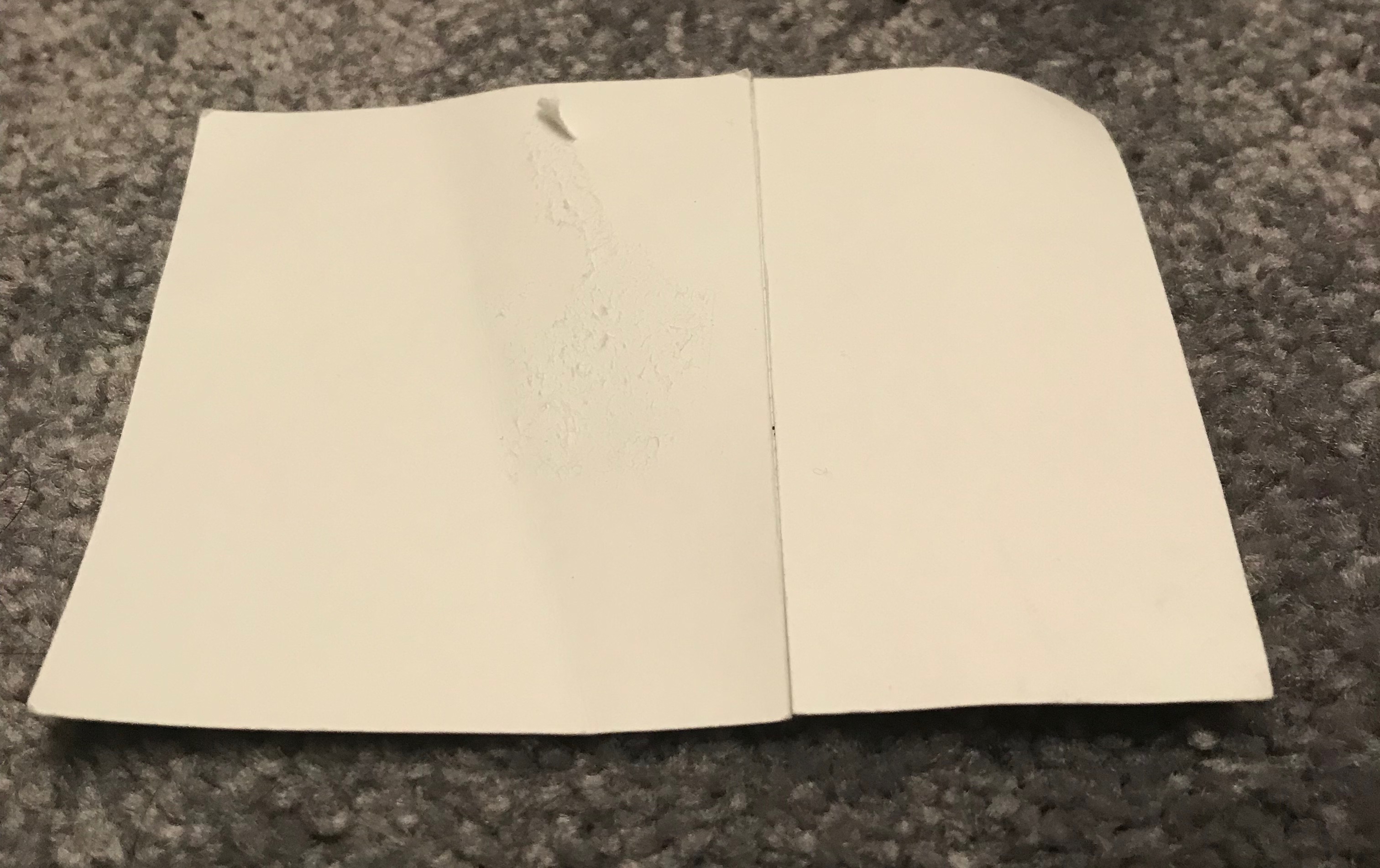
Upon further analysis of the two back pieces, it can be seen that one of them is quite worn and a layer has peeled off, though it still protects the adhesive.  This wear comes from tape that had been placed on the back to hang the sticker on the wall without having to remove the cardstock. Tape was used so that the function of the sticker would remain and it would be usable on a future surface, as I move locations approximately twice a year in New Paltz and want to use this sticker as a decoration repeatedly.  If the cardstock is removed, the adhesive will likely work effectively only once and will be difficult to remove cleanly. If I peel back the cardstock I can feel the adhesive. It is quite strong and feels glue like. It could likely remove paint from something if stuck there and later pulled off.

The front of the sticker reads “UCB COMEDY”.  This print covers a little over half of the surface.  The letters “UCB” are tan and rest on a black background.  The word “COMEDY” is also written in a tan color, but lays on a red background.  In smaller font on the bottom of the sticker, it says “UCBCOMEDY.COM” in tan and on a black background.  The purpose of this print is to direct the public to a website explaining what UCB Comedy is. The letters “UCB” stand for “Upright Citizens Brigade”.  The Upright Citizens Brigade is a comedy hub dedicated to original comedy. Each of the printed letters is raised slightly and you can feel each individual letter when running your fingers across the sticker.  

In the top left corner of the sticker, some semblance of a human face can be seen and is created using a tan and black color scheme.  There are very thick glasses perched on a sketch of a nose. This image is the symbol of the United Citizens Brigade. This symbol is also the one that my improv troupe, TBA Improv, has adopted. The similar symbols make this sticker even more meaningful to me.  While this object may not be old or objectively valuable, it is extremely valuable to me. It reminds me of arguably one of the best nights and most unique experiences of my life to date. It is also a memento of an experience I will likely never have again, as the marathon is moving to California next year.  It is a reminder of the only time I have ever performed and probably the only time I ever will perform on a New York City stage, at one in the morning, with several close friends. It is a sticker. It isn’t worth much money, if any (I got it for free) and yet, it brings me so much joy. I intend to bring this sticker with me wherever I move and hang it up on display so that I can look at it every day.  This sticker reminds me of a night that I will talk about for years to come.

1907 Silver United States Barber Dime

I have decided to talk about a pure silver dime that dates to 1907. I found this coin while working at my summer job, where I was given the task of fixing a mechanical issue in a vending machine.

While I am not a coin collector, I do dedicate a lot of my free time towards understanding United States history, specifically focusing on the Progressive Era. When I found this dime jammed in the coin mechanism of a vending machine, I immediately realized it wasn’t an ordinary dime causing the machine to malfunction. One of the stark differences I immediately noticed was that this dime did not have President Franklin Delano Roosevelt embossed on the head of the coin; rather, a Greek or Roman figure appears on the head of the dime (reference figure 1). I wasn’t sure if this was a common coin design at the turn of the twentieth century, or if I had stumbled upon a diamond in the middle of a haystack. Upon further research, I discovered that the coin was mass produced (3.1 million copies, roughly) in the San Francisco Mint, the same Mint that produced dimes with similar designs from decades earlier, and the coin was designed and approved in 1907 by Charles E. Barber, the sixth Chief Engraver in the United States Mint, hence the name Silver United States Barber Dime (1907-S Barber Dime 1).

Figure 1 – The front of the 1907 Silver United States Barber Dime

Another observation I made was the lack of a Latin inscription on the Barber Dime. In figure 3, I have photographed the back of a dime that was produced in 2000, and if you look closely, the following phrase, E Pluribus Unum, is engraved on the tails side of the dime. This phrase translates from Latin to English as the following: Out of many, one (E Pluribus Unum 1). I found this to be a strange discovery, considering the Latin phrase has been required on all United States coinage since February of 1873 (E Pluribus Unum 1); what is even more perplexing is when I analyzed photographs of the same coin (other copies in mint condition), I still could not identify the Latin phrase. I am under the impression that even though these coins are deemed to be in mint condition, there is the possibility that the inscription slowly faded away over the course of its one hundred and twelve years of existence. The only words which appear on the dime consist of the currency value (ten cents) and the word liberty. I realize from the photo provided in figure 1 it may not be exactly clear where the word liberty appears, but it’s supposed to be engraved in the headpiece that the Greek or Roman figure is wearing on the heads side of the dime.

Figure 2 – The tails side of the 1907 Silver United States Barber Dime

Figure 3 – The tails side of a modern day dime (the dime was produced in the year 2000)

At the beginning of this assignment, I was concerned that I would not have enough information to analyze. However, to my surprise, after comparing with modern day currency and researching the history of United States coinage, I was able to see stark differences in the way currency was produced at the turn of the twentieth century. After extensive research and analysis, I can say with absolute certainty that I have a new-found appreciation for this dime. While this coin might not flood my mind with wonderful memories like my New York Yankee shirts, I feel like it provides me a small connection to my great grandparents, both of which I never met. Once my great grandparents immigrated to the United States in 1899, this was currency that they most likely used to purchase groceries, clothing, or coal. Unfortunately, my family does not have a significant number of items passed down from their generation, so while this is not a direct family artifact, it still reminds me of my family heritage.

Works Cited

 “1907-S Barber Silver Dime.” Littleton Coin Company, Littleton Coin Company,     https://www.littletoncoin.com/shop/ProductDisplay?storeId=10001&catalogId=29555&r eferralCode=WRB&productId=18058&gclid=EAIaIQobChMI_6eGvfSd4AIVgo-            zCh0ifwR2EAQYAiABEgLZI_D_BwE. Accessed 3 February 2019.

“E Pluribus Unum.” United States Department of the Treasury, United States Department of the    Treasury, 30 November 2010, https://www.treasury.gov/about/budget-            performance/strategic-plan/pages/dlinks.aspx. Accessed 3 February 2019.

The Book of Inspiration

The Book of Helen was created by my camp kids from last summer. I had written them all letters in the beginning of camp so they decided to return the gesture at the end. I participated in an international summer camp called SIG. SIG stood for Summer Institute for the Gifted. These students ranged from 11-15 years old. They all had to apply in order to be accepted and many of them had to be in the 95 percentile. That summer, SIG took place at Princeton University and it was such a gorgeous campus. I had eight students of my own who I spent three weeks with.

Cover page of booklet

This book is comprised of eight entries, each with their individual responses to me. The cover page is hot pink and the pages are alternating yellow and neon green. On the cover page, “The Book of” is in black ink and “Helen” is in blue caps. The subtitle says “Summer of 2018” in black ink. The bottom of the cover page listed all eight authors. The pages, along with the cover is 8.5 inches by 11 inches. The last page is also hot pink and it has my turtle door tag on it. I had made all my students turtle door tags because our hall was “underwater” themed. Each page displayed a different kind of handwriting, each unique to the individual who wrote to me. Some of the pages had drawings at the top, bottom or side to illustrate our times together or individual conversations we had. Some handwriting was neat and big while others were big and had to read. Some pages were decorated with colors of the rainbow and written in gel pen. The writing in gel pen sparkled under the light. One student had cut out the bottom of the card to make a heart and had decorated the borders with lines.

Turtle door tag

I had an amazing time that summer and this book will forever remind me of those moments. They wrote about the stories I would tell about my life because I wanted them to know that even though I was older, I can still relate to them on some degree. We had many talks about school, careers and boys. The student on the first page wrote about how she was going to miss the patterned knock on their door every morning to make sure they were awake. She even drew a sequential picture of how they were late on one of my day offs. It says, “We woke up late, we missed you and we were malnourished”. The second entry was longer and about how she was nervous coming to sleepaway but I was always there whenever she needed me and she appreciated that a lot. She even mentioned the night I was on duty and she wasn’t supposed to be showering, but rather in bed, and I warned her to rush back into her room. At the end of the entry, she wrote “You were like my second mom, thanks for taking care of me!” The third entry will always make me laugh because there was a running joke that I didn’t socialize enough in my life so therefore I was a “grandma”. At the bottom, she wrote “Never grow old Grandma Helen”. She also wrote that she wished she had more space because there was so much still unsaid. The fourth entry was a girl from India. She was so different and energetic. She wrote about how I would always laugh with her when she performed her ice skating routines. These “ice skating routines” were where she swirled around and around twirling her legs until she was super dizzy and would fall. It seemed that she was always on a sugar high and that kept the rest of the group going. She ended up going back to India and I will miss her a lot.

Eight entries all written by my girls 🙂

The fifth entry was written by a girl from Russia who was staying in the local area with family. She was a commuter but nonetheless, part of the family. She wrote about our trip to NYC and how she enjoyed every minute even though it was chaotic. At the bottom, she wished me all the luck in my teaching career because she had no doubts that I will be great. The sixth entry was written by a girl who gave me the hardest time at camp. She didn’t respond well to authority and it took some time, but I slowly won her over. In her letter, she apologized for all the times she was difficult and wished me all the best in the world. I appreciated it and accepted her apology. The last two entries were written by two international students from Asia, one was from mainland China and one was from Vietnam. The girl from Vietnam also wrote about our adventures through the city and the local town of Princeton. The girl from China wrote a short letter, but it still warmed my heart. She had came to me towards the end asking how she could apply for this program next year and be my student again. I gave her all the proper resources since I wasn’t sure of the progress. She compared me to her sisters back home and loved that I reminded her of them.  

I realized that even though we took our separate ways and there were a lot of tears on the last day, this isn’t the end. This book will forever be a token of my experience, something I hope to do again in the future. Mementos such as this one, will continue to inspire me to pursue teaching. I hope to come back in another summer and maybe I will see my girls again. I told them that maybe one day they will see me on the streets and recognize me. I told them that they had their whole lives ahead of them and maybe one day we will bump into each other on a corner or street. The international students can travel to America and I can travel abroad. Destiny works in mysterious ways and you never know, we may cross paths again.

My Grandmother’s Recipe Book

My grandmother’s recipe book

The object I have chosen to describe is the recipe book that belonged to my grandmother, who has passed away and so the book has fallen into the possession of my mother.

This recipe book is fairly small, measuring 6 ¾” tall, 5 ½” wide, and approximately ¾” thick. It is very light; I find it fascinating how an object I perceive as containing such a wealth of information manages to seem practically weightless. The cover of it is made of a thick cardboard material with a smooth, glossy look that has been dulled and yellowed over the years. On the cover, an image of a wide array of food set on a table is depicted, with the word “Recipes” in the top right corner. The spine is beginning to crease and crack in some places after being opened and closed many times by many different hands.

The inner pages separated from the cover (left inside cover reads “1 stick – 1/2 cup”)

The inside of the cover is peeling away a bit from the edges, and there are some yellowing stains, either from age or perhaps recipe ingredients. Handwritten by my grandmother on the inside cover is: “1 stick – ½ cup” (referring to butter measurements). The book is divided into sections with tabs made of slightly thicker paper that designate each category of food, such as “Soups and Sauces,” “Meat, Poultry and Fish,” and “Cakes and Pastries.” Each section consists of small, yellow lined notebook pages. The inner binder holding the pages together is made of thin white plastic; now, the pages are a bit hard to turn and some are beginning to fall out. Upon further inspection, I realized that the pages are actually fixed within the book with a cardboard insert on the back cover and can be removed.

What is notable about this recipe book is that the main food categories (soup, meat, fish, and so forth) are completely empty. There are only recipes written in the “Candy,” “Desserts,” and “Cookies” sections, clearly implying that my grandmother was a huge fan of baking and not as interested with cooking (the “Cookies” and “Desserts” tabs are actually more wrinkled and seem more physically aged than the other tabs because they have been handled so much more). As a result of my grandmother’s inclination toward baking, there actually are not many recipes at all in this book, but my mother and I still regularly make some of the cookies and breads that my grandmother scrawled in cursive across the small pages.

My grandma’s “Peanut butter swirl bars” recipe (for some reason, this recipe is written in the Candy section)

Although my mother and I have had and used this recipe book for years, I actually felt a deeper connection with it after taking the time to carefully depict this item in great detail. Measuring it, running my fingers over the cracks in the spine, and feeling the slight texture of my grandmother’s handwriting on the pages made me appreciate that this object has held together so well for so long. That is not to say that it’s perfectly preserved – there are a couple of faint stains on the pages, certainly from minor spills of vanilla extract or batter, now commingled with the other ingredient smudges left by my grandmother when she used this book and mixed together the components of her pumpkin bread or gingerbread cookies years ago. Baking is something I have always loved, and I hope to be able to pass this book on to my own children one day.

Course Blog #2: Upright Sohmer Piano

Towards the beginning of high school, I had developed a deep passion for music. In order to supplement this passion, I began learning to play the piano on a fairly cheap keyboard I had received many years ago as a child. Eventually, the mundane nature of the instrument began to hinder my musical growth. In spite of this, during the fall of 2015, my parents and I decided it would be appropriate to purchase a true, acoustic piano. Following months of research, planning and dedication, we had finally found an instrument for a fair price that would suit my musical needs as a pianist. Consequently, for this week’s blog post, I have decided to write a detailed description of my personal upright piano.

A full view of my Sohmer Upright Piano.

For starters, it is important to note that this piano was assembled by Sohmer & Co., a piano manufacturing company founded in New York City in 1872. This logo can be seen on the front side of the piano right above the keys. The first aspect of the object an individual may observe is the rectangular shape the instrument conforms to. In addition, closer inspection reveals that the object measures 40 inches high with 59 inches defining its length and 25 inches defining its width. Although I am unable to give any quantitative information on its weight, I would roughly estimate that the instrument weighs somewhere between 500 and 600 pounds.

Moreover, the entirety of the piano, with the exception of the keys, is composed out of a dark brown wood that has been finished with polish. This ranges from the lid of the piano, to the music rack (the shelf that holds the sheet music), to the fallboard (the backboard directly above the keys), and to the legs and lower panel of the instrument.

Inside the top portion of my Sohmer Upright Piano.

Upon opening the top half of the piano, more insightful information can be collected about this object. First of all, it is important to note that the piano has a total of 88 black and white keys stretching across its surface, and when pressed, the keys lift hammers inside the piano that strike strings which allow it to produce its distinctive sound. Despite the fact that the piano utilizing strings to create sound and has more strings than any other string instrument, the piano is actually classified under the percussion family of instruments due to pressing the keys with your fingers, rather than plucking the strings.

Furthermore, based on the image of the piano’s interior, one can notice that the strings vary in thickness from one side to the other. This difference in thickness is what causes each note to produce a diverse range of pitches that, when harmonized, creates the everyday music that we are so accustomed to. In addition, one other critical part of this object I want to explore are the metal piano pedals that are located near the bottom of the instrument. In total, my upright piano has a total of three pedals: the soft pedal, the sostenuto pedal and the sustain pedal. These three pedals help to define the image of the piano as well as its functionality as an instrument.

At first glance, a piano can be seen as simplistic; despite this, if one takes the time to fully observe and analysis this object, he or she will discover the many complex structures that compose this instrument in its entirety. After going back and taking these seemingly trivial observations into account, I can say with confidence that observing my instrument in greater detail definitely led to an overall greater appreciation for my piano. With that said, I look forward to exploring this object in even more detail in my next post in where I describe other aspects on this object such as its history and overall function.

World War II Navy Medals and Case

The cast from the front
The case from the back

The case from the side. Quarter for scale.

I decided to describe my grandfather’s World War II medals, which were passed from my grandmother to my uncle, who had them framed as a gift for my mother.

The case is wood, based on the high-pitch door sound it makes when knocked on gently, and has a thin coat of yellow metal that feels like brass. A thin layer of glass protects the three bronze medals, which have 1.75” ribbons and are pinned to indigo fabric. It also contains his insignia and a plaque bearing his name. The case is 8” long by 6.5” wide and 1.5” thick.

Looking at the side, it has a rounded inset and a ridge can be seen at each corner where the the frame pieces meet. The metal coating is beginning to wear away on the side shown, and some darker spots can be seen along the outer edge.

The back of the case is made of thin card stock, with a metal bracket at the top, and two rubber stoppers at the bottom corners, allowing it to be mounted to a wall. There is a thin sheet of paper over it that can be pulled off slightly. It also has a stamp on the back that reads “Custom Framed by Skyline Gallery and Framing,” along with a phone number and a Texas address.

In more detail, at the top of the display is a badge 1.5” wide by 0.5” tall, bearing a bumblebee holding a wrench and what looks to be a machine gun. This rests atop a saber and rifle crossed over an anchor, and behind it all is a field of leaves. The badge is made of a metal silver in color that has a luster akin to steel.The leftmost medal has a blue ribbon adorned with black, white, and red vertical stripes. The ribbon is about 1.75” long and 0.5” wide, as are the other two. The medal itself looks to be made of bronze, with a brown color, and has the image of a plane overhead and a sinking submarine in the foreground. The words “American Campaign” circle around the top. It has roughly the same diameter as a dime.

The center medal has a yellow ribbon again with red, black and white stripes. It has the image of soldiers and a palm tree and the words “Asiatic-Pacific Campaign” embossed on it. It looks bronze like its neighbors, and is of identical size. To the right, the last medal is slightly larger than the other two has a large central red stripe and rainbow stripes on either side. It has a man with a dagger stepping on a helmet, and reads “World War II”. This medal is slightly larger and thinner than the other two, about a nickel’s diameter but almost paper thin.

Under all three medals is a steel plaque with my grandfather’s name, “Charles G. Riccio, US Navy” engraved into it. My grandfather died in 1992, so along with a few pictures these are all I really have of him. They usually sit on my mother’s dresser, and have a solemn presence that instills in me a sense of longing and of pride.