A Clock with Two Faces

The grandfather clock stands auspiciously in the entrance hall of the Deyo House, replacing a similar clock that historically would have been there. The case is adorned with columns and brass spires, coming together in a curved crown. Its early 19th century English style displays the Deyo’s American heritage and wealth. While it now tells the history of the Deyos, the clock also has its own unique story.

Description

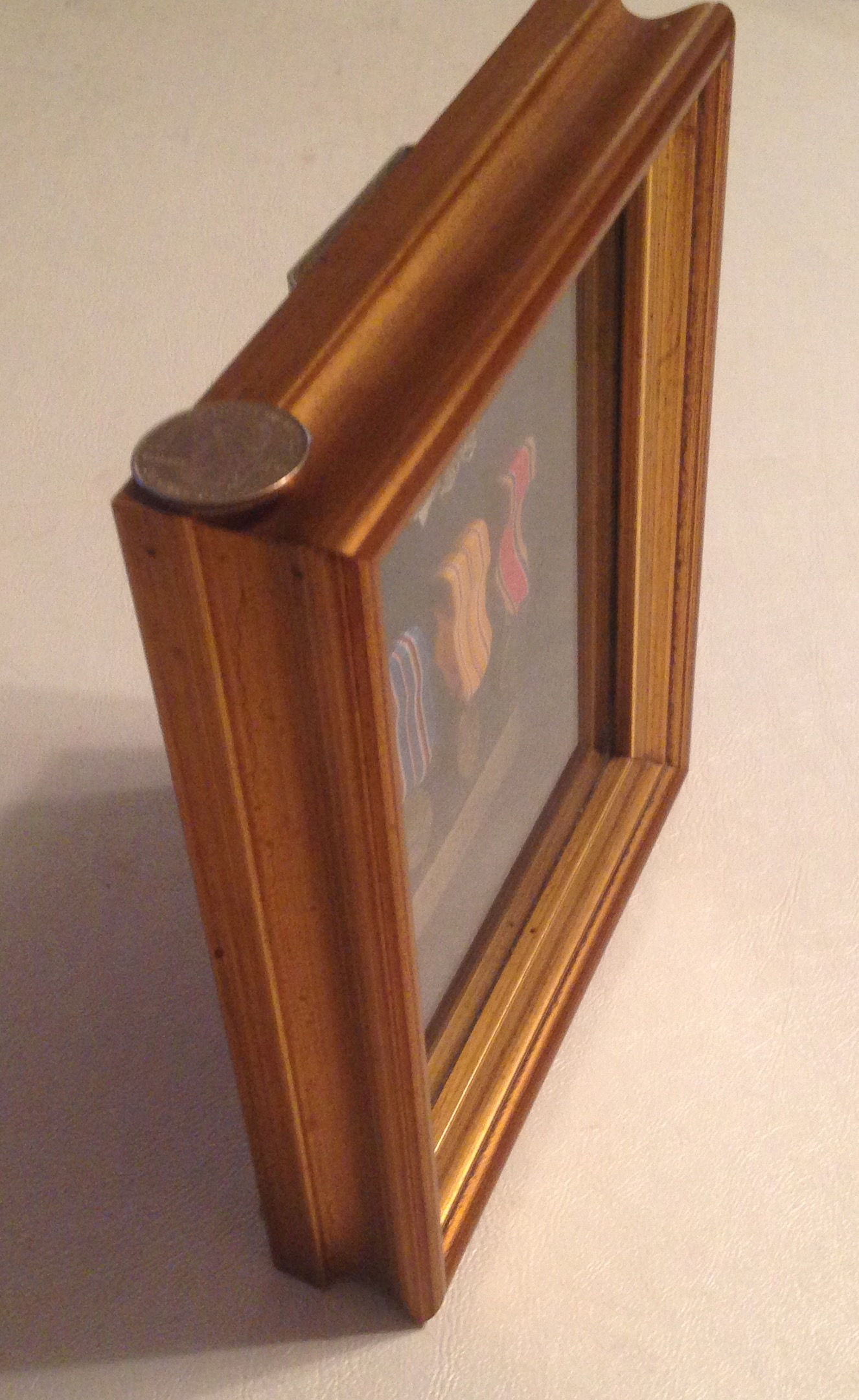
                Made of Mahogany wood, the casing of the clock runs ten inches deep at all points, and it runs 21 inches wise at the top and bottom, narrowing slightly for the central section where its counterweights hang. The interior is covered in black fabric, and has a brass plate that reads, “In memory of Doctor Arthur Dubois Brundidge: Presented by his sisters Louise Brundidge and Pauline Brundidge.” Two round plates with hooks are also visible. Behind the glass cover the face of the clock is white with gold floral patterns adorning the corners and the rounded top. Under the wiry hands, the numerals are Arabic, and the center reads faintly in elegant script, Robert Russell, Ballymena. Columns on either side of the clock face culminate in rounded brass spires, and the very top of the clock curls in to a circular brass ornament that crowns the work at eight feet tall.

Provenance

              This clock is part of the recreation of the Deyo House, and not original to it. As is displayed on the plate that now rests inside it, the clock was donated in 1980 by Louise and Pauline Brundidge on behalf of their late brother, Arthur Brundidge. The siblings are children of Jeannette Deyo Dubois, born in Gardiner in 1880 and Arthur Daniel Brundidge, born in Newburgh in 1875 (DuBois Lineage). A note left with the donation claims, “Federal period case by NY maker – in Brundidge Quimby family since 1795 Marlboro, Plattekill, Newburgh and Walden,” but a 2015 note under it states “This information is probably related to another clock” (Historic Huguenot StreetAcc. #3474-80.1).

Narrative

                This clock, of course, is not the original from the Deyo House. However, its presence tells a story that dates back to Gilded Age American and Colonial Revival. Having good financial fortune and wanting to show it, Abraham and Gertrude Deyo Brodhead turned the Deyo family home into the modern era mansion that stands on the street today in 1894. Of course, for a home to truly cement its owners’ reputation as budding socialites, it needs to be filled with the very finest furniture. From gold-gilded radiators to a player piano, no expense was spared. In particular, early American heirlooms were in style as a part of the Colonial Revival movement.

               To some extent, Colonial Revival was founded a growing appreciation of American history and a desire to preserve it, but it almost certainly sprouted from the desire of older families  to separate themselves from the new wave of immigrants. (Haley) Given that, what better way to display the Brodhead’s Anglo-Saxon, Protestant heritage than with an 18th century English grandfather clock by Clark of London? Clarke was a world-renowned maker, known for using Turkish numerals on clocks, which were generally exported to the Ottoman Empire, and finely adorned with round, brass ornaments (British Museum). The first thing a guest sees when they enter the house, the Clark clock undoubtedly made the right impression on hundreds of guests over the years. Abraham would go on to lose the family fortune, and auctioned off most of the furniture in 1915, but interestingly the clock is not among the items listed. Gertrude and Abraham took the clock with them to their next residence on North Chestnut Street, and Gertrude wouldn’t auction it until 1926, when the “Grandfather’s clock brass dial by Clark of London” was sold by J.B. Sissons and Sons  (New Paltz Independent).

               The current clock is a good replacement for the clock that used to sit in the Deyo House. It’s Arabic numerals and brass ornaments are in the same style as Clark, but it has quite a story of its own, in addition to the one it tells as part of the museum display. Contrary to the donation note, Ballymena is a town in northern Ireland, so the clock was most certainly not made in New York. Robert Russell shows up on Ireland’s 1821 census as a 40 year old “Watch and Clock Maker” living in Navan,  a town, in the center of Ireland, quite a trek from Ballymena. He isn’t a very well known clock maker, but seems to have been doing well for himself, married with four children, an apprentice, and one house servant. This means the clock was almost certainly not in the Brundidge Quimby family in 1795, as it’s doubtful Russell had his own workshop at 14 years old.

Tracing the Brundidge family, I only managed to get as far back Louise’s grandfather, Henry Brundidge, born in Newburgh in 1840. But what is interesting about him is that he is listed in the 1900 census as a clock repairer, along with his sons Arthur and Albert (United States Federal Census). The three worked together in the business district at 124 Water Street in Newburgh, fixing jewelry, watches and bicycles (Newburgh City Directory). It’s hard to know exactly how the Robert Russel clock came into their possession, but it seems likely that the clock was acquired by their repair show at some point. While the clock doesn’t always stay with its case, it’s easy to imaging the Russel clock, with the swan neck crested case, ticking away amidst the bustle of Water Street; an attractive show piece that proved this repair shop meant business. Assuming it was on water street, the clock saw a unique piece of local history, as the district was later demolished, and 124 Water street now has nothing on it.

Most historical museums are missing some of original furniture, and fill in where necessary. In that sense the clock, which looks enough like a Clark of London piece, does an excellent job telling the story of the Deyo family. But, perhaps more importantly, this clock has a story different from the one it tells as its day job. Made in Northern Ireland, likely fixed in Newburgh and then passed down throughout the Hudson Valley, the clock traveled the Atlantic to witness the growth of the region, and in doing so, gathered a uniquely American history of its own.

References

DuBois Family Lineage, Historic Huguenot Street Records, p. 664

British Museum. “George Clarke (Biographical Details).” British Museum, http://www.britishmuseum.org/research/search_the_collection_database/term_details.aspx?bioId=89468.

Haley, Jacquetta. Furnishings Plan, Deyo House. 2001.

Historic Huguenot Street Donation Records. 3474-80.1- Clock, tall case.

National Archives of Ireland. 1821 Census. Web. 19 Apr. 2019 http://www.census.nationalarchives.ie/pages/1821/Meath/Navan/Navantown/383/

New Paltz Independent, “Auction of Antique and Modern Furniture, Oriental Rugs, Etc.”  4 November, 1926.

Newburgh City Directory, 1901

United States Federal Census, 1900

My Skis and their Parts

My most recent purchase was a pair of downhill skis, with the supposed intent of saving money on rentals. We’ll see how that goes.

This particular pair is a set of Fischer Pro Mountain Fire Skis, and bears the Fisher triangle logo at the top, as well as the phrase “Pro MT Fire” at the top and bottom, with a green stripe design printed onto a black plastic surface.

The skis stand 5’5” tall, and taper from a width of 4.5” thick at the top to 3” at the center, back to 4.5” at the bottom, giving them a sort of lanky hourglass shape when looked at head on. At this angle, the tips bend toward the viewer, then curves up slightly again at the center such that it is pressed into the snow by its user’s weight. This type of curve is called a rocker, and both prevents the ski from catching on small elevation changes, while limiting how much the skier’s boot presses into the snow, allowing a smoother glide.

The Center of the Skis, and the Bindings

Looking from the side of the skis, they are about half an inch thick , and the center separation due to the rocker is brought into closer view. The bindings that I installed myself are also visible, though they are really separate pieces fitted onto the skis rather than parts of the skis themselves. At the edge of the skis where the black plastic cover ends, a thin strip of steel can just be made out, bolted onto the ski to protect the less durable materials from wear. Taking this off would allow the removal of the outer plastic, and reveal the contents of each ski. I like my skis, so I’ll make do with images provided by ski manufacturers instead.

Internals of the Pro Mountain Fire Ski (Fischer)

From Fischer’s image above, the yellow center material is wood. This wood core is assembled from long strips of a hard wood like birch ash, or maple (Ski Construction). This gives the ski strength, while allowing it to flex along the long axis created by the wood. Around the wood, in grey, is a fine layer fiber glass, both waterproofing the ski and binding the wood tightly in place. From there, the black top and bottom layers are added to ski on. The image below shows these outer layers in more detail.

Extrusion of Ski Layers (Ski Construction)

From the above, the blue layer at the top is the plastic that covers the top of the ski, while the bottom layer is now more visible, along with the metal strips that line the bottom edges. This black material is polyethylene plastic of various concentration (Ski Construction). This adheres nicely to wax, which is what provides low enough friction to glide on the snow.

Slightly Damaged Ski Wax

The polyethylene layer completes the ski and is clearly visible in its almost pitch dark black, however, it has a sheen provided by the layers of wax on it. In this particular picture, some grooves are evident in the wax; wear that comes naturally with use over a long period, and in this case has appeared in short order from ill-fated off trail adventures.

Fischer is mainly recognized as a nordic ski company, and brand recognition from using them in the past probably contributed to my decision to buy my downhill skis from them as well. Fischer skis are made in their factory location in Innkreis, Austria (About Fischer), and this particular pair shipped overseas to an Amazon warehouse in Pennsylvania before arriving at my doorstep this December.

Quite a lot of materials go in to making a pair of skis, and thinking about where the wood, glass, wax, metal and plastic were made and then shipped to Austria for assembly really does give me a new perspective on both the amount of effort that went into making them, and how many different places the money I spent on them ended up. Perhaps next time I’ll think twice about chopping them up on the glade terrain.

Works Cited

Fischer. “Fischer Pro MTN Fire Skis w/RS 9 GW Bindings Mens .”   Amazon, Amazon, 2019, http://www.amazon.com/Fischer-Fire-Skis-Bindings- 160cm/dp/B07HH2DJJZ/ref=sr_1_138?s=outdoor-recreation&rps=1&ie=UTF8&qid=1544410428&sr=1-138&refinements=p_85:2470955011,p_36:20000-50000&th=1&psc=1.

“Ski Construction.” Ski Construction – Ski Equipment – Mechanics of Skiing, Mechanics of Sport, http://www.mechanicsofsport.com/skiing/equipment/skis/ski_construction.html.

Fischer Sports. (2019). About Fischer. [online] Available at: https://www.fischersports.com/us_en/explore/company/about-fischer [Accessed 4 Mar. 2019].

Of Medals and Dragons

I got in touch with my uncle to discuss my grandfather’s medals in further detain, and much to my dismay, found out that they are in fact not authentic to my grandfather. Rather, my uncle bought them at the Navy Store in 1991, and says the original copies are lost, and that he never saw my grandfather with them. He did help me pull up my grandfather’s military record, which lists that he was a Carpenter’s Mate Third Class, Construction Battalion (CB), and earned the Victory Medal, American Theatre Medal and the Asiatic Pacific Medal. That at least confirms that the medals are correct for his service record, but they’re still not authentically his. My uncle says he picked them up for between $8 to $10 each, along with the pin.

And so, with a bit of disappointment in my findings and the story of the medals completed, I decided to post about something from my dad’s side of the family; Advanced Dungeons and Dragons.

The Box from the Front
One of Two Identical Sets of Sides, Quarter for Scale

The Advanced Dungeons and Dragons Figure Set clocks in at 8” long by 4” wide and 1” tall, and has on its surface the image of a Beholder, a floating mass of snakes and flesh with a giant eye. He seems to be watching a Fly Man, or Aarakocra, fighting against a Snake Man, called a Yuan Ti. It has a number 2012, placed above the phrase “Dwellers Bellow”, and has two yellow sides with “Advanced Dungeons and Dragons Figure Set ” and two green sides that say “Advanced Dungeons and Dragons ” again, with the company information “Grenadier Models Inc. PO Box 305 Springfield PA 19064, and Made in USA in the bottom right corner. It’s made of cardboard that is beginning to deteriorate at the corners, and has a brow cardboard backing. Inside the box are several figurines kept in rectangle cutouts that are set in blue foam.

The Figurine Set, and a Drawing I Found with it
A Close-Up on the Beholder and Aarakocra

The box is filled with figurines representing various characters and monsters. They are all about as big as a quarter, though the larger ones are almost 1.5” long. In particular, there’s a drawing of a man with red hair, and a painted Aaarakocra with two shields and a sword, along with my favorite monster, the beholder.

The figures are made from a soft gray metal that I’m 90% sure is lead from the way it rubs off on my fingers, giving them a slimy (perhaps toxic) feel that renders them far from pleasing to touch; quite a contrast from DeWall’s netsuke.

Grenadier Inc. is a company long out of business, so it took some digging to find just where these came from. The company ran from 1975 to 1996, and produced this particular set in 1980 at its plant in Springfield, PA (Cook). They were made from a die mold, and were indeed cast out of lead, prompting me to wash my hands. I was able to confirm that these figures are authentic 1st edition casts, since there were no reprints.

The 1980 Catalog for this Set (Cook)

I picked these up because they belonged to my father, who played D&D with his brother and his friend Chris when they were in high school in the early 80’s. The Aarakocra is my dad’s work, and the drawing was done by Chris, representing one of his characters. My father used to tell me about the adventures they’d have, how my uncle would try to kill every creature he stumbled upon, and how my grandfather, a self-proclaimed bodybuilder, played a few times as a barbarian. These figures would be at the center of the table, standing menacingly on hand-drawn grids representing dungeons and caves, helping the players imagine the sinister obstacles their heroes had to overcome. Chris would write all the encounters, and went on to make a side job for himself telling ghost stories at “haunted” places.

My father somehow ended up with all of the D&D materials, and gave these to me when I turned 12 in 2009. We played a few adventures with my younger brother, and I later became an avid board game player. Whether I like these figures so much because I like board games or I like board games because I played with the figures remains to be answered.

Now that they’re with me, the figurines (and four similar sets) have transitioned from pieces used to play a game into a shared memory with my father. I display the figures in their box and never take them out; partially because they’re lead, but mostly because I’d be afraid to lose the characters that connect me to my father when he was close to my age, doing the same things I do.

Works Cited

Cook, Jim. “Grenadier’s AD&D Solid Gold Line.” Paintbrushes for Miniatures, http://www.dndlead.com/Grenadier/Grenadier.htm.

A Seabee’s Medals

Most of what I know about my grandfather and his medals comes from asking my mother and my uncle, who, being a retired Colonel, is a great source for all things related to the military. My basic understanding is that my grandfather enlisted in the Navy at the start of the war, and worked building airstrips and docks used for the Island-Hopping campaign.

The Medals Again

The badge at the top of the case is the seal of an enlisted Seabee Combat Warfare Specialist, a member of the Navy’s Construction Battalion, or C.B. for short (Warfare Pins/Badges). The bee with the machine gun and the wrench is their symbol, both a play on words and representation of their role in combat. These are worn on uniforms as a symbol of status and qualification, and don’t specify a particular rank, though an officer would wear a gold one. The badge signifies broad knowledge of naval history, weaponry and construction, as well physical fitness. These were minted by the Navy in 1992, which struck me as odd since my grandfather died that year. I asked my mother about it, and according to her, my uncle put in the paperwork and the badge was awarded posthumously, meaning, oddly enough, that my grandfather never owned or wore it.

As for the medals, I know the two on the right, but had to do some digging on the leftmost medal. That one is the American Campaign medal, awarded by FDR in 1942 to those who served in the US before entry to the war, and later to personnel who served during the war on the US theartre, namely our islands in Alaska and Hawaii (Herman). Its ribbon is red white and blue, the colors of the United States. Because the ribbon was issued before the medal, my grandfather may have actually had this on his uniform, though I doubt he wore it often, or any shirt for that matter.

My Grandfather (Left) in the South Pacific Wearing Traditional Seabee Uniform

The center medal is the Asiatic-Pacific Campaign Medal, given after the war to every soldier serving on the Pacific front, and the rightmost medal is the World War II victory medal, commemorating every US soldier who served in the conflict. The Asiatic-Pacific Campaign Medal shows soldiers in the tropics, just like my grandfather’s picture above. The yellow, gold, and red ribbon mirrors the colors of the Japanese forces. On the victory medal, I was actually mistaken in my interpretation. The image is Lady Liberty holding a broken sword, and standing on the helmet of Mars, God of War (Medals of America). The central red stripe represents the conflict, and the rainbows flanking it are interpreted as the triumph of peace.

These medals are made mostly out of copper, then plated with the yellowish alloy that the Smithsonian calls “Gold-Colored Plating” (Air and Space Museum, World War II Victory Medal). After the medal is pressed into form and plated, the ring at the top is soldered on to attach the silk ribbon. The manufacture of these medals is contracted out to various mints, so it’s hard to know exactly where these were made, though judging by their wear (especially the victory medal, which has lost its gold color), my best guess is my Grandfather put in for them a few years after their issue in 1946. To get one, a valid service record that qualifies for the medal must be submitted, a precaution taken against stolen valor.

These medals are what my grandfather would have worn on his uniform after the war, at memorial day services, military balls and the like. Since then, they’ve transitioned from their initial function of mementos for him to recall and display his service with into something for my family to remember him by. I suppose its a characteristic of war medals that they are printed to acknowledge personal achievement and military history, and end up becoming family heirlooms.

The Stamp in Detail

As far as the case, I know from the stamp on the back that it was put together from four frame corners at Skyline Gallery and Framing in Killeen Texas. My uncle lived in Texas very briefly from around 2004 to 2007, so this means that the display that sits on my mother’s dresser was put together in that time, moving the medals from stand alone pieces to a collection in memory of my grandfather.

Works Cited

US Navy. “Warfare Pins/Badges .” All Hands, 2007. https://www.navy.mil/ah_online/archpdf/ah200701.pdf

“American Campaign Medal.” Stein, Herman E. – TracesOfWar.com, STIWOT, http://www.tracesofwar.com/awards/268/American-Campaign-Medal.htm.

“World War II Victory Medal | Medals of America | Military Blog.” Medals of America, Medals of America, 22 Aug. 2018, http://www.medalsofamerica.com/blog/world-war-ii-victory-medal/.

“Medal, World War II Victory Medal.” National Air and Space Museum, 13 Mar. 2018, https://airandspace.si.edu/collection-objects/medal-world-war-ii-victory-medal-2

World War II Navy Medals and Case

The cast from the front
The case from the back

The case from the side. Quarter for scale.

I decided to describe my grandfather’s World War II medals, which were passed from my grandmother to my uncle, who had them framed as a gift for my mother.

The case is wood, based on the high-pitch door sound it makes when knocked on gently, and has a thin coat of yellow metal that feels like brass. A thin layer of glass protects the three bronze medals, which have 1.75” ribbons and are pinned to indigo fabric. It also contains his insignia and a plaque bearing his name. The case is 8” long by 6.5” wide and 1.5” thick.

Looking at the side, it has a rounded inset and a ridge can be seen at each corner where the the frame pieces meet. The metal coating is beginning to wear away on the side shown, and some darker spots can be seen along the outer edge.

The back of the case is made of thin card stock, with a metal bracket at the top, and two rubber stoppers at the bottom corners, allowing it to be mounted to a wall. There is a thin sheet of paper over it that can be pulled off slightly. It also has a stamp on the back that reads “Custom Framed by Skyline Gallery and Framing,” along with a phone number and a Texas address.

In more detail, at the top of the display is a badge 1.5” wide by 0.5” tall, bearing a bumblebee holding a wrench and what looks to be a machine gun. This rests atop a saber and rifle crossed over an anchor, and behind it all is a field of leaves. The badge is made of a metal silver in color that has a luster akin to steel.The leftmost medal has a blue ribbon adorned with black, white, and red vertical stripes. The ribbon is about 1.75” long and 0.5” wide, as are the other two. The medal itself looks to be made of bronze, with a brown color, and has the image of a plane overhead and a sinking submarine in the foreground. The words “American Campaign” circle around the top. It has roughly the same diameter as a dime.

The center medal has a yellow ribbon again with red, black and white stripes. It has the image of soldiers and a palm tree and the words “Asiatic-Pacific Campaign” embossed on it. It looks bronze like its neighbors, and is of identical size. To the right, the last medal is slightly larger than the other two has a large central red stripe and rainbow stripes on either side. It has a man with a dagger stepping on a helmet, and reads “World War II”. This medal is slightly larger and thinner than the other two, about a nickel’s diameter but almost paper thin.

Under all three medals is a steel plaque with my grandfather’s name, “Charles G. Riccio, US Navy” engraved into it. My grandfather died in 1992, so along with a few pictures these are all I really have of him. They usually sit on my mother’s dresser, and have a solemn presence that instills in me a sense of longing and of pride.


Man vs. Books: A Tidying Up Experience

I should preface this by saying that I’m the kind of person who likes to have stuff around, and am skeptical at best about the “magic” of tidying up. Reading phrases like “… when we reduce what we own and essentially ‘detox’ our house, it has a detox effect on our bodies as well,” (193) makes my stomach want to detox my lunch, and gives the impression of a sales pitch for snake oil. At any rate, the KonMari method won’t kill me, so it’s worth trying at the very least.

My Bookcase and some Unrelated Objects

Clothes are supposed to come first, but I decided to organize my books because they need it. I like to read and have saved all kinds of books, ranging from children’s stories and novels to textbooks and encyclopedias. My main bookcase has been overrun by other knick-knacks and lack of space, and the rest of the books are relegated to a crate by my dresser, also a jungle with no particular standard of organization. In total, I estimate there are about 150 books jammed in.


The Bookshelf Annex

Starting out, I thought for a bit about what I wanted to gain from organizing. I decided that de-cluttering my bookshelves would make my room a better work environment, and a nicer place to spend time reading. That would make me happy, so I got to work tearing my shelves apart; every book on the ground, and everything else relocated to another place.

My Three Piles
Left: Visual Top: Practical Right: General

Tearing everything out of the shelves was quite fun, and I sorted everything into three piles since I don’t have magazines. On the left is my visual pile, with some photo collections, yearbooks and puzzles. At the top is practical, where my textbooks, dictionaries and manuals went. Everything else went to the right, and since I mostly read for pleasure that pile was the largest by far. I counted 183 books in total, and right away was struck by just how much I had. There are test prep manuals for exams I already took, some things I’ve never read, books I’ve grown out of, and books I’ve never read at all. I felt a little guilty about just how much was piled up, and since the practical pile was blocking my exit I had no choice but to move to the joy test.

Mementos – Things I’ll be Keeping for Sure

Holding most of my books didn’t cause me to feel anything. A select few brought back personal memories that have little to do with the actual book. These include mazes I did with my dad as a kid, my yearbook and gifts from past mentors. I feel a special connection with these, making them mementos.


Going through the rest felt strange, and not just because I had to thank inanimate objects. It was easy to toss the few I hadn’t read, but I finished the vast majority, and enjoyed them too. Even still, I didn’t feel any joy holding most of them. They were good stories, I had fun reading them once, and I have no intention of ever picking them back up again.

Thanks for the Stories!

My mother is the librarian at the local elementary school, so she took all the books in the black bag. I’m not sure what to do with the rest, but it does feel good knowing some of them will be read again.

My New Display

There were a few books that made me feel something when I held them. These brought back images, quotes, and ideas, and reminded me why I love them. In particular, I found that the books I felt connected to relate to me personally. Calvin and Hobbes just makes me laugh, but others helped shape me as a person and introduced me to ideas that worked their way into my character. I like these books because they are a part of me, and looking at them really does make me happy. I only kept 39 books, so I decided to show off the covers with the extra space. Since I reference them all the time, I also put my most used engineering texts here.

For what it’s worth, I was probably too critical of the value of organization at first, and I really do like the look of my bookcase now. The exercise also helped me to understand that the books I’m attached to really stem either from memories of other people, or because I identify with them on a more personal level. My physical health has yet to improve, but my bookcase says something about me, and I feel joy looking at it.


Works Cited

Kondo, Marie. The Life-Changing Magic of Tidying Up: The Japanese Art of Decluttering and Organizing. Translated by Kathy Hirano, Ten Speed Press, 2014.