In a world of mass-produced media, in an information-flooded culture, books are taken for granted across the Western world, both for their style and content. A casual reader would hardly recognize differences in binding or font unless drawn attention to the glued spine or the use of serif fonts in nearly all their favorite publications. Bibliophiles hoard books into their personal libraries, sometimes faintly aware of their aesthetic appeal, yet more so taking advantage of their accessibility. Thanks to computer processors and rapidly-progressing technology, e-readers offer immense content and a variety of design styles at one’s fingertips.

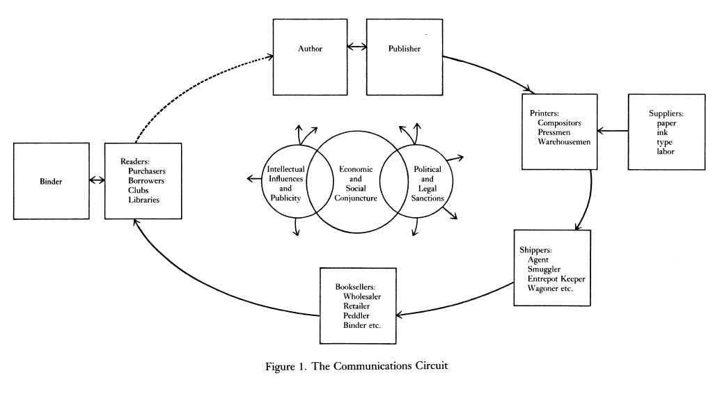
Yet without the written word and its sturdy encasing, our monumental creations would carelessly alter at the whim of one’s memory. A few stories of oral tradition survived, but only when transcribed into a translatable language, such as Beowulf. Nearly all literary merit originates with the transcription of text and the mass reproduction thanks to the printing press, credited to Johannes Gutenberg in 1450. Similarly, the study of the history of books primarily starts with the famous machine, since documents were otherwise mainly scrolls without strong binding, and expands towards other steps in the printing and distributing process. A book only persists in the common media with the right “communications circuit that runs from the author to the publisher (if the bookseller does not assume that role), the printer, the shipper, the bookseller, and the reader” (Darnton 67). The reader then influences the author with critique, and because “authors are readers themselves” (Darnton 67). Even in our expansive world today, we can see how authors draw from their readership, anticipate their audience’s reaction to their work, and form a reader/writer literary community that pushes the cycle. Perhaps more of such exists today because of widespread media. Take John Green for example; he discusses his upcoming novels on his video blog series with his brother, and he can easily garner the reaction of his work by scrolling down the Youtube comments. As such, the full cycle persists.
According to Darnton, book historians take a singular section of the full cycle and analyze, then contextualize the part to the whole, particularly in the context of and to describe the economic, social, political, and cultural environment. In “What is the History of Books?”, Darnton offers the publishing history of Voltaire’s Questions sur l’Encyclopedia, particularly analyzing the role of the bookseller Rigaud, to vividly illustrate the full cycle and reveal crucial missing evidence that continues to leave holes in the book history narrative. The successful bookseller relies on the readership, just like the author, and Rigaud’s variety in his bookshop catered to varied audiences: “travel books, histories, novels, religious works, and the occasional scientific or philosophical treatise” (Darton 70). Similarly, the bookseller competes with other businesses, vying for dominance in the industry, just as one could find today with the liquidated Borders and expanding Barnes & Noble. Yet, Darton’s questions towards all part of the cycle, starting on page 75, reveal the heavy burdens of the study of the history of books. Some documents persist to answer the questions, but not enough data can be found to solidify conclusions about mainstream literary trends.
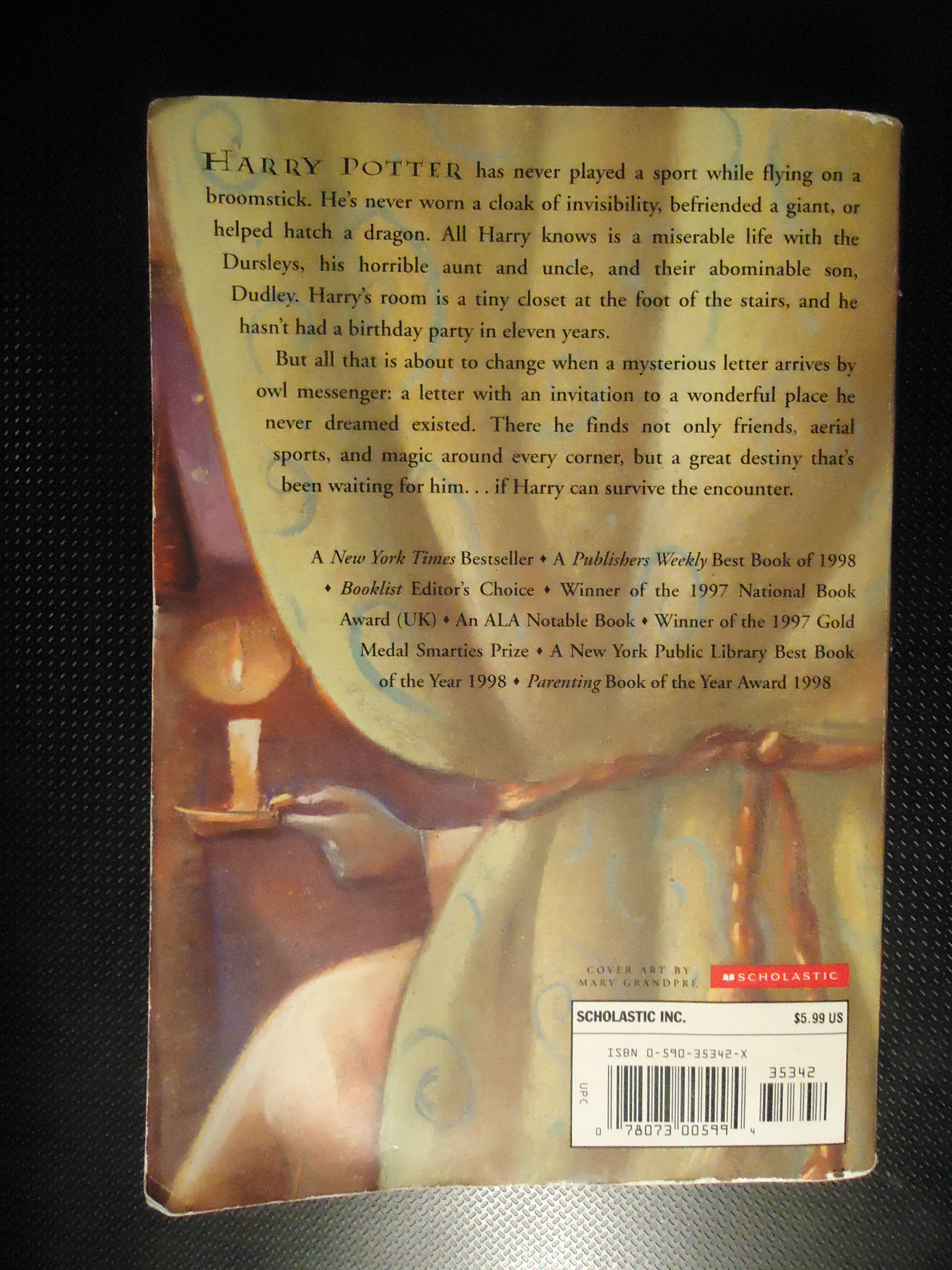
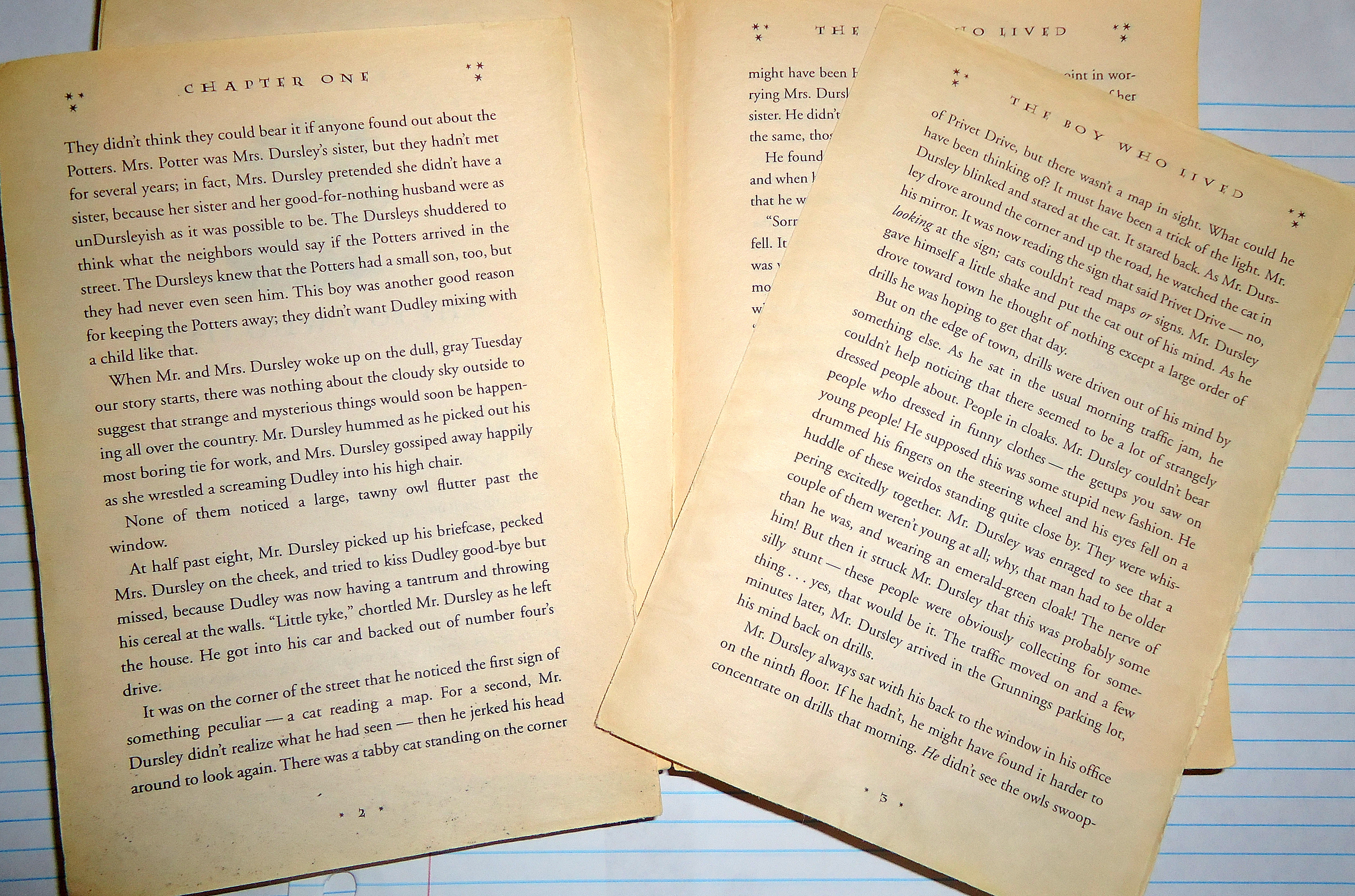
How does this all relate to the physical book you will present in class? How does it not? The interconnected cycle offers a rich history of the social climate. Voltaire’s success with Questions reveals an Enlightenment trend in the 1770s and 1780s through literature; Harry Potter’s massive sales reveal a cultural trend towards children’s literature, perhaps even as backlash against surging visual media. A bookstore, even today, detects what would be successful, orders in massive stock, and promotes its great wares. In a way, the book lives not because its creator bestowed life but because the seller validates its importance to the literary world. If none of the booksellers believed Questions or Harry Potter would be profitable, the books would never receive such high acclaim and awareness. Yet, the bookseller decodes its readership to make its purchases, and the readers encourage the authors to produce more.
Such logical interconnection does not falter in studies of print. Just like books, the printing press launched the development of fonts; with the advent of moveable type, printers could style text typefaces for massive reproduction. Themes of readability and simplicity dominate font style both in books and on a multitude of printed works. While mainstream books and newspapers do not deter from serif fonts, since the feet naturally separate the letters and make otherwise cramped text easier on the eyes, contemporary shorter printed media (signs, advertisements, etc.) abandoned the serif. Prior to the creation of Helvetica in 1957, a san-serif was introduced in the early 1800s, but popularity of san-serif hit spiraled in the 1900s with types such as Johnston (used by the Transport for London), Gill Sans (popularized as the typeface for LNER’s marketing materials), and Broadway. As recognized in the movie Helvetica, the font type dominated the print sphere because of its simplistic design. It offers no emotional tug and became the basis for other sans-serifs developed decades later, such as Arial, Century Gothic, and Calibri. In their lack of emotional attachment to viewers, the font exists and persists in the background, unknowingly beloved by millions of viewers because it does not call attention to itself. Since the font does not suggest anything, the designer can adjust it for their visual aesthetic, and the viewer can imbue their own meaning to the text. This modernist trend conflicts with post-modernist font trends that reject such simplicity; post-modernist fonts are intentionally designed with implied meaning. One could classify Papyrus as a post-modern font due to its apparent replication of ancient Egyptian scroll-work, adding a certain foreign and relic element to the text. No matter what type of font used, its careful design and craft reflects on its object quality, offering a narrative that pervades multiple media trends, from books to the world wide web.
Annotated Bibliography
“History of Books and Printing: A Guide to the Collections of the Stephen A. Schwarzman Building.” New York Public Library. n.p, n.d. Web. 05 Apr. 2013. http://legacy.www.nypl.org/research/chss/grd/resguides/bookhist/
The New York Public Library, located near Bryant Park in Manhattan, offers its collection on the history of books and printing in the Stephen A. Schwarzman Building. Their works are divided into several subcategories: Bibliographical Description of Books; General Surveys; Bibliographies; Antiquity: Alphabets, Writing Systems, Writing Materials; Medieval Period: The Codex an Manuscript Production; Art of the Book; Invention and Spread of Printing; Publishing and Bookselling; Books and Society; and The Book in the United States. Online, a dedicated scholar can look up all their resources according to category, along with their call number, to aid in further research at the library itself.
Hutchings, Emma. “Typeface Timeline Shows Us the History of Fonts [Infographic].” PSFK. n.p., 3 Apr. 2012. Web. 05 Apr. 2013. http://www.psfk.com/2012/04/history-of-fonts.html
This graphic timeline of the history of western typefaces primarily starts with the invention of moveable type with the printing press in 1440 by Johannes Gutenberg up to 2011 when Matthew Carter, who designed Georgia and Veranda, won the national Design Award for lifetime achievement. Notably, the sans serif first originated in the early 1800s, but only skyrocketed in the 1900s, especially when Helvetica was created in 1957. The timeline also notes significant font debuts in popular media, such as Catul for the Google logo, a modified Klavika Bold for Facebook, and Futura for The Social Network poster.
“The Centre for the History of the Book.” The University of Edinburgh. n.p., 19 Apr. 2012. Web. 05 Apr. 2013.
http://www.hss.ed.ac.uk/chb/
The Centre for the History of the Book, established in 1995 as a leading resource for advanced interdisciplinary research and study of the material culture of the text, offers a website to aid scholars in navigating its resources, showcase related events, and offer information for its postgraduate programs in the History of the Book. The Centre is affiliated with the University of Edinburgh, located in Scotland.
Helvetica. Dir. Gary Hustwit. Plexifilm, 2007. DVD.
This feature-length documentary on the development and prevalence of Helvetica exposes the culture, history, and art of print-making and text design, centered on the typeface of the same name. Candid interviews with leading graphic and type designers, such as Matthew Carter, who originally designed web fonts Verdana and Georgia, assist brief glances around New York City, where Helvetica continues to populate and persist across the bustling city, a history of the typeface, and insight on the battle between modernist and postmodernist type.
“Jessica Hische – From Berlin with Love.” Gestalten TV. Vimeo, March 2013. Web. 08 April 2013. http://vimeo.com/60556612
Jessica Hische talks to Gestalten TV about designing letters B, E, R, L, I, and N. She also discusses the balance of personality in font design, the value of serifs, and collaborating with other print-makers in a recent two-day Gestalten workshop. In conclusion, Hische finds font design a unique exposure of self and personal artistry, as each font design will end up differently depending on the designer. Hische, a letterer and illustrator, has been named a Forbes Magazine “30 under 30” in art and design, an ADC Young Gun, and one of Print Magazine’s “New Visual Artists.”
By Jaime Burns and Jessi Putnam