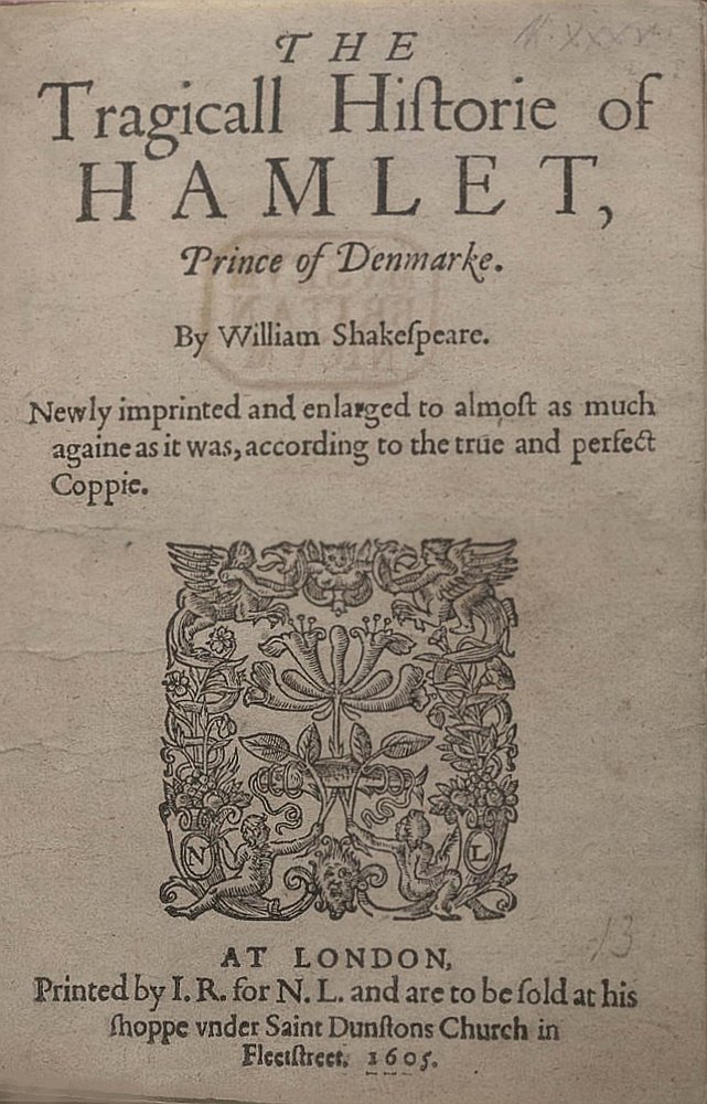
When looking at the objects that present themselves in Hamlet, it is often hard to extract them from the implicit symbolism that embodies their description. An example of this are the flowers that Ophelia describes in Act IV, Scene V (pg. 388). Here, Ophelia in all of her psychological anguish, hands out flowers to those around her and in doing so ascribes meaning to them;
Ophelia: There’s rosemary; that’s for remembrance. Pray you, love, remember. And there is pansies; that’s for thoughts.
Laertes: A document in madness – thoughts and remembrance fitted!
Ophelia: There’s fennel for you, and columbines. There’s rue for you, and here’s some for me. We may call it herb of grace o’ Sundays. You may wear your rue with a difference. There’s a daisy. I would give you some violets, but they withered all when my father died. They say ‘a made a good end.
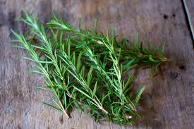
rosemary
“A document of madness…” Laertes claims, but surely, as we know from Shakespeare’s tendency to call upon objects with a rich cultural history, there is no folly in what Ophelia is suggesting by presenting these flowers. As a reader, we are under the impression that the flowers must be embedded in some deeper context that allows Ophelia to look at them as symbols of larger ideas (such as remembrance, and thoughts). And indeed they are; in order to understand why Ophelia is looking at these specific objects as vehicles for a more significant message, it is necessary to look at each plant and its historical uses.

pansies
Rosemary – Was first used by the Greeks and Romans as an aid of protection against evil spirits. Students in ancient Greece wore garlands of rosemary around their necks, or braided it into their hair to improve their memory during exams. Others would place it in their pillow the night before to enhance memory during sleep. When it was brought to Europe it was regarded as a purifying and healing herb, but it’s usefulness for retaining memory was also reiterated in the English court. Sir Thomas More (1478-1535) wrote, “As for rosmarine, I lette it runne all over my garden walls, not onlie because my bees love it, but because it is the herb sacred to remembrance, and, therefore to friendship . . .” In addition to Hamlet, Shakespeare also makes the use of rosemary as an allegorical symbol in Romeo & Juliet (Friar Lawrence requests that mourners bestow Juliet with rosemary at her burial, as dedication to her memory).
Pansies– The flower’s name is derivative of the French pensee, meaning thought, reflecting the flower’s reputation for bringing thoughts of loved ones. Shakespeare also cited the meaning of the flower when, in A Midsummer Night’s Dream, he wrote that the sleeping Titania will fall in love with the first creature she will see when she will awake, thanks to the pansy juice on her eyes; “the juice of it, on sleeping eyelids laid, will make a man or woman madly dote upon the next live creature that it sees.”.

fennel flower – The fennel flower looks very different from the wild fennel plant and the fennel root (both of which can be eaten and used in home remedies).
Fennel – Fennel is one of nine Anglo-Saxon herbs known for secret powers; a bunch of fennel hung over a cottage door was said to prevent the effects of witchcraft. Greek and Roman women nibbled on fennel seeds because they believed the herb suppressed the appetite. Ancient Egyptians believed eating the fennel herb and seeds imparted courage, strength, and conveyed longevity.
The columbine flower comes in a large variety of colors with differing petal shapes…it’s hard to believe they’re all the same species!
Columbines – The symbolism of the columbine flower is varied, and often quite confusing. It was once believed that this flower was a symbol for foolishness, at the same time, however, it was considered a symbol of fidelity and holiness. Today, though, these flowers are given as gifts to represent its more modern meanings of seduction and anxious excitement. These flowers make very uncommon but beautiful and meaningful gifts, and are sometimes given as potted plants or simple, single-cut flowers.

rue flower – The rue flower differs from the rue plant; at one time the holy water was sprinkled from bushes made of rue at the ceremony usually preceding the Sunday celebration of High Mass, for which reason it is supposed it was named the “Herb of Repentance” and the “Herb of Grace”.
Rue –In the Middle Ages and later, it was considered – in many parts of Europe – a powerful defense against witches, and was used in many spells. At one time the holy water was sprinkled from bushes made of rue at the ceremony usually preceding the Sunday celebration of High Mass, for which reason it is supposed it was named the “Herb of Repentance” and the “Herb of Grace”.

white daisies

wild violets
Daisy – The Celtics connected daisies with innocence. They believed that daisies came from the spirits of babies who had died during the birthing process. The daisy flowers grew in order to lighten their parents’ grief. Daisies have their place in Christianity. One legend has it that the daisy grew from the Virgin Mary’s tears. In fact, daisies are sometimes used to symbolize Christ and the Virgin Mary. You will also see the daisy as a motif in artwork from the medieval period as a symbol of Christ’s innocence when Christ was a child. Another Christian legend describes how the wise men were looking for a sign of where the newborn Christ was located. When they saw groups of daisies near a stable, the wise men knew they had found Jesus as the daisies looked like the star that had led them to Bethlehem.
Violet – In Christian symbolism, the violet stood for the virtue of humility, and several legends tell of violets springing up on the graves of virgins and saints. European folktales associate violets with death and mourning. In the language of flowers, it has had various symbolic meanings. Its color may indicate the love of truth or, conversely, the truth of love. In keeping with the latter, it is said that unknown persons who had secretly admired or loved him decorated the tomb of the Roman tyrant Nero in the spring with violets.
As I began to do research about each of these specific plants, I started thinking about the phenomenon of the flower as an object. Firstly, it is important to recognize that flowers are meant to die. In many ways they are similar to human beings; they are given life by preexisting organisms (germination and seeding), their growth depends on the environment they are brought up in, and their life span is generally short. Looking at those facts alone, it is interesting that Ophelia in her “madness” chooses to draw similarities between the life of these flowers and the lives of the people around her.
Stepping outside of Hamlet and looking into the historical/mythological associations of these plants has helped me understand the important influence that religion had on Shakespeare’s work (and most other artistic creations of that time). When Shakespeare began writing plays for the group called Lord Chamberlain’s Men in 1594, Queen Elizabeth I had already dealt with England’s fierce schism over Protestantism and Catholicism. As Queen, she wanted to appease a large majority of the English population who had converted to Protestantism when her father, Henry VIII, had implemented the Protestant Reformation in 1532; however Elizabeth herself still clung to symbols of the Catholic faith such as the crucifix. Although most of the religious upheaval had been settled by the time Elizabeth died in 1603, Shakespeare lived another 13 years under the rule (and patronage) of King James VI, who is remembered primarily for his campaign against witchcraft. James became obsessed with stopping the threat posed by witches, and in 1597 wrote the piece Daemonologie, which is suspected to be the main source of background context for Shakespeare’s Tragedy of Macbeth.
In looking at all of this research simultaneously, it is fascinating to see how close Shakespeare was to the religious figureheads of his time, and in retrospect, notice the religious influence on the implicit meaning of the objects presented in Hamlet. One small example that I found absolutely fascinating is to look at the way Ophelia describes the daisy in comparison to the rest of the flowers; “There’s a daisy.” When I first read it, I wondered why the daisy was undeserving of any more explanation. But upon doing research on the mythological associations of the flower, and learning that in the Christian faith, some believed daisies marked the path that the wise men followed to find Christ in Bethlehem, it made sense that Ophelia simply stated “there it is”. It’s as if the daisy, in this context, could be representative of that traditional story, or it could be an indication from Ophelia that the daisy is representative of guidance.

“Ophelia”, Sir John Everett Millais, 1851-52. This painting is held in the Tate Britain Gallery in London. It depicts Ophelia singing before she drowns in the river in Denmark. The work was not widely regarded when first exhibited at the Royal Academy, but has since come to be admired for its beauty and its accurate depiction of a natural landscape.
Many more connections could be made when looking at the deeper symbolism of the objects in Hamlet, but this specific section painted a full circle connection in my own head, so I thought I’d share!
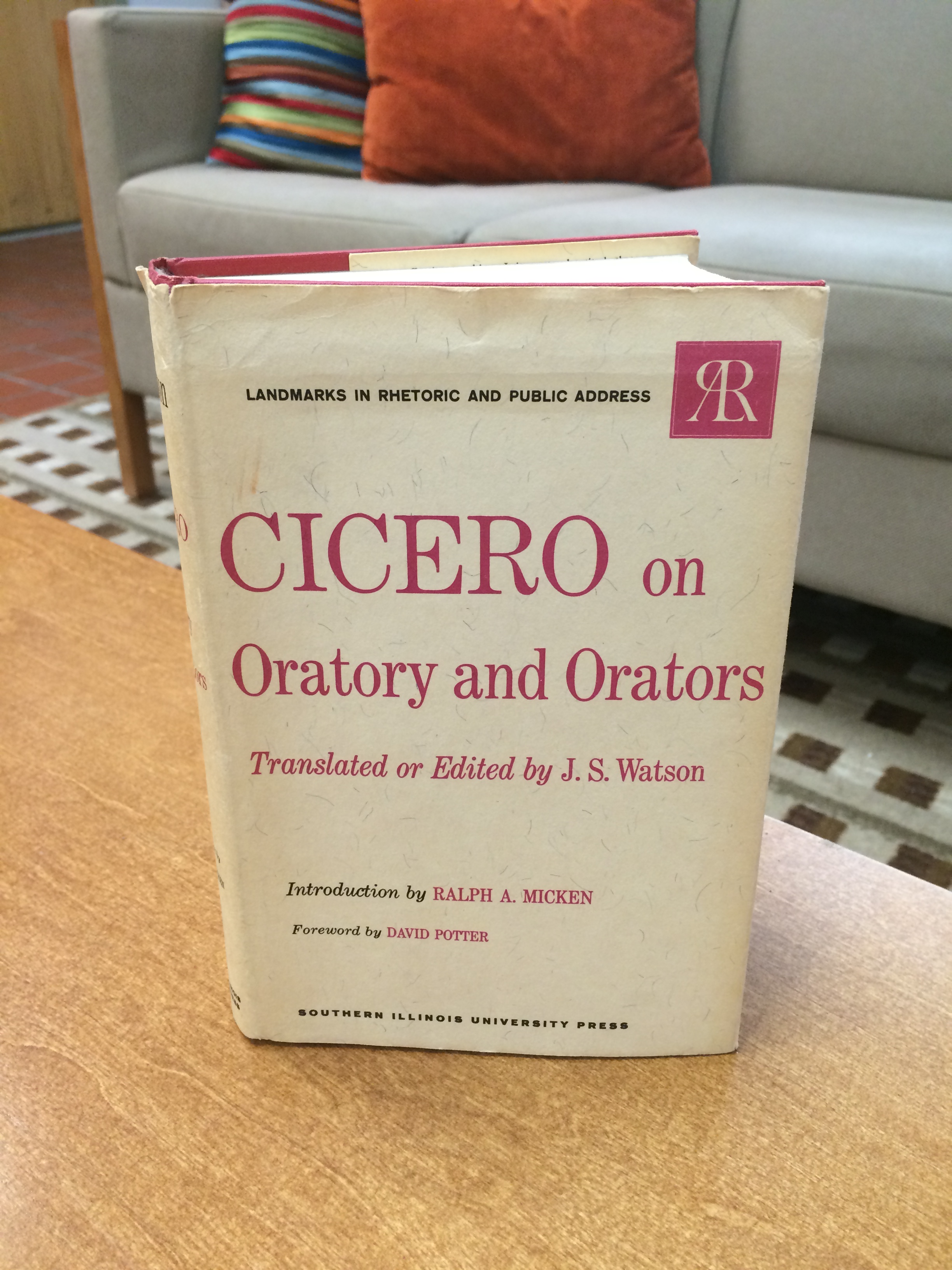
 The size of the back is about 5 x 7 inches. It is a paperback edition published in New York by Scribner an imprint of Simon & Schuster in 2003. Scribner originally published the book on 22 October 1926. The book has remained in print since it’s original publication. Hemingway used his own experiences in Spain to inspire the novel. The photo to the left is a first edition cover of the book.
 once middle weight boxing champion of Princeton.” Hemingway deleted the several pages of material he had written before this official opening line.


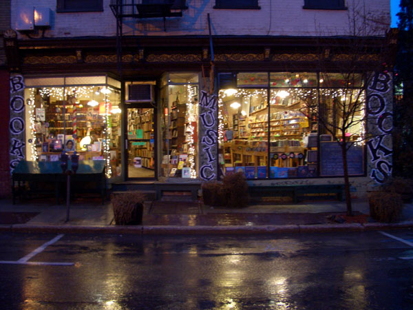
 Peekskill. The clerk who is usually there is an older gentleman with a kind smile and a receding hairline reminiscent of Prufrock. I once heard him read poetry at an open mic several years back. He had brought in his poem to the open mic reading in a paper bag and while he read dramatically dropped the pages to the ground as he flew through his verses. He started off saying, “No one wants to be a poet – it’s like being an aristocrat during the revolution.” I still don’t know if I agree with him, but I’ll never forget the surprise I felt in finding that the little old man behind the counter of my favorite bookstore had so much to say. It was a lot like finding this book. Forgive the cliché, but I had discovered something much more in its pages than the cover could ever reveal