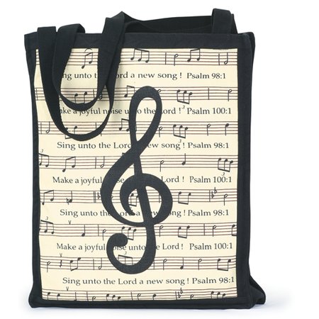
tote bag with details resembling the music notes on mug
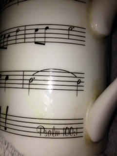
Psalm number
close up of the notes
As I reflect on my mug for a second time I will be paying more attention to the musical significance behind it; particularly, the psalm imprinted on the object and why out of all the Bible verses, this psalm was placed on this mug. Psalms serve tremendously within a Catholic mass; they are typically done as solos by a cantor (one who leads the music of the mass) and are done between the first and the second readings which occur early on in the mass. They consist of one refrain and several verses. They are sung very reverently and holy and make the mass all the more spiritually serene and lovely. The psalm written on my mug resembles a verse of the psalm with the refrain: Sing to the Lord a New Song for He has Done Marvelous Deeds (Psalm 98:1). As I researched where my mother bought the mug I came to realize that another object she bought for me (a psalm tote bag) has the same musical notes imprinted on it with the same psalm verse (along with the refrain that I just quoted from chapter 98). I cannot take a picture of the tote bag as it’s at home with my family but I will attach the picture of it from the website so you can get an idea of what it looks like. As I researched the origin of the psalm’s other verses I found the full piece as written according to the King James Bible Version:
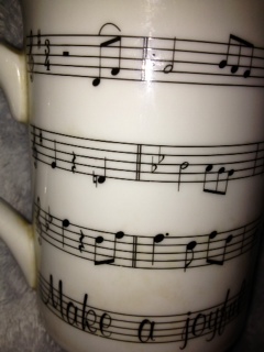
Psalm 100:1-5
100 Make a joyful noise unto the Lord, all ye lands.
2 Serve the Lord with gladness: come before his presence with singing.
3 Know ye that the Lord he is God: it is he that hath made us, and not we ourselves; we are his people, and the sheep of his pasture.
4 Enter into his gates with thanksgiving, and into his courts with praise: be thankful unto him, and bless his name.
5 For the Lord is good; his mercy is everlasting; and his truth endureth to all generations.
These are the words of the entire psalm and now I moved to look at the musical notes on the mug. The music notes have a large range and its G-clef detail represents that is written for a female singer. However I could not mange to find a familiar tune to match up the notes with and so I searched the website in which the item was purchased (christianbook.com). Unfortunately, I could find no trace of the mug so I searched for the tote bag because it also has a musical staff on it and perhaps the description would have some information on the notes. Unfortunately the product description was not very informative and simply states that the bag’s detail has a G clef “against a musical score background”. Therefore I do not believe the music on the mug represents a particular song but rather music in general. This makes sense because psalms are written and sung in multiple ways in Catholic masses; traditionally they are sung slowly with organ accompaniment but others are sung with guitar or different types of musical accompaniment at a faster pace. Therefore, the significance of the musical background is simply to stress that one should sing praise to God through music. After reflecting on the words of the psalm one can sense the urge for people to be joyful because God is our creator and everything about Him is good. On a personal level this psalm is comforting to me because it pushes me to be happy even in my greatest struggle because I can be assured the Lord will not betray me – his mercy is everlasting. I believe my mother chose this object with these words for several reasons. First, and perhaps the most obvious reason is because I am a singer and it serves as a reminder to never stop praising or in my case, never stop singing. I have been singing for over ten years and music has made me particularly involved with my faith and so my mother uses this verse as a message to never lose this involvement and never stem away from your faith. I believe my mother also chose this object to serve as a representation for those memories of rehearsals, church concerts and first solos that I underwent throughout my time of church singing in my home parish. She wants me to have a reminder of all the happiness I have endured through my music ministry and to never forget that God gave me that talent. Psalms are the most holy part of the mass and they are the time in which the cantor truly can give thanks in her own personal way. When a psalm is sung it should be sung for God since it typically is coming from one voice, the relationship between God and the singer becomes that much more intimate. These words and the music on the mug represent a form of praise and thanksgiving and serve the psalm justice in a beautiful way.